Design Systems & UI Libraries
We create scalable component libraries tailored for mobile platforms that keep your brand consistent, eliminate design debt, and get your products to market faster.

100+Reviews
1000+Projects Delivered
Ready to build a design system that scales with your product?
Inconsistent UI components and fragmented design decisions slow down mobile development and create compounding design debt. Without a shared system, teams duplicate work, diverge in implementation, and struggle to maintain coherence at scale.
A structured design system eliminates that friction. By engineering token-based foundations, reusable component libraries, and Figma-integrated workflows, we give teams a single source of truth, one that scales across products, platforms, and teams without breaking.
CUSTOMER STORIES
Client Results and Success


What We Do
Our Capabilities in Design Systems & UI Libraries
Structured, scalable design systems engineered for mobile platforms, from component architecture to full Figma integration.
Custom UI Libraries
Purpose-built component libraries designed for reuse, consistency, and long-term maintainability across mobile products.
Theming
Theme systems engineered to support multiple visual modes without duplicating components or breaking design integrity.
Token-Based Design
Design tokens that create a single source of truth for color, typography, and spacing — bridging the gap between design and code.
Integration with Figma Workflows
Component libraries synced with Figma to ensure design-to-development handoff is accurate, efficient, and conflict-free.
<2s
TIME TO INTERACT
60FPS
STABLE UI PERFORMANCE
99.9%
CRASH-FREE SESSIONS
2x
Faster Interaction Response
99.9%
Uptime & Reliability
KEY BENEFITS
Strategic Advantages of Design Systems & UI Libraries
A well-engineered design system is not just a UI toolkit; it is a long-term investment in product quality, team efficiency, and development speed.
Visual Consistency
A unified component library ensures every screen adheres to the same design language across teams, releases, and platforms.
Faster Development Cycles
Pre-built, reusable components reduce build time and eliminate redundant work across every sprint.
Easier Scaling Across Teams
A shared system gives distributed teams a common foundation — reducing conflicts and accelerating onboarding.
Reduced Design Debt
Structured tokens and components prevent the accumulation of inconsistencies that slow down long-term product growth.
OUR PROCESS
A Structured Process That Takes Your Design System From Foundation to Full Team Adoption
- An evaluation of existing UI patterns, inconsistencies, and gaps followed by the establishment of a token-based design foundation.

- Reusable, platform-optimized components built to a defined specification, ensuring consistency across every screen and team.

- Clear, structured documentation that gives designers and developers a single reference point for every component and decision.

- Hands-on guidance to integrate the design system into existing workflows, reducing friction and accelerating team-wide adoption.

- 01Audit & FoundationAn evaluation of existing UI patterns, inconsistencies, and gaps followed by the establishment of a token-based design foundation.
- 02Component EngineeringReusable, platform-optimized components built to a defined specification, ensuring consistency across every screen and team.
- 03DocumentationClear, structured documentation that gives designers and developers a single reference point for every component and decision.
- 04Adoption SupportHands-on guidance to integrate the design system into existing workflows, reducing friction and accelerating team-wide adoption.
OUR FULL WEB ECOSYSTEM
Comprehensive solutions for Mobile Engineering
Cross-Platform App Development
Build high-performance React Native and Flutter apps using the latest architectures. Single-codebase efficiency without native compromises.
Offline-First Architecture
Power apps that work without bars. We use SQLite, MMKV, and optimistic UI to ensure seamless UX and data integrity in zero-connectivity.
Maintenance and Long-Term Support
Stay ahead of OS shifts and SDK updates. We manage full lifecycle maintenance to eliminate technical debt and ensure store compliance.
Performance Audits and Optimization
Identify and kill lag. From JS thread analysis to memory leak detection, we profile and tune your app for 60 FPS fluid interactions.
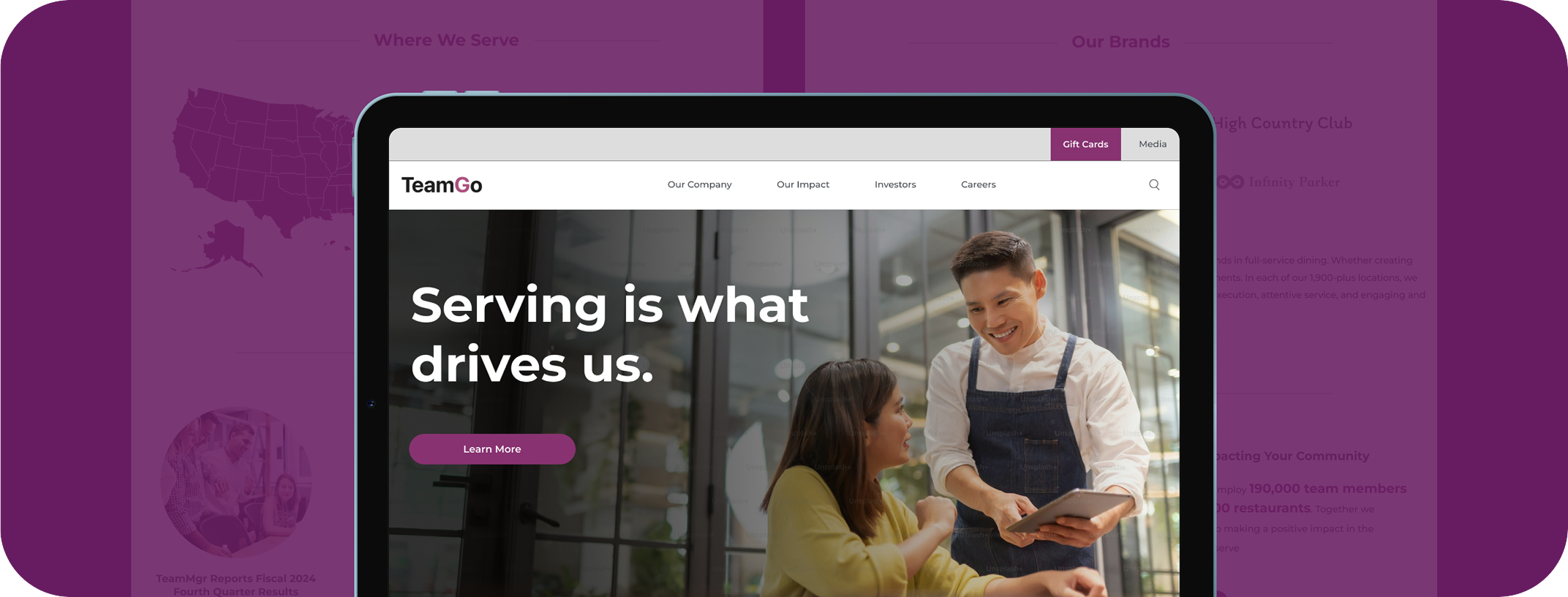
Design Systems and UI Libraries
Scalable UI foundations. We build token-based libraries and Figma-to-code workflows that ensure visual consistency across all platforms.
Accessibility and Compliance
Inclusive by design. We bake in WCAG standards, screen reader support, and focus handling from the component level, not as an afterthought.
MODERN AND SCALABLE
Technology Stack for Design Systems & UI Libraries
The right tools for a design system depend on the product, its platform targets, component complexity, and the scale at which teams need to operate. Every technology decision is made to support consistency, maintainability, and long-term design integrity.


INDUSTRIES WE SERVE
Design Systems & UI Libraries Built for Every Industry
Every product operates at a different scale, serves a different audience, and demands a different visual foundation. We build design systems and UI libraries for:
FEATURED CONTENT
Our Latest Thinking in Mobile Engineering
Discover the latest blogs on Our Latest Thinking in Mobile Engineering, covering trends, strategies, and real-world case studies.

Technology
Jul 10, 2026
How We Built the Missing Bridge from Code to Figma
This blog explores how AI-generated React apps get turned into fully editable, designer-ready Figma files by reading React Fiber instead of the DOM.

Technology
Dec 15, 2025
Design Patterns in AI & ML — Building Smarter Systems
From pipelines to feedback loops, explore essential AI & ML design patterns that help you build smarter, cleaner, and production-ready machine learning systems.

Technology
Oct 22, 2025
Understanding Brand Strategy in the design context
Design without strategy is decoration. Learn how brand strategy transforms visuals into powerful stories that resonate with audiences.

Technology
Oct 21, 2025
UX without data: Turning assumptions into results
No data? No problem. Learn how GeekyAnts turns UX assumptions into results with smart strategies, competitor insights, and rapid design decisions.
Technology
May 10, 2024
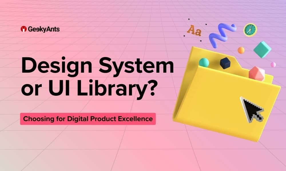
Design System Vs UI Library: Understanding the Difference for Digital Product Excellence
What are the nuances between UI libraries and design systems in digital product design? Learn their distinct roles for enhanced efficiency and brand consistency.

Events
Jul 18, 2022
Design Systems Meetup: First Edition
We arranged a Design Systems Meetup where designers could exchange their ideas about what they are and what's new and trending. Let us tell you everything that unfolded at the event.
Build with us.Accelerate your Growth.
Customized solutions and strategiesFaster-than-market project deliveryEnd-to-end digital transformation services
Trusted By
Book a Discovery Call
Build with us.Accelerate your Growth.
- Customized solutions and strategies
- Faster-than-market project delivery
- End-to-end digital transformation services
Trusted By

What You Need to Know
FAQs on Design Systems & UI Libraries
A design system is a structured library of reusable components, design tokens, and guidelines that govern the visual and functional consistency of a product. Without one, teams duplicate work, accumulate design debt, and ship inconsistent UI across releases. For mobile products, a design system reduces development time and ensures every screen aligns with the same visual language. It is a long-term investment in product quality and team efficiency.