Sep 26, 2023
Mastering the Details: Revealing Subtle Contrasts in UI Elements
Explore the nuanced differences between UI components - Popovers, Tooltips, Modals, and Dialogs through this insightful article.
Author

Book a call
Table of Contents
Introduction
During our various projects, we noticed some UI components that seem similar but have unique uses. Recently, we were involved in a Design System project, researching various UI components to enhance the experience for both designers and developers. It was fascinating to uncover subtle yet crucial differences that set them apart, like Popovers vs. Tooltips or Modals vs. Dialogs. These distinctions make a big impact on how we design for user interactions. As designers and developers, we often encounter scenarios where seemingly similar components, like Popovers and Tooltips, or Modals and Dialogs, stand at the crossroads of selection.
Delving into these seemingly subtle distinctions can unlock a treasure trove of insights, elevating our ability to craft interfaces that resonate with users on a deeper level. In this exploration, we will traverse the delicate boundaries that differentiate these UI components, dissecting the fine lines that dictate when to employ each one. Whether you are a seasoned designer crafting visual narratives or a developer shaping user interactions, understanding the intricacies of these components can be the key to orchestrating a harmonious symphony of design and functionality.
Join us as we unravel the subtle tapestry of Popovers, Tooltips, Modals, and Dialogs, and embark on a journey to discern when to wield each brushstroke for a masterpiece in UI design and development.
Commencing our journey, we will begin by outlining the fundamental explanations for each element.
Explaining Different UI Elements
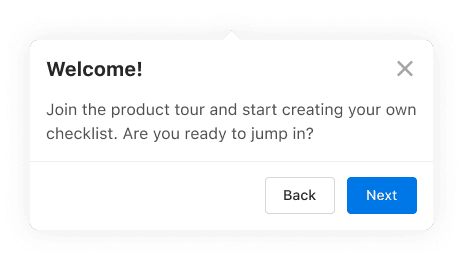
Modal: A "modal" component is a temporary overlay that appears on top of the main content, blocking user interaction with the underlying interface until a specific action or input is addressed. It can serve as a type of "dialog," which is a broader term for user interactions, but a modal specifically requires immediate attention before users can continue. Modals are often used for critical actions, confirmations, or input requests.
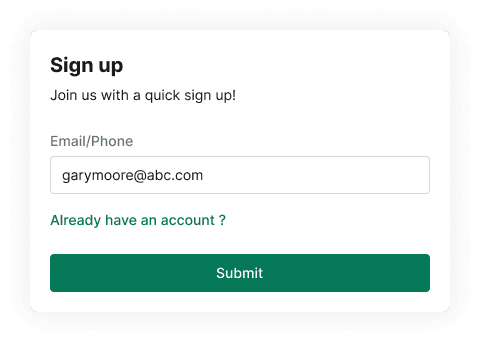
Dialog: A "dialog" is a user interface component that prompts users for input, information, or confirmation within the context of an ongoing task or page, often allowing continued interaction with the main content. It differs from a "modal" by being non-blocking, letting users engage with both the dialog and underlying interface simultaneously, whereas a modal temporarily interrupts user workflow, requiring focused interaction. In short, a dialog facilitates user interactions seamlessly without full interruption.
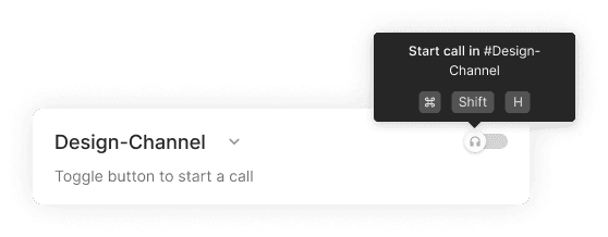
Popover: A Popover component is a user interface element commonly used in web and software applications to display additional information, options, or content in a small, transient overlay that appears when a user interacts with a specific trigger, such as hovering over an element or clicking on it.
Tooltip: A Tooltip component is a user interface element commonly used in web and software applications to provide brief, context-sensitive information or labels about a specific UI element when the user hovers over or focuses on that element. Tooltips are typically used to offer additional details, hints, or explanations to help users understand the purpose or function of a particular UI element.
Differences Between Modal and Dialog
Now, let us delve into comprehending the distinctions that set Modal and Dialog apart.
Dialog
Contextual Engagement: The dialog component commonly serves to elicit specific actions or inputs from users, tailored to the immediate context of the ongoing task or page. It manifests as a compact window or box seamlessly integrated within the existing interface.
Seamless Task Progression: Frequently employed to collect essential information or proffer choices imperative for users to seamlessly pursue their existing task, dialogs lean towards gathering input or facilitating decisions before onward progression.
Unobtrusive Functionality: By design, dialogs can adopt a non-obtrusive stance, enabling users to engage with other facets of the application or page even as the dialog remains open. This permits users to reference or engage with supplementary information while simultaneously responding to the dialog.
Potential Persistence: Dialogs possess the capacity for persistence across distinct interactions within the same session. Consequently, they might persist beyond an individual action, reappearing when required throughout the user's journey.
Lightbox or Embedded: Dialogs materialize either as a lightbox overlaying the primary content or as an embedded entity within the content region.
Scenarios where you can use dialog: Form Inputs, Swift Edits, Search & Filters & Multi-step process.
Modal
Task Disruption: Typically, the modal component is harnessed to momentarily disrupt the user's ongoing task or workflow, presenting pivotal information or actions necessitating immediate attention. Positioned at the screen's center, it often impedes interaction with other facets of the application until closure is initiated.
Focused Task Engagement: Modals diligently concentrate the user's focus on a precise task or action, ensuring the completion of the interaction before transitioning onwards.
Interaction Restraint: Intentionally, modals embrace a restraint approach, requiring user response before venturing into engagement with other application segments.
Transitory Nature: Modals ordinarily embody transience, fading into obscurity once the user concludes the essential task or action.
Epitome of Focus: Distinctly captivating, modals emerge as a pinnacle of focus, meticulously tailored for imperative and substantial interactions.
Scenarios where you can use Modal: Confirming Vital Actions, Sign-in/Sign up, Essential Alerts or Notifications & Image Galleries or Slideshows.
A dialog is crafted to offer options or interactions aligned with the ongoing task or page, whereas a modal usually intercepts the user's current workflow, unveiling vital information or actions demanding immediate attention. The choice between a dialog and a modal hinges on factors such as the user's experience, task continuity, and the significance of the information or action being presented.
A dialog could find its application in less pivotal interactions or for imparting information that doesn't demand instantaneous user focus. For instance, a non-disruptive dialog might serve to exhibit a notification regarding a successful password alteration, while the process of modifying or resetting the password would likely be executed through a modal.
Differences Between Popover and Tooltip
Now, let us explore the nuances that differentiate the Popover and Tooltip components.
Popover
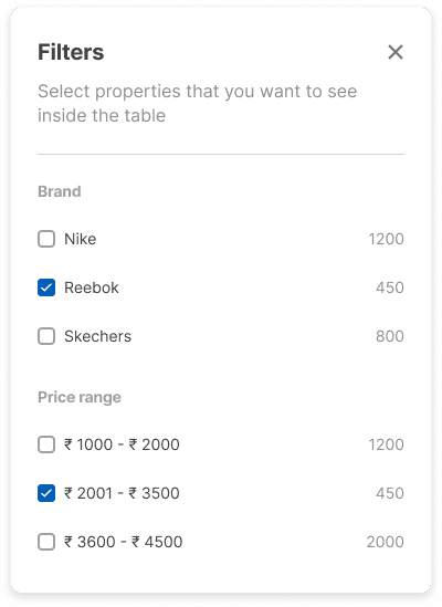
Purpose: Popovers encompass a broader spectrum of objectives. While akin to tooltips in furnishing contextual insights, they also possess the capability to showcase more intricate content, such as exhaustive explanations, choices, or interactive components.
Content: Popovers can accommodate diverse content types, ranging from text, images, buttons, and links to forms and beyond. Their capacity to offer richer and more interactive content surpasses that of tooltips.
Appearance: Typically more sizable and visually conspicuous compared to tooltips, popovers often manifest as compact boxes hosting an expanded content range. They might incorporate buttons or links to foster user engagement.
Interaction: Popovers are commonly activated by user interactions like hovering or clicking an element. Generally, user action is necessary to dismiss them, which could involve clicking outside the popover or pressing the Esc key.
Content Delivery: Popovers excel in delivering both contextual elucidations and more intricate content. They find utility in presenting options, facilitating user selections, and even executing actions within the confines of the popover itself.
Scenarios where you can use Popover: To show extra details with different elements, Configurable settings & Confirmation Messages.
Tooltip
Purpose: Tooltips are chiefly crafted to furnish succinct, contextually relevant explanations or labels for UI elements. Their prime objective is to offer supplementary insights into an element's purpose, function, or significance.
Content: Generally composed of concise text, tooltips predominantly house brief descriptions, hints, or labels, which materialize when users hover over or focus on an element.
Appearance: Tooltips typically adopt a simple, compact box design that emerges near or above the associated UI element. Often characterized by minimalistic aesthetics, they seamlessly blend into the interface and feature a subtle triangular indicator pointing to the relevant element.
Interaction: Tooltips are triggered through user actions like hovering the cursor over an element or employing keyboard navigation to focus on it. Their appearance is instantaneous, and they retreat from view when the user shifts the cursor away.
Content Delivery: Tailored to swiftly impart crucial information without disrupting the user's workflow, tooltips are designed for non-intrusive context enrichment. They are generally non-interactive and oriented solely towards delivering supplementary insights.
"Popover" and "tooltip" are both user interface components used to display additional information or context to users, but they differ in terms of their purpose, appearance, and behavior. Tooltips are designed for concise contextual explanations, while popovers can handle a wider range of content and interactions, making them more versatile for displaying both simple and more complex information. The choice between using a popover or a tooltip depends on the type of content you need to display and the level of interactivity you want to offer to the user.
A question might arise regarding the triggering mechanism (hover or click) of a popover, as well as whether popovers are accompanied by an overlay or background. Here is the answer:
The prevalent method of triggering a popover involves hovering over a UI element. Upon the user's cursor being placed over the element, a brief delay is often introduced before the popover materializes, furnishing supplementary information or choices pertinent to the said element. This approach is commonly adopted as it swiftly offers contextual insights without necessitating a click or supplementary keyboard interaction.
However, the choice of trigger depends on the specific use case, user experience goals, and the type of content the popover displays.
Hover (Mouseover): Hover-triggered popovers are effective for providing on-the-spot context without disrupting the user's workflow. They work well for elements where users might want to quickly check additional information before deciding to click or interact further. For example, tooltips and simple explanations are commonly triggered by hover (Ideal for Tooltips).
Click: Click-triggered popovers are useful when you want to display more detailed information, options, or actions related to a UI element. This trigger is suitable for scenarios where you expect users to actively engage with the popover's content (Ideal for Popovers).
Conclusion
As we conclude this journey through the labyrinth of UI components, we emerge armed with newfound insights into the realm of subtle distinctions. These seemingly minor variances wield the power to sculpt user experiences, emphasizing the importance of every design choice we make. Armed with this knowledge, designers and developers alike are equipped to harness the potential of components like Popovers, Tooltips, Modals, and Alerts.
Subscribe to Our Newsletter
Subscribe to RSS
Press & Media Hub RSS FeedRelated Articles.
More from the engineering frontline.
Dive deep into our research and insights on design, development, and the impact of various trends to businesses.

Jul 17, 2026
From Compliance to Predictive Resilience: Building AI-Powered Supply Chain Risk Management Systems

Jul 10, 2026
Self-Healing AI Agents: The Future of Enterprise Automation Needs Governance, Observability, and Product Engineering
Jul 10, 2026