
AI can produce a polished React or Next.js interface in minutes. The harder problem is making it feel like your product rather than another variation of the same template.
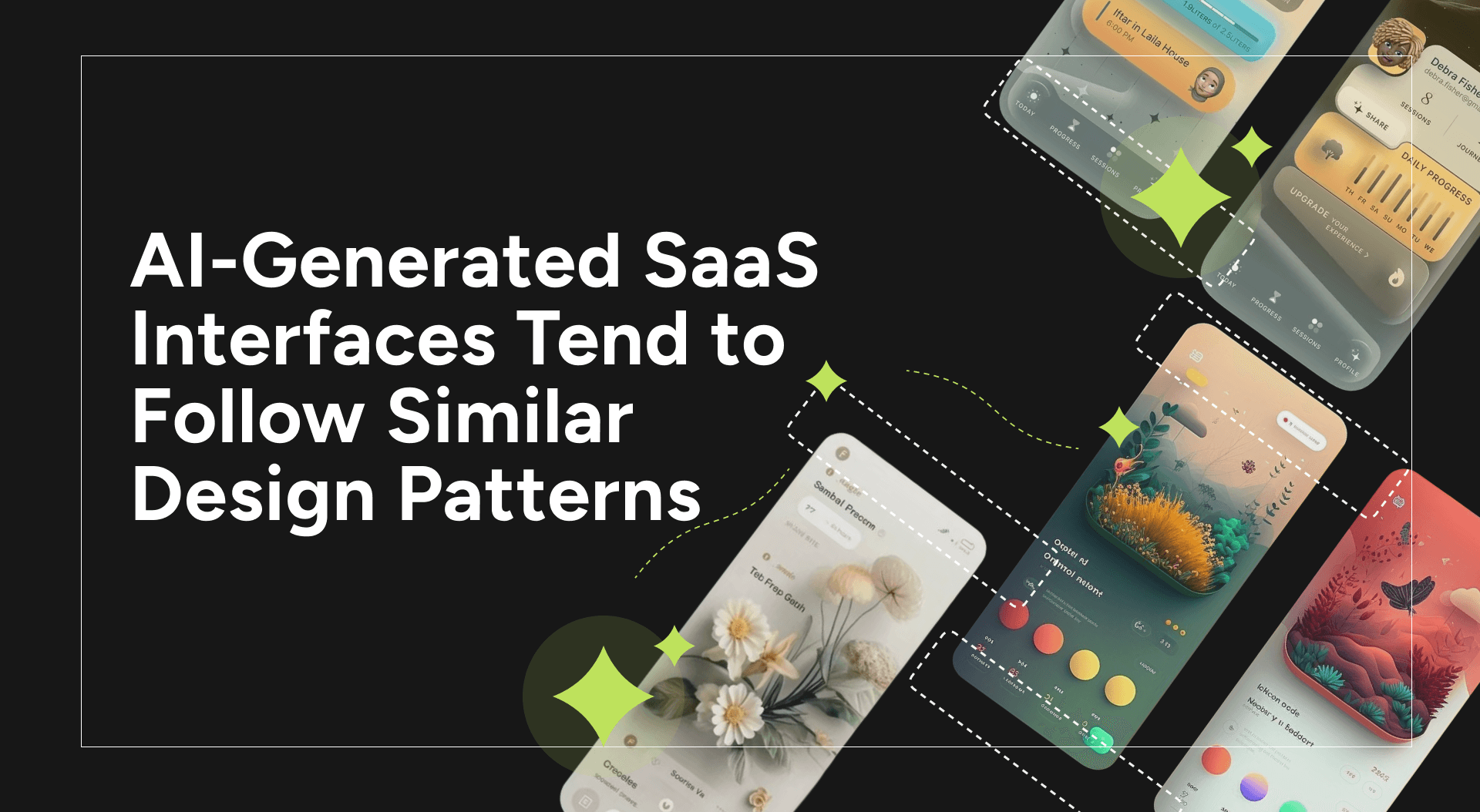
AI-Generated SaaS Interfaces Tend to Follow Similar Design Patterns
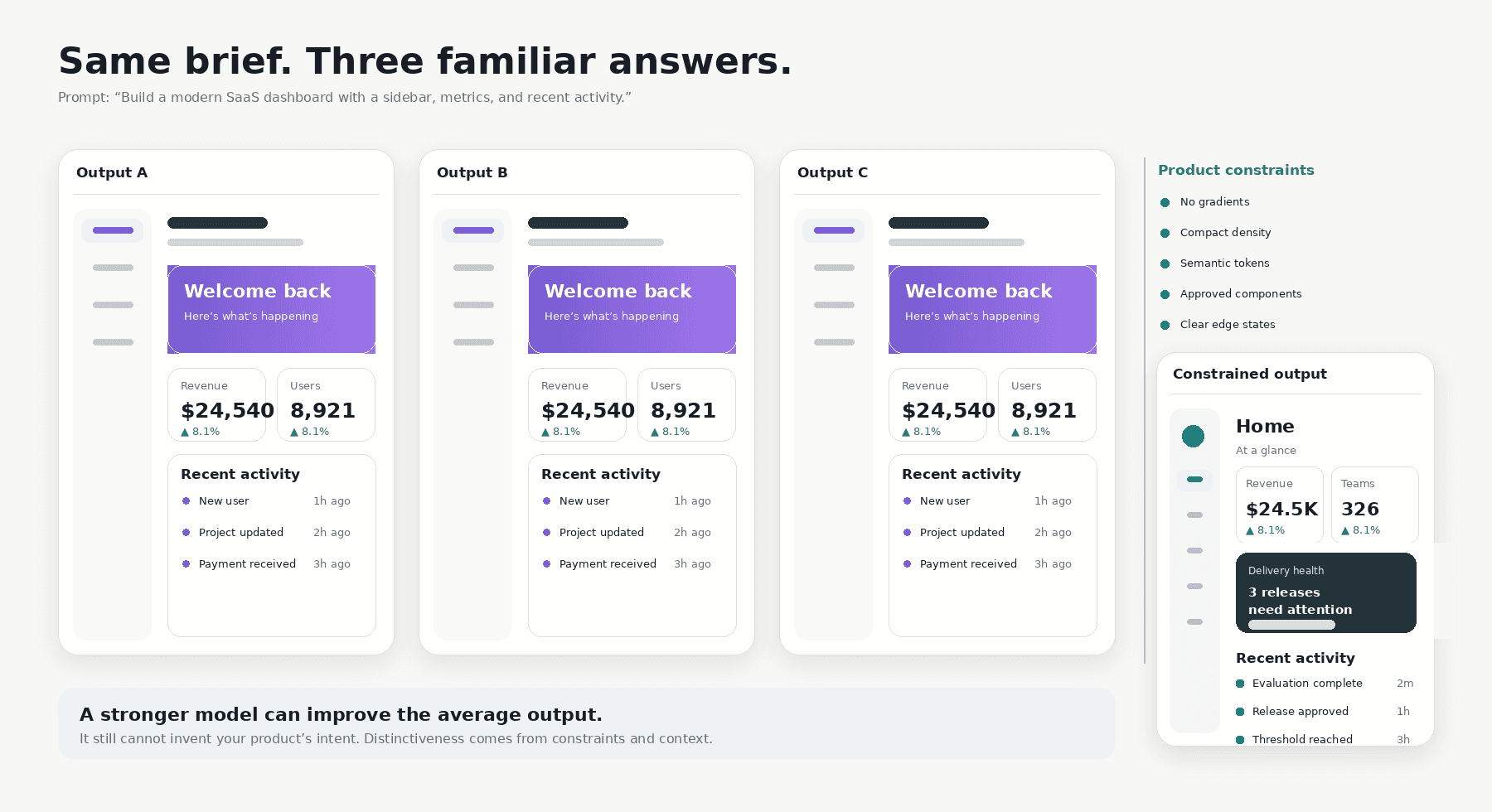
Illustrative recreation, not a benchmark of specific tools. The exact output changes; the repeated visual grammar is the point.
Ask an AI coding tool to create a SaaS dashboard, onboarding flow, or landing page and the first result will probably look fine.
It may also feel strangely familiar.
The oversized sans-serif headline. The purple gradient. The rounded cards. The bento grid. The soft shadow. The same icon family and neutral product copy.
None of these choices is inherently poor. Together, they have become a recognisable default. A product can look modern and finished while still resembling dozens of products launched in the same month.
That is acceptable for a disposable prototype. It becomes expensive when the interface must win buyer trust, communicate a differentiated position, and expand without requiring a proportional increase in design review.
The “AI look” is a product-engineering problem
AI can infer the pattern, not the intent
Generative tools produce plausible answers quickly. When context is missing, they choose patterns that are common, well documented, and safe to assemble.
In frontend development, that often means React, Next.js, Tailwind CSS, accessible primitives, and public component libraries. Vercel’s v0, for example, uses shadcn/ui as its default component system and supports custom registries so teams can provide their own components and tokens.
That foundation is useful. It is one reason a model can generate working interfaces so quickly.
But a model can infer how a dashboard is assembled. It cannot infer why your operations team prefers compact density, why destructive actions are never primary, why your brand avoids gradients, how your product communicates uncertainty, or which interaction patterns your customers already understand.
Those decisions often live in Figma files, review comments, Slack threads, and the memories of the people who made them. When documenting its own product-design skill, Vercel described the issue directly: code shows what shipped, but the reasoning behind the standard lives elsewhere. For an agent, context absent from the repository effectively does not exist.
A more capable model will not remove this problem. It may produce a sharper median, but not a more distinctive one. Capability does not create product intent. Constraints and context do.
The shared library is not the problem. Starting from a blank page is.
Standardized UI Patterns Reduce Product Differentiation
Why sameness costs the business
The first impression becomes weaker
Users form visual judgements before they understand your architecture or feature set. Lindgaard, Fernandes, Dudek, and Brown found in 2006 that people could form stable judgements of a webpage’s visual appeal after only 50 milliseconds; Tuch and colleagues later showed that visual complexity and prototypicality shape those first impressions. Stanford’s Web Credibility Project, led by B. J. Fogg, reached a complementary conclusion: people evaluate credibility through visual design, and a site should look professional and appropriate to its purpose.
By the time a visitor begins evaluating features, the interface has already framed the company as deliberate and credible—or raised doubts about whether the product fits the problem.
Differentiation becomes harder to see
A company may have a meaningfully different architecture, workflow, or business model. Generic visual language makes that difference harder to perceive.
This matters in crowded B2B categories. Before a prospect reaches the technical explanation, the interface has already communicated a position. A product can feel focused and mature—or like one more interchangeable option in the category.
Distinctiveness is part of how positioning becomes visible.
The team pays a redesign tax later
The speed of the first generated screen can hide the cost of the tenth.
When engineers prompt independently, the codebase accumulates slightly different cards, buttons, spacing values, form patterns, loading states, and responsive behaviours. The variation returns as longer reviews, duplicated components, accessibility fixes, visual bugs, and eventually a redesign.
The first screen took ten minutes. The cleanup arrives months later.
Why a better prompt is not enough
A detailed prompt can improve one result. It cannot reliably run a product system.
“Make it premium, minimal, and distinctive” still leaves the model with enormous freedom. Premium often becomes a dark background. Modern becomes a gradient. Minimal becomes a large headline surrounded by empty space.
Prompts also drift. One engineer remembers the spacing rule but forgets the loading state. Another bypasses the existing component because the prompt never mentioned it.
AI-assisted engineering is already moving toward explicit context. GitHub’s Spec Kit starts with a structured specification that becomes the source of truth for generation and validation. OpenAI’s Codex supports repository-level AGENTS.md files so teams can persist project norms and review rules close to the code.
The lesson for product UI is straightforward: turn decisions into reusable inputs instead of repeating them in every prompt.
Make your product language executable
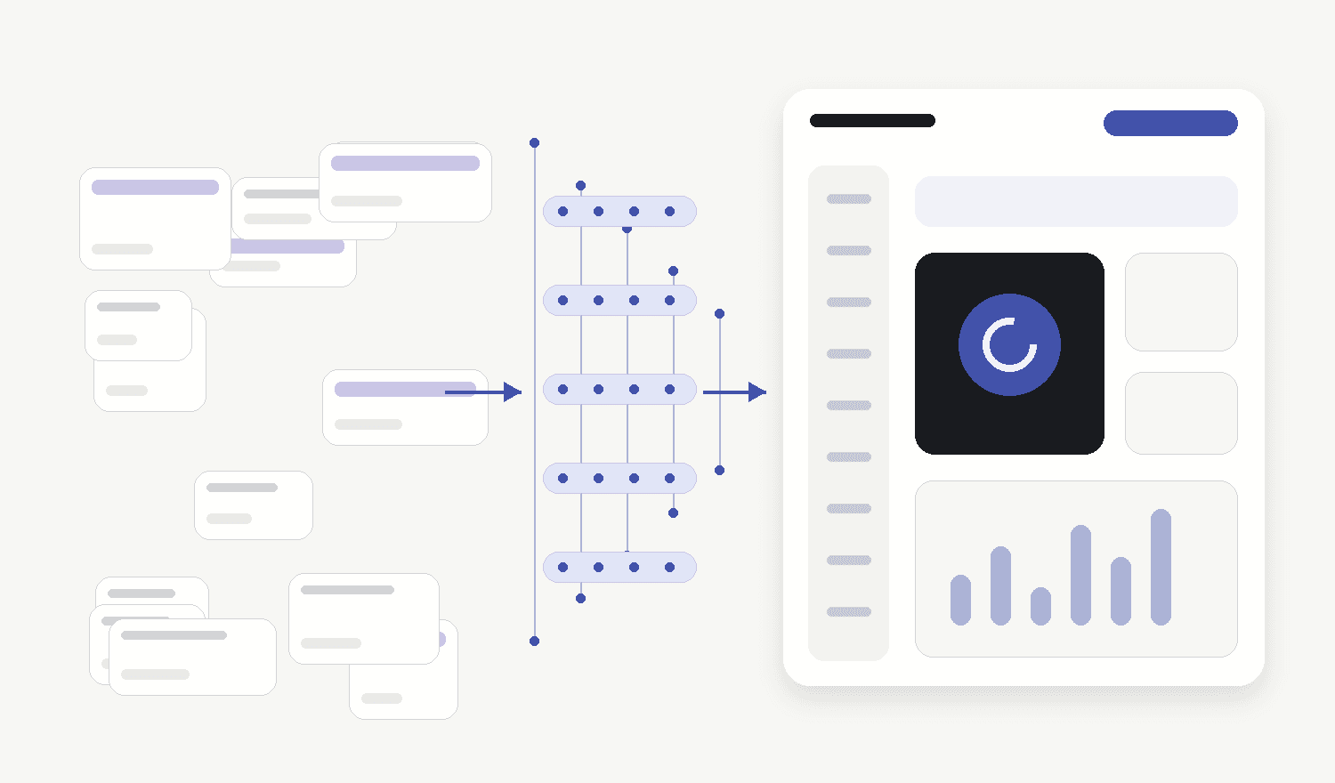
A mature design system is more than a Figma library or a page of brand colours. In an AI-assisted team, it becomes an executable description of how the product should look, behave, communicate, and handle real conditions.
The useful minimum has five layers:
- Foundations
Define colour, typography, spacing, radii, elevation, motion, breakpoints, content widths, and density once.
In React or Next.js, these should exist as code through CSS variables, theme objects, and semantic tokens. The word semantic matters: an agent should choose surface-danger or text-muted, not invent #EF4444 or text-gray-500.
- Components
Create a dependable set of production components for recurring patterns: buttons, inputs, cards, tables, dialogs, navigation, alerts, empty states, and loading states.
Give the agent a preferred path. When a documented Button already covers hierarchy, focus, loading, and accessibility, there is little reason to recreate it from raw utilities.
- Product rules
Tokens and components do not capture product judgement on their own.
Document when to use a page, drawer, or modal; how dangerous actions are confirmed; how errors explain recovery; how AI confidence is communicated; and which patterns the product deliberately avoids.
These rules often contain more differentiation than the colour palette.
- Examples and anti-examples
Provide approved screens, production components, and shipped pull requests that demonstrate the standard.
Show failures too: the wrong card density, an unnecessary gradient, an incorrect empty state, or a flow that failed usability review.
Concrete references outperform a page of aesthetic adjectives.
- Enforcement
Context guides the model. Automated checks stop predictable drift.
Lint arbitrary colours and spacing. Run accessibility checks. Add visual regression tests for critical components. Require generated UI to be rendered and inspected. Keep human review for genuinely new product decisions.
The GOV.UK Design System offers a non-commercial example of the same operating principle. Its reusable components sit alongside explicit usage guidance, accessibility criteria, user research, and a review process for proposed additions. The system scales by preserving the decisions around the code, not merely the code itself.
Embedding Product Design Rules Into an AI-Ready Repository
Why sameness costs the business
The first impression becomes weaker
Users form visual judgements before they understand your architecture or feature set. Lindgaard, Fernandes, Dudek, and Brown found in 2006 that people could form stable judgements of a webpage’s visual appeal after only 50 milliseconds; Tuch and colleagues later showed that visual complexity and prototypicality shape those first impressions. Stanford’s Web Credibility Project, led by B. J. Fogg, reached a complementary conclusion: people evaluate credibility through visual design, and a site should look professional and appropriate to its purpose.
By the time a visitor begins evaluating features, the interface has already framed the company as deliberate and credible—or raised doubts about whether the product fits the problem.
Differentiation becomes harder to see
A company may have a meaningfully different architecture, workflow, or business model. Generic visual language makes that difference harder to perceive.
This matters in crowded B2B categories. Before a prospect reaches the technical explanation, the interface has already communicated a position. A product can feel focused and mature—or like one more interchangeable option in the category.
Distinctiveness is part of how positioning becomes visible.
The team pays a redesign tax later
The speed of the first generated screen can hide the cost of the tenth.
When engineers prompt independently, the codebase accumulates slightly different cards, buttons, spacing values, form patterns, loading states, and responsive behaviours. The variation returns as longer reviews, duplicated components, accessibility fixes, visual bugs, and eventually a redesign.
The first screen took ten minutes. The cleanup arrives months later.
Why a better prompt is not enough
A detailed prompt can improve one result. It cannot reliably run a product system.
“Make it premium, minimal, and distinctive” still leaves the model with enormous freedom. Premium often becomes a dark background. Modern becomes a gradient. Minimal becomes a large headline surrounded by empty space.
Prompts also drift. One engineer remembers the spacing rule but forgets the loading state. Another bypasses the existing component because the prompt never mentioned it.
AI-assisted engineering is already moving toward explicit context. GitHub’s Spec Kit starts with a structured specification that becomes the source of truth for generation and validation. OpenAI’s Codex supports repository-level AGENTS.md files so teams can persist project norms and review rules close to the code.
The lesson for product UI is straightforward: turn decisions into reusable inputs instead of repeating them in every prompt.
Make your product language executable
A mature design system is more than a Figma library or a page of brand colours. In an AI-assisted team, it becomes an executable description of how the product should look, behave, communicate, and handle real conditions.
The useful minimum has five layers:
1. Foundations
Define colour, typography, spacing, radii, elevation, motion, breakpoints, content widths, and density once.
In React or Next.js, these should exist as code through CSS variables, theme objects, and semantic tokens. The word semantic matters: an agent should choose surface-danger or text-muted, not invent #EF4444 or text-gray-500.
2. Components
Create a dependable set of production components for recurring patterns: buttons, inputs, cards, tables, dialogs, navigation, alerts, empty states, and loading states.
Give the agent a preferred path. When a documented Button already covers hierarchy, focus, loading, and accessibility, there is little reason to recreate it from raw utilities.
3. Product rules
Tokens and components do not capture product judgement on their own.
Document when to use a page, drawer, or modal; how dangerous actions are confirmed; how errors explain recovery; how AI confidence is communicated; and which patterns the product deliberately avoids.
These rules often contain more differentiation than the colour palette.
4. Examples and anti-examples
Provide approved screens, production components, and shipped pull requests that demonstrate the standard.
Show failures too: the wrong card density, an unnecessary gradient, an incorrect empty state, or a flow that failed usability review.
Concrete references outperform a page of aesthetic adjectives.
5. Enforcement
Context guides the model. Automated checks stop predictable drift.
Lint arbitrary colours and spacing. Run accessibility checks. Add visual regression tests for critical components. Require generated UI to be rendered and inspected. Keep human review for genuinely new product decisions.
The GOV.UK Design System offers a non-commercial example of the same operating principle. Its reusable components sit alongside explicit usage guidance, accessibility criteria, user research, and a review process for proposed additions. The system scales by preserving the decisions around the code, not merely the code itself.
Embedding Product Design Rules Into an AI-Ready Repository
What this looks like in a React or Next.js repository
A practical starting point can live inside the existing codebase:
apps/web/
  components/
    ui/
    product/
  styles/tokens.css
  .agents/skills/product-design/
    SKILL.md
    references/
    examples/
  AGENTS.md
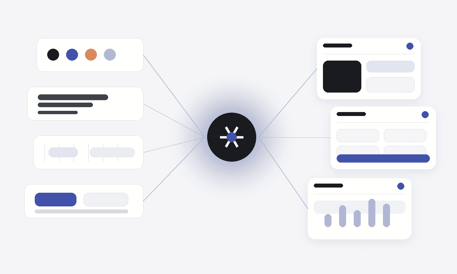
The folders are secondary. The operating model matters:
- Canonical tokens and components live in code
- Agents are instructed to use them
- Product rules capture reasoning that code cannot reveal
- Approved references demonstrate quality
- Automated checks catch deterministic violations
- Humans decide new standards and exceptions
Figma’s Code Connect can map design-system components to their production implementations, reducing the chance that generated work substitutes an approximation for the component the team already maintains. Tooling amplifies a clear system; it cannot repair an undocumented one.
The design system becomes AI infrastructure
For leaders, the value is larger than visual consistency.
The system compresses repeated decisions, shortens review cycles, centralizes accessibility and responsive behaviour, and lets the team expand product surface area without matching that growth in manual oversight. It also preserves differentiation while output accelerates.
McKinsey’s Business Value of Design study found that top-quartile companies on its Design Index achieved 32 percentage points higher revenue growth and 56 percentage points higher total shareholder-return growth than industry benchmarks over five years. The study examined design capability broadly rather than design systems alone, but the leadership implication applies here: design creates more value when it is embedded in the operating model instead of reserved for late-stage polish.
As code generation becomes cheaper, the scarce asset is the accumulated judgement that tells the system which interface is right.
What your team can do this week
Do not begin with a six-month design-system programme. Pick one important journey and make its decisions reusable.
1. Audit one shipped flow
Choose onboarding, checkout, project creation, or another high-value journey. Find duplicated components, arbitrary values, and inconsistent states.
2. Define the core vocabulary
Establish semantic tokens for colour, type, spacing, radii, and elevation.
3. Standardize five to eight components
Include loading, disabled, error, empty, and responsive states.
4. Write one product-design context file
Cover layout, density, copy, prohibited patterns, accessibility, edge cases, and when the agent needs human judgement.
5. Add three approved references
Use reviewed production screens or shipped pull requests.
6. Add one automated guardrail
Lint arbitrary values, run accessibility checks, or add visual regression coverage.
7. Regenerate the same flow
Compare review time, duplication, consistency, and corrections required.
The aim is to encode judgement the team has already developed, so humans and agents stop solving the same problem repeatedly.
The products that stand out will use AI with better context
A blank prompt produces a fast approximation of what the market already looks like. A product design system produces a fast expression of what your company believes good should look like.
High-performing teams will treat design decisions as engineering inputs: documented, reusable, testable, and available to every agent that touches the product.
When anyone can generate a decent interface in minutes, distinctiveness becomes a system.
And systems scale.
Sources
- Lindgaard et al. (2006), “Attention web designers: You have 50 milliseconds to make a good first impression!”
- Tuch et al. (2012), “The role of visual complexity and prototypicality regarding first impression of websites”
- Stanford Guidelines for Web Credibility
- v0 Design Systems documentation
- Vercel, “Teaching agents product design at Vercel”
- GitHub Spec Kit
- OpenAI Codex: Custom instructions with AGENTS.md
- GOV.UK Design System components
- GOV.UK guidance for developing a component or pattern
- Figma Code Connect
- McKinsey, “The business value of design”