Nov 12, 2025
Design or Die: How UX Decides the Fate of Fintech Apps
Poor UX kills fintech apps faster than bugs. Learn how design, trust, and personalization decide which banking apps win—and which lose 95% of users in 30 days.
Author

Book a call
Table of Contents
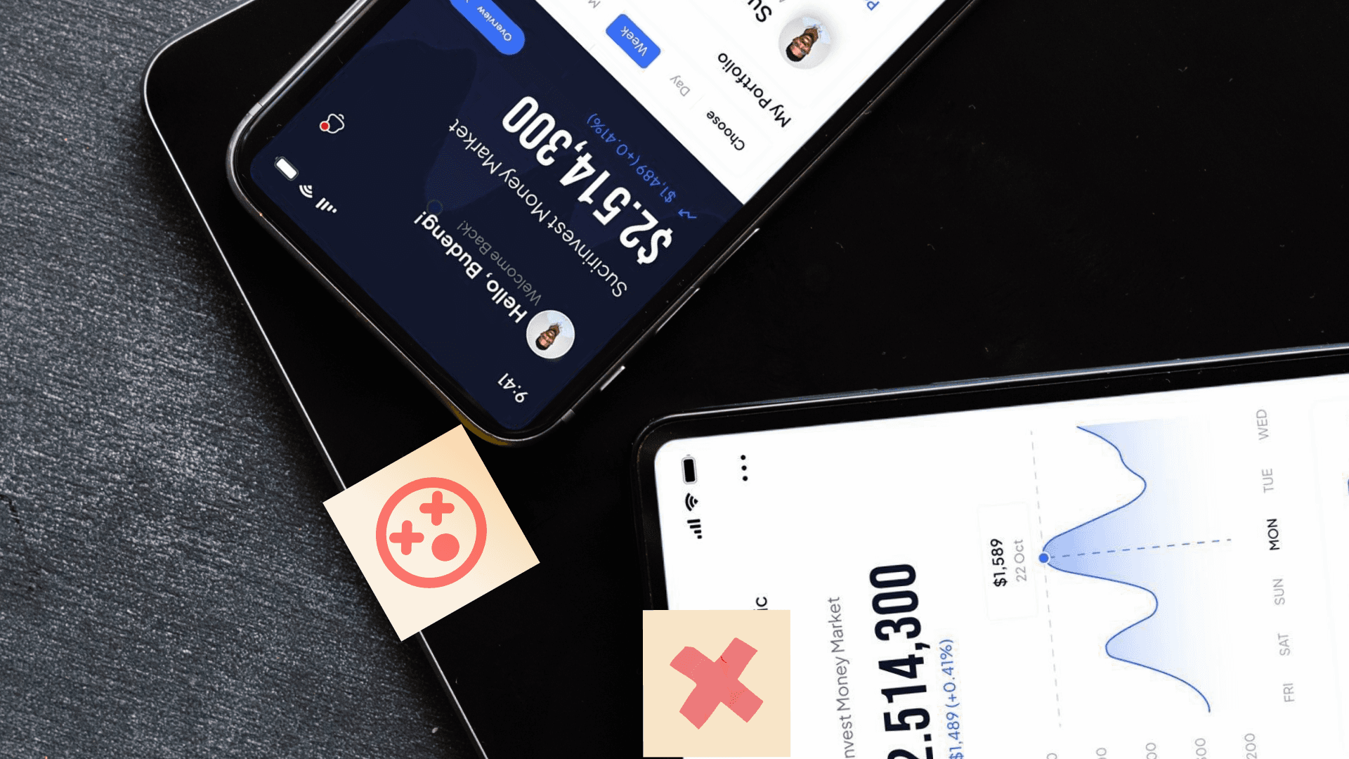
Your billion-dollar fintech app will fail if users can not figure out how to send money to their mom.
That's not hyperbole. Research shows 76% of consumers are willing to switch banks for better digital services. Not for interest rates. Not for rewards programs. For better UI/UX.

The €5.7 Billion Onboarding Problem
Europe wastes €5.7 billion annually on abandoned onboarding. Users start signing up, hit a confusing screen, and disappear forever.
The data tells a brutal story. In 2016, 40% of users abandoned digital bank onboarding. By 2022, that number jumped to 68%. User expectations evolved faster than most banks could redesign their apps.
Only 4.5% of finance apps retain users after 30 days for general banking services.
Think about that. You spend millions acquiring users. Design a complex product. Launch with fanfare. And 95.5% of users delete your app within a month.
Chase solved this problem through location-based personalization. They built customized experiences showing local imagery based on where you live. Users in Chicago see their skyline. Users in Miami see their beaches. This small touch makes the app feel personal instead of corporate.

Why N26 Killed Passwords (And You Should Too)
Passwords create friction. Users forget them. They reset them. They abandon apps rather than deal with them.
N26 built keyless authentication that converts biometric data into cryptographic keys without storing the actual biometric information. Your fingerprint never lives on their servers. Instead, it becomes a mathematical key that unlocks your account.
The system achieves industry-leading accuracy while being infinitely more convenient than traditional passwords.
Chase adds behavioral biometrics. The app tracks how you type, how you hold your phone, and how you swipe. If someone steals your password, the app notices they don't move like you do.

The AI That Saves Money While You Sleep
RBC's NOMI AI studies your spending patterns. When it spots extra cash, it moves money into savings automatically. Users don't plan this. They don't click buttons. They just wake up with more savings.
Bank of America's Erica serves nearly 20 million active users. The AI answers questions, tracks packages, and finds old transactions. It works because it anticipates needs instead of waiting for commands.
The pattern holds across successful apps: AI should work in the background, invisible until needed.
Revolut lets users customize their dashboard. You can add widgets for features you use and remove everything else. The app moulds itself to your habits instead of forcing you into predefined paths.
Why European and American Apps Look Different
GDPR changed how European fintech apps function. Privacy by default means maximum protection without user action. No pre-checked boxes. No hidden permissions.
European users expect sophisticated, muted color palettes. They want regulatory compliance badges visible on every screen. Trust comes from demonstrating you follow rules, not from claiming you're secure.
American users prefer colorful designs with clear calls-to-action. They respond to blue (trust) and green (prosperity). They want simplicity over sophistication.
Canadian apps must handle bilingual compliance. Every screen needs English and French. Every payment flow needs Interac integration. These aren't nice-to-have features. They're legal requirements that shape the entire design system.
The ROI That Makes Executives Pay Attention
Every dollar invested in UX returns $100.
That is not a typo. Forrester Research found UX improvements generate 9,900% ROI. Better design means higher conversion rates, better retention, and lower support costs.
The numbers break down like this:
- Finance apps achieve strong conversion rates on iOS compared to industry averages
- Personalized experiences significantly outperform generic ones
- Mobile apps loading in under two seconds see substantially higher conversion
- Good UX design improves conversions 25-50% across all funnel stages
Fintech apps that focus on mobile-first design, visual budgeting, and biometric login see measurable retention improvements within three months.

Voice Banking Is not Coming—It is Here
Voice banking represents a significant investment in customer service infrastructure globally. Users can check balances, transfer funds, and pay bills through natural language commands.
JPMorgan Chase integrated with Amazon Alexa. Users ask their speaker about account balances. They request payment confirmations. They check if the paychecks arrived.
This matters most for accessibility. Users with low digital literacy can bank through conversation. Elderly users avoid complex menus. Visually impaired users access full functionality through audio alone.
What Revolut Gets Right
Revolut built a super-app that combines banking, currency exchange, and stock trading. They've reached millions of retail customers globally by solving real problems.
Their currency exchange shows the real rate with transparent fees. No hidden markups. No confusing calculations. You see exactly what you'll get.
Their stock trading removes intimidation. New investors start with educational content explaining basic concepts. The interface guides users through their first trades without overwhelming them.
The Trust Factor You Can not Fake
Wise achieves high UX scores through radical transparency. Every fee appears upfront. Real-time rate displays show exactly what you'll receive. Users trust the app because it hides nothing.
Apps that explain their AI recommendations clearly tend to see higher user trust. When apps show why they made recommendations, users feel in control instead of manipulated.
Security badges and trust signals boost conversion when backed by real security measures. Users spot fake trust indicators immediately.

Where Fintech Design Goes Next
Embedded finance is creating a multi-trillion-dollar market. Financial services will integrate into platforms you already use.
Grab in Southeast Asia embeds microloans and insurance within ride-hailing. Users access financial services without switching apps.
MercadoLibre integrates payments directly into e-commerce. Users shop and bank in the same interface.
This trend matters because context beats features. Users prefer financial services delivered when needed, where needed.
AR and VR applications in finance are growing rapidly. Bank of America's AR features visualize spending decisions. HDFC Bank shows mutual fund performance in interactive environments.

The Bottom Line
Superior UI/UX determines which fintech companies survive the next five years.
Users will abandon your app if it frustrates them. They'll switch to competitors who make banking feel effortless. They will choose experiences over features every single time.
The companies winning this battle combine innovative design patterns with regional compliance expertise. They leverage AI without overwhelming users. They implement biometric security that feels invisible. They build accessible experiences that serve everyone.
Most importantly, they understand that good design isn't about looking pretty. It's about making complex financial tasks feel simple.
Your users do not care about your technology stack. They care whether they can send money to their mom at 2 AM without calling support.
Subscribe to Our Newsletter
Subscribe to RSS
Press & Media Hub RSS FeedRelated Articles.
More from the engineering frontline.
Dive deep into our research and insights on design, development, and the impact of various trends to businesses.

Jul 10, 2026
How We Built the Missing Bridge from Code to Figma

Jun 27, 2026
Building a Resilient Hybrid-Cloud Network with WireGuard HA, Route-Based Failover, and Deep Observability

Jun 25, 2026
Automating Loan Origination Workflows: From SAR Prep to Fraud Checks

Jun 19, 2026
We Built a 114-Second AWS-to-Azure Failover. Here’s What We Learned

Jun 12, 2026
Cloud-Native and Cloud-Agnostic Are Not Ideologies; They Are Business-Stage Decisions

Jun 12, 2026