Nov 8, 2023
How to Ace Minimalistic UI Designs for Apps You Want to Launch in the UK
Unlock the secrets of minimalistic UI design and revolutionise your app's user experience. Dive into our comprehensive guide now.
Author

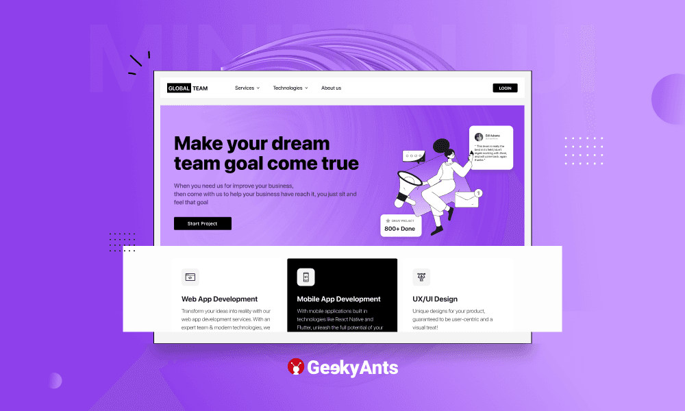
Book a call
Table of Contents
Mastering the art of minimalistic user interface (UI) design can be a game-changer for app developers looking to make a mark in the market. This design approach, characterised by its clean lines, simple aesthetics, and focus on functionality, provides users with an intuitive and clutter-free experience.
If you are looking to develop apps that will offer an enjoyable and efficient user experience, this a detailed guide on perfecting minimalistic UI designs.
What Does Minimal UI Design Mean in App Development?

Minimal UI design in app development means keeping things simple and clear. Think of this as when you look at a clean and organised room - it is easy to find what you need, and it feels comfortable.
In an app with minimal design, you will not see too many fancy decorations or lots of different colours. Instead, you will see a neat layout with just the important stuff your users need to use the app.
Buttons and menus will be easy to find and use, and everything will look clean and uncluttered.
Elements of Minimalistic UI Design in App Development to Keep in Mind
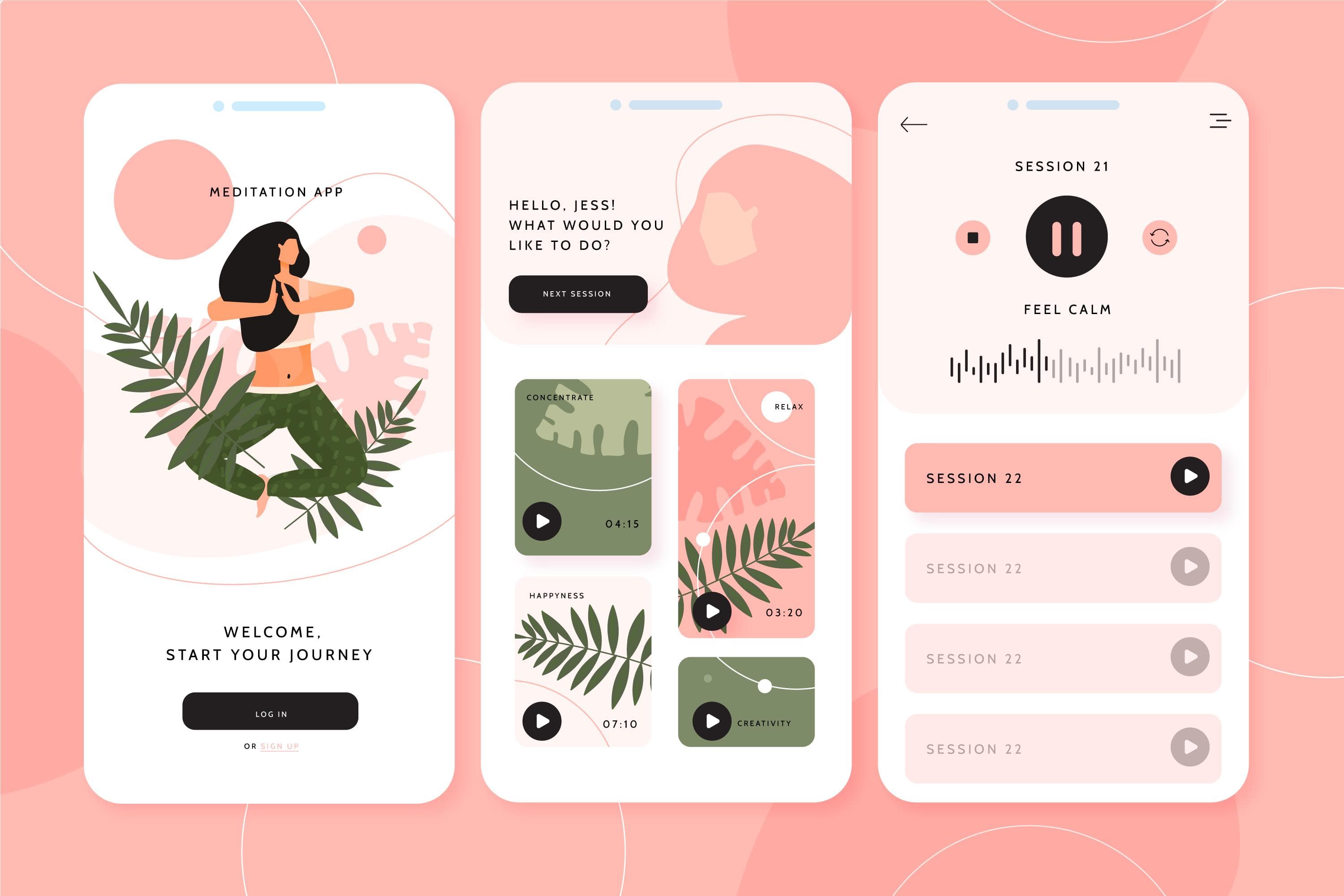
1. Make Functionality a Priority
A hallmark of minimalistic UI design is its unwavering focus on functionality and user-centred design. Identify the core features and functionalities that your app must offer and ensure they are easily accessible. Use intuitive navigation patterns and interactive elements that guide users seamlessly through the app's interface. Always prioritise user needs and convenience in every design decision.
2. Curate a Thoughtful Colour Palette
Selecting an appropriate colour palette is crucial in minimalistic design. Muted tones, soft pastels, and neutral hues are often well-received. Choose a limited set of colours that not only align with your brand identity but also evoke the desired emotional response from users. Maintain consistency in colour usage to create a cohesive and visually pleasing experience.
3. Balancing Style and Readability
Typography is pivotal in conveying information and establishing the app's visual identity. Opt for clean, legible fonts that complement your brand's personality. Consider using a combination of fonts for headings, body text, and buttons to establish visual hierarchy. Pay careful attention to font sizes and spacing to ensure optimal readability on various device screens.
4. Leverage White Space Strategically
White space, often called negative space, is a fundamental element in minimalistic UI design. It serves to reduce visual clutter and direct focus towards essential elements. Ensure that there is ample breathing room around buttons, text, and images, allowing the interface to feel balanced and harmonious. Strategic use of white space enhances overall user comprehension and engagement.
5. Intuitive Navigation to Guide Users Seamlessly
Efficient navigation is the backbone of any successful app. In a minimalistic UI, navigation should be intuitive and unobtrusive. Employ familiar navigation patterns like tab bars, hamburger menus, and clearly labeled buttons. Prioritise user flow, ensuring that users can effortlessly transition between different app sections.
6. Uphold Design Consistency Across Elements
Consistency in design elements and interactions is paramount in a minimalistic UI. Maintain a unified style for buttons, icons, and other UI components throughout the app. This consistency fosters a sense of familiarity and predictability for users, ultimately enhancing usability and user satisfaction.
7. Test, Iterate, and Incorporate User Feedback
After developing a working UI design, conduct rigorous usability testing with real users. Gather feedback on the user experience, identifying any pain points or areas for improvement. This feedback is invaluable in refining the UI to ensure it aligns with the evolving needs and preferences of your audience. Iterate on the design based on user insights to achieve an optimal user interface.
Characteristics of Minimal App Design
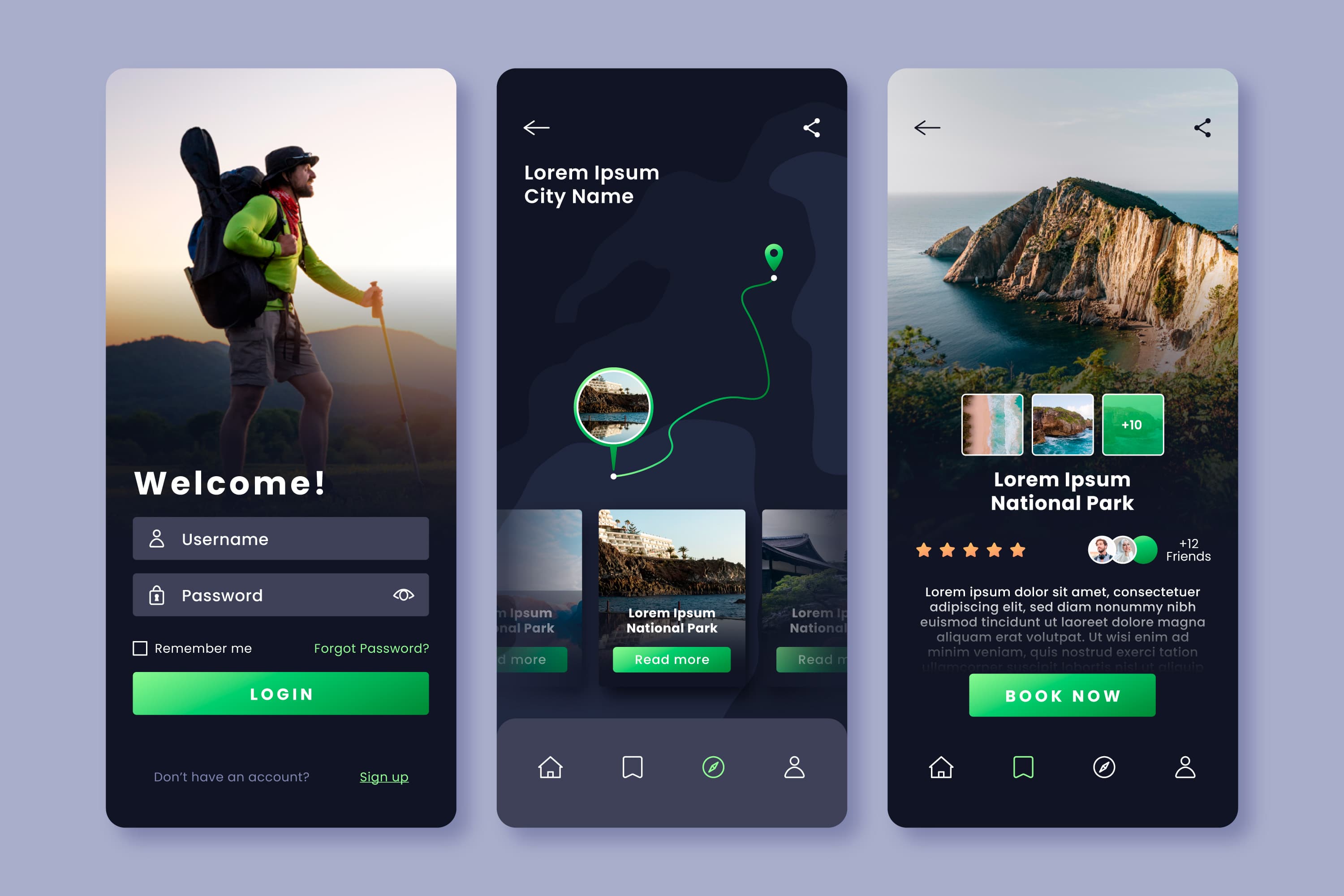
Minimal app design is characterised by several key features that set it apart from more complex or ornate design styles. Here are the key characteristics of minimal app design:
1. Simplicity
At its core, minimal app design is all about simplicity. It embraces a "less is more" philosophy, focusing on the essential elements and functionality without unnecessary embellishments or distractions.
2. Clean Lines and Shapes
Minimalist designs often feature clean lines, geometric shapes, and straightforward layouts. This creates a visually uncluttered and organised appearance.
3. Limited Colour Palette
A minimal app design typically employs a limited colour palette with muted tones, neutral hues, and subtle contrasts. This restrained use of colour contributes to a clean and harmonious visual experience.
4. High-Quality Imagery
When images are used, they are of high quality and relevance. They are often employed sparingly to complement the overall design without overwhelming the user.
5. Mobile-Friendly
Given the prevalence of mobile devices, minimal app designs are typically optimised for smaller screens. They prioritise responsive layouts and ensure that content remains accessible and legible on various devices.
6. Timeless Aesthetics
Minimalist designs often have a timeless quality. They can age well and are less likely to become dated than designs heavily relying on trends or complex visual elements.
Benefits of Minimal Design in Apps
Minimalistic UI designs go beyond just looking fancy and provide the following advantages:
1. Enhanced User Experience
A clutter-free, minimalistic UI reduces cognitive load for users. It allows them to focus on the core functionality of the app without distractions. This leads to a smoother and more enjoyable user experience.
2. Faster Load Times
Simple UIs typically require fewer resources to render, resulting in faster loading times. This is crucial for retaining user engagement, especially in today's fast-paced digital environment, where attention spans are limited.
3. Improved Readability and Comprehension
Minimalistic designs often feature clean typography, well-spaced elements, and legible fonts. This makes content easier to read and understand, enhancing user interaction with the app.
4. Increased Accessibility
A minimalist approach to UI design can lead to better accessibility. Clear visual hierarchies, larger font sizes, and simplified navigation contribute to a more inclusive experience for users with varying abilities.
5. Consistency and Branding
A minimalistic UI can help maintain a consistent brand identity. It allows for a unified design language that extends across different screens and platforms, reinforcing brand recognition.
6. Reduced User Frustration
Cluttered interfaces can confuse and frustrate users. A clean, minimalistic UI reduces the likelihood of users getting lost or overwhelmed, leading to a more positive overall experience.
7. Mobile-Friendly Design
With the increasing use of mobile devices, minimalistic UIs are particularly effective. They ensure that content and functionality are easily accessible and legible on smaller screens.
8. Faster Learning Curve
Intuitive design patterns in a minimalistic UI reduce the learning curve for new users. They can quickly grasp how to navigate and interact with the app, leading to faster onboarding.
9. Adaptability to Trends and Updates
Minimalistic designs tend to age well and are more adaptable to evolving design trends. They can be easily updated without overhauling the entire UI, providing longevity to the app's visual appeal.
10. Focus on Core Functionality
By removing unnecessary elements and features, a minimalistic UI puts the spotlight on the core functionalities of the app. This ensures that users can easily access and utilise the app's primary purpose.
Elevate Your App’s UI Designs with gluestack-ui
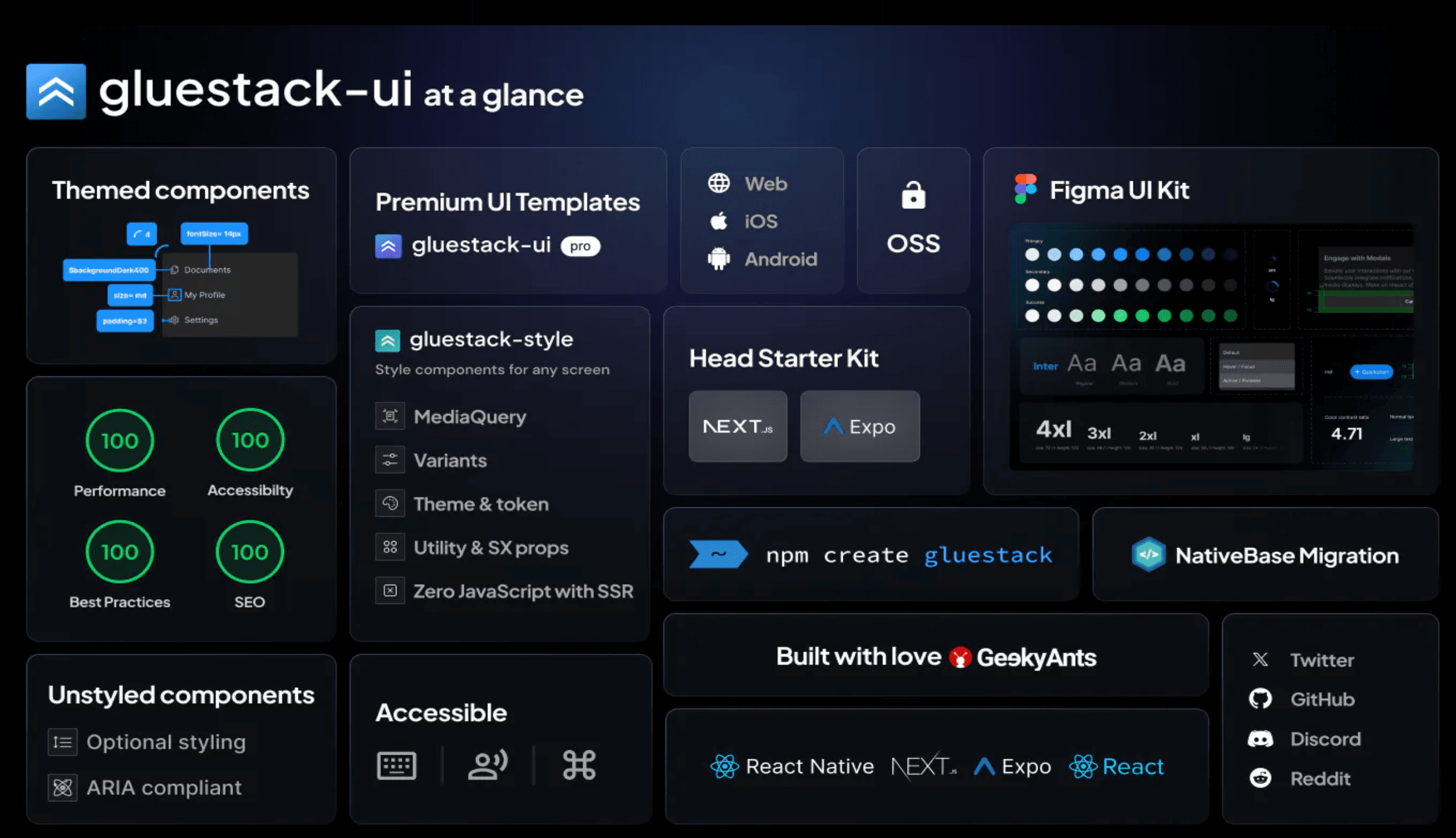
Looking to take your UI development to the next level? Meet gluestack-ui, the ultimate customisable component library for React, Next.js, and React Native enthusiasts. This dynamic library offers themed and unstyled components, seamlessly integrating into projects developed with React, React Native, Next.js, and Expo.
Why Choose gluestack-ui?
Originating from the renowned NativeBase library, gluestack-ui emerged as a standalone library with significantly improved performance. It prioritises speed and is optimised even for complex applications with numerous elements. A shift from prop-based APIs to compound APIs provides a more cohesive, robust, and consistent interface for designers and developers.
A Parting Note on Unleashing UI Brilliance
In essence, a minimalistic UI design caters to the needs and preferences of users in an increasingly fast-paced and visually overloaded digital landscape.
At GeekyAnts app design and development studio, we specialise in crafting user-centric, visually stunning interfaces that not only captivate users but also enhance functionality. With our experience and a keen eye for design trends, we can transform your app concept into a polished, market-ready masterpiece. So, whether you are a budding entrepreneur or an established brand, partnering with us could be the secret sauce to catapulting your app's success.
With these insights and adding gluestack-ui to your toolkit, you are poised for UI greatness. Happy designing!
Related Articles.
More from the engineering frontline.
Dive deep into our research and insights on design, development, and the impact of various trends to businesses.

Apr 27, 2026
The Gap Between an AI-Generated Prototype and a Shippable Product
A working AI prototype isn’t a production-ready system. Learn the critical gaps in scalability, security, and architecture before scaling.

Apr 24, 2026
RAG vs Fine-Tuning vs AI Agents: Which Architecture Fits Your Use Case
RAG, Fine-Tuning, or AI Agents? Use a proven decision framework to choose the right architecture for accuracy, cost control, and real outcomes.

Apr 24, 2026
How to Build a HIPAA-Ready AI Healthcare Product Without Slowing Delivery
AI healthcare products miss compliance reviews because of deferred decisions and poor architecture. This blog walks engineering leaders, product managers, and founders through practical patterns that keep delivery fast and compliance built in from the start.

Apr 23, 2026
Your AI Works in the Demo. It Will Not Survive Production Without Preparation
Why AI prototypes fail before reaching production, and the six readiness factors that determine whether they scale successfully.

Apr 23, 2026
Why Healthcare AI Initiatives Fail Before They Reach Clinical Impact
This blog covers the key reasons healthcare AI initiatives fail before reaching clinical impact, from poor data infrastructure and stalled pilots to the physician buy-in gap.

Apr 20, 2026
AI MVP Development Challenges: How to Overcome the Roadblocks to Production
80% of AI MVPs fail to reach production. Learn the real challenges and actionable strategies to scale your AI system for enterprise success.
