
“A user interface is like a joke. If you have to explain it, It’s not that good”
UI designers are artists. They rely on their cognitive skills and talent to convey motions and messages through a palette, but it is also an art that has a science to it. I guess that makes UI designers scientists too.
The common notion behind UI designing is ‘making things look pretty’, but it is so much more than that. A well made UI is like a box of chocolates. Aesthetic on the surface, clean like the packaging, diverse like the chocolates within and pleasing to the eye. It is about the presentation, yes but it is more about the user. How the user interacts with the app and how the app pleases the user is very important and if you’re a newbie, you don’t have to feel overwhelmed by it. There are guidelines set in the UI world to guide your vision towards the right path.
You should always try to aim towards creating as a simple UI as possible which will help the users get to their desired goal as quickly as possible.
If you are struggling with understanding the basic principles of design, this article is for you.
To deliver impressive UIs, remember—users are humans, with needs such as comfort and a limit on their mental capacities. The following guidelines are based upon these ideas:
Unaligned elements
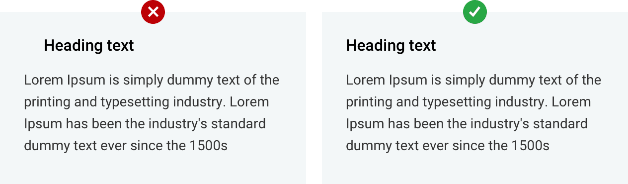
Always align your elements. Unaligned elements look rough and unpolished. They create a sense of discomfort that you need to avoid. A small example would be:
Avoid small ‘Tap’ areas:
Your elements should be big enough for the user to tap easily. After all, it’s all about the usability and if the user can’t tap it, it’s useless.
Apple recommends ‘Tap’ areas to be at least 44px, as below.

Drop-down menu options
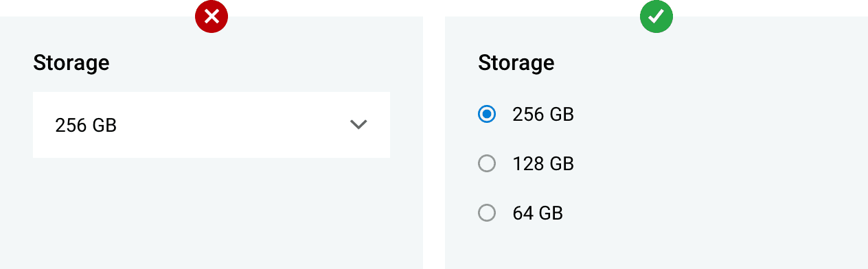
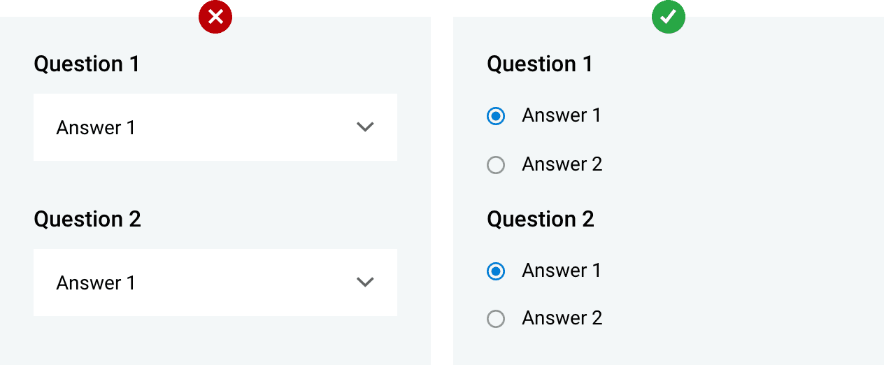
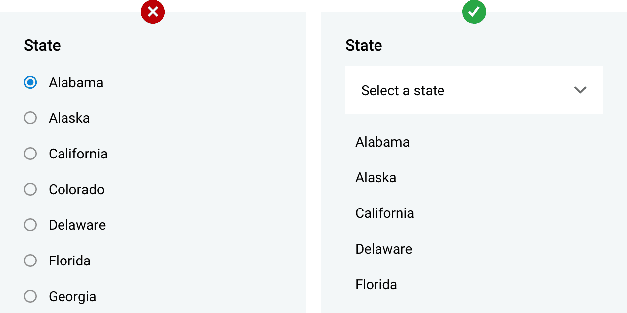
There’s always a better way to manage your drop-down menus. Ideally, when your drop-down menu is closed, the user won’t be able to see the other choices. This is not a good choice of design when it comes to data with short responses. This comes in handy when a quick response is a priority.
In the example below, instead of letting the user add an extra interaction with the app, the options can be displayed to keep the number of taps to a minimum and still get the desired response.
This begs the question,’When do you use the dropdown menu?’ The answer is simple. Use dropdowns in the following scenarios:
Too many options.
Use drop-downs for menus which have more than 7 items on the list. For the rest, use the above choice.
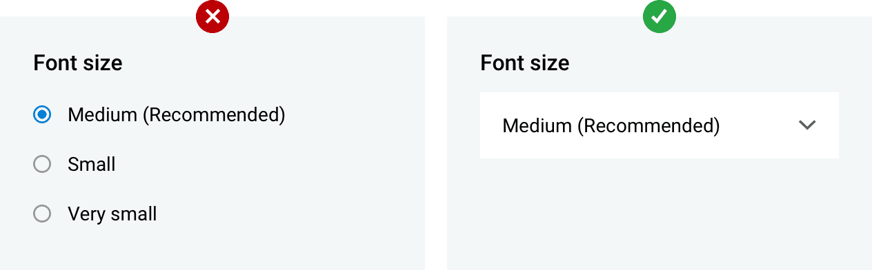
Recommended options
Dropdowns help your user decide to view only the recommended options.
Input Box
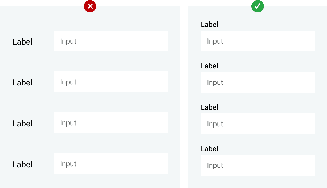
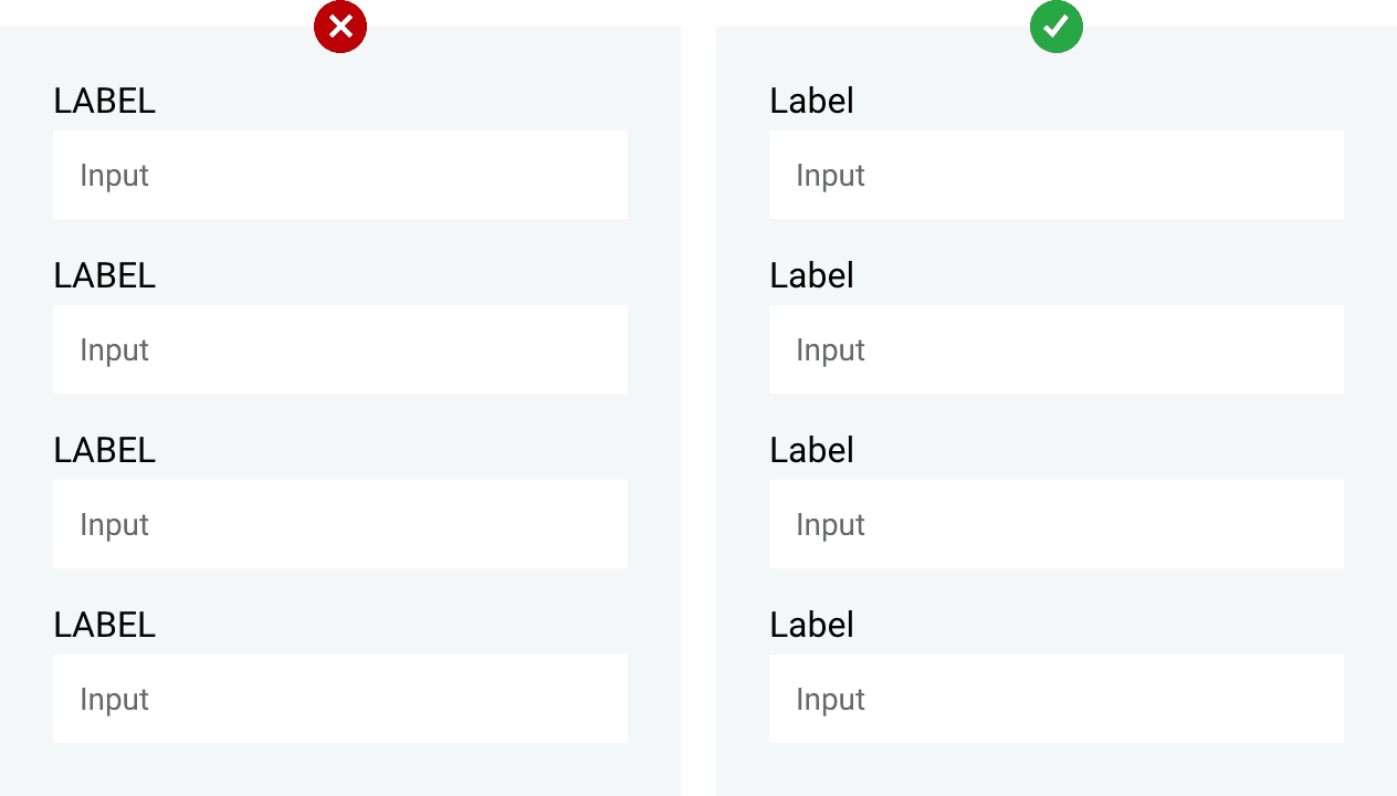
Labels on top -
Instead of using left labels for large data input boxes, labels on top are easier to scan together for users.
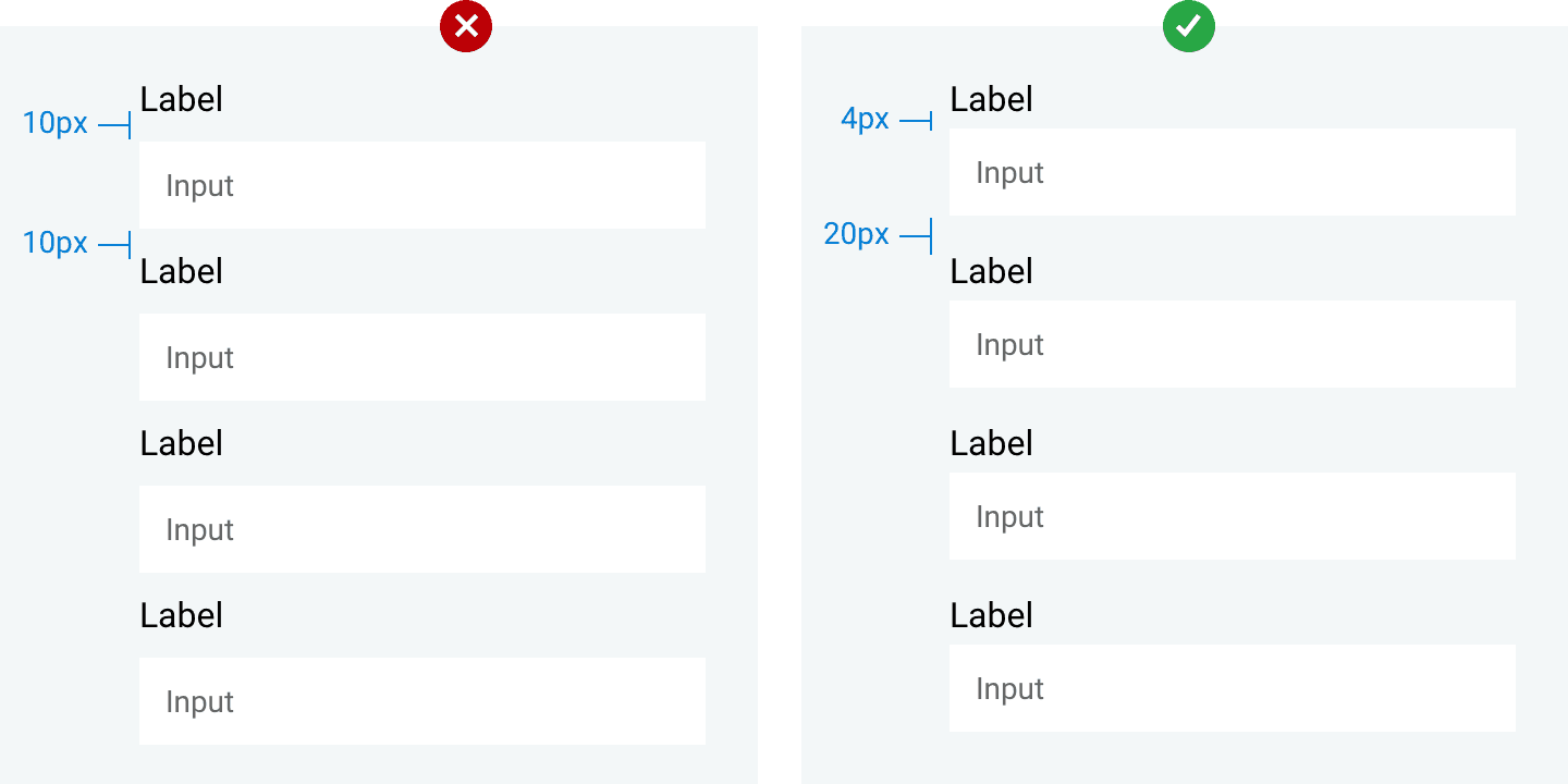
For spacing, make sure there is enough height between the fields. The height between the heading and the input box should be lesser than in between the fields in order to convey a connection between the two, like in the example below:
Avoid using all caps. You should rarely use uppercase when writing labels as it might be hard to read and scan due to the lack of height difference. Plus, it just becomes too ‘out there’.
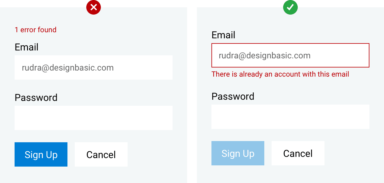
Errors messages should be shown to users when an error occurs and should also provide the reason behind the occurrence in red letters.
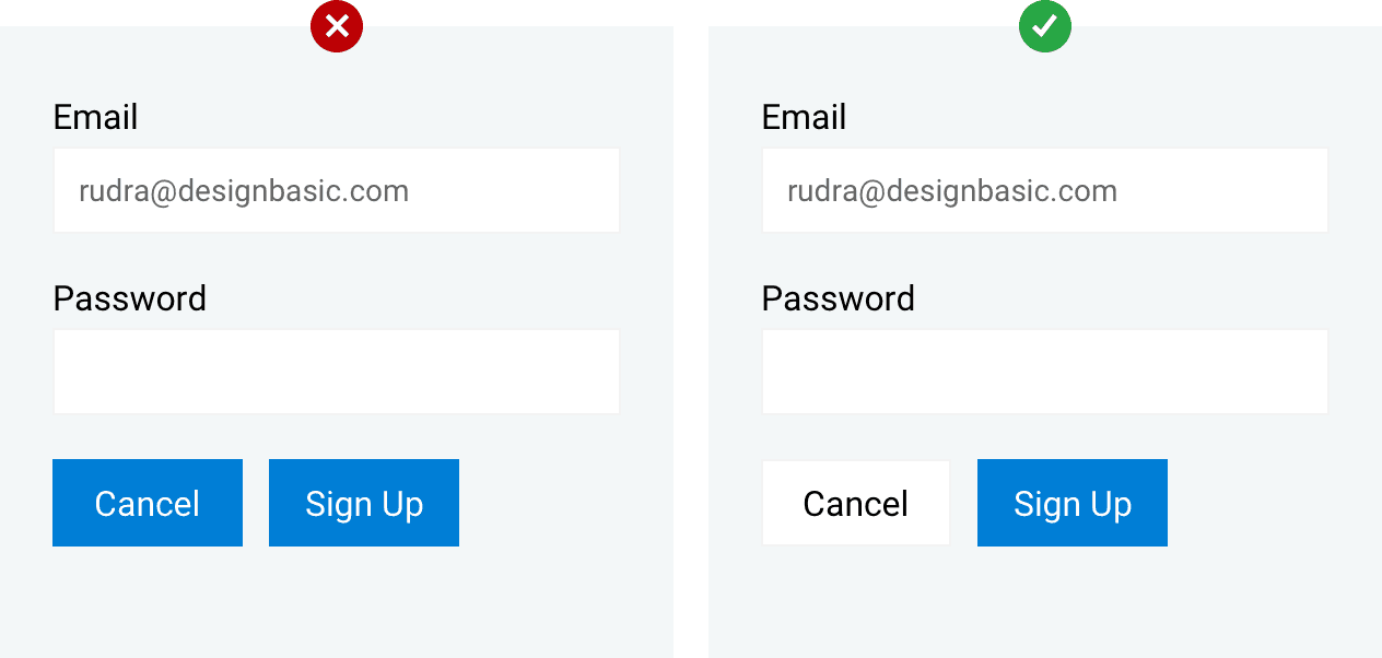
Primary and Secondary Call-To-Action (CTA)
The button with the strongest visual weight will get the most attention. Secondary actions should have the weakest visual weight (should be noticeable but not as prominent).
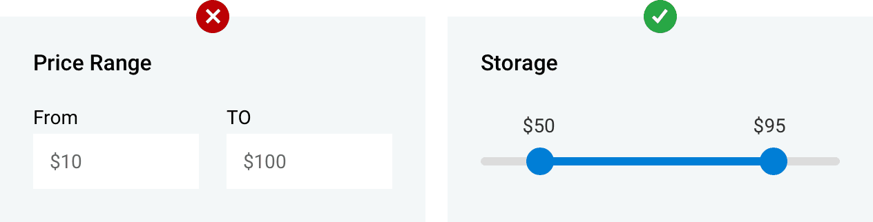
Avoid writing when possible. Users respond to visual cues better and it opens up new ways for UI designers to depict certain messages. A finger swipe or a mouse movement is way faster and less stressful.
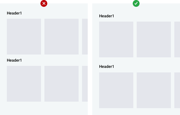
Respect the whitespace. Give your design some space to breathe! It is one of the most important things in any design and THE MOST common mistake designers make when approaching a design..
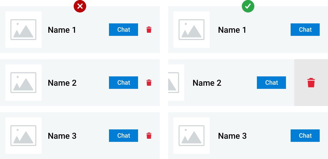
Use hidden unimportant CTA.
In UI designs for mobile apps, gestures are a great tool but highly underused. Certain gestures can be programmed to activate hidden controls and free up space on your screen.
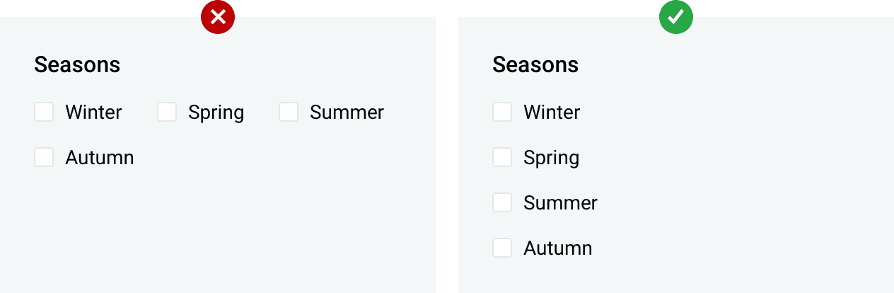
Checkboxes - Set checkboxes and radio buttons on top of each other in a list fashion for easy viewing rather than placing them side-by-side..
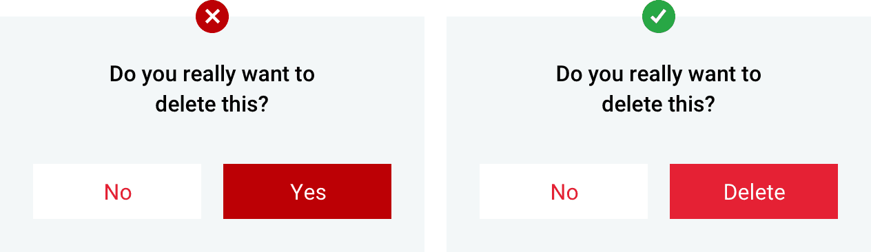
Buttons should always be located in places where users can expect to see them.
The order of the buttons should reflect the nature of the conversation between the user and the system.
With this information, you should now have a basic understanding of how your design should look and what users expect from a well made UI.
I hope you enjoyed the article. Thank you for reading and keep being inspired.