
pepperfry
Discover how Pepperfry, a leading furniture and décor store, achieved an 80% improvement in design consistency with a new design system from GeekyAnts. Learn more in our case study!


About the Client
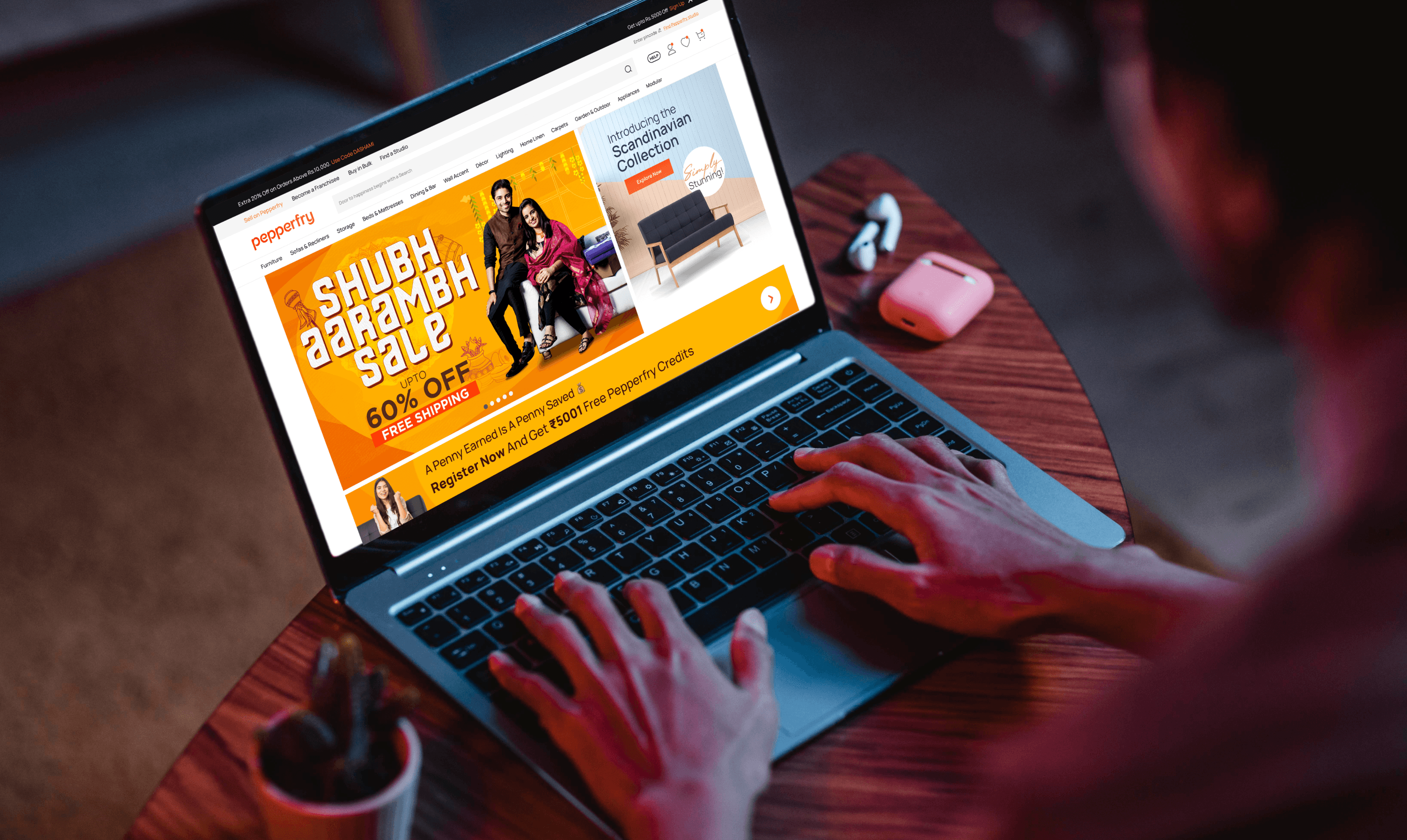
Pepperfry is a leading furniture and décor store focusing on home décor elements. They offer a curated selection of furniture, lighting, décor accents, and kitchen appliances, all designed to elevate your living space.
Their primary goal towards customer acquisition and engagement is to allow the customer to place their order anytime, anywhere, and via any device or channel.
Their primary goal towards customer acquisition and engagement is to allow the customer to place their order anytime, anywhere, and via any device or channel.
About the project
Overview
Pepperfry achieved 80% improvement in design consistency with the new design system. This strong foundation will serve as an essential driver of efficiency gains over the years.
100%
Responsiveness across 5 screens80%
Consistent Growth300+
Reduction in Design Hours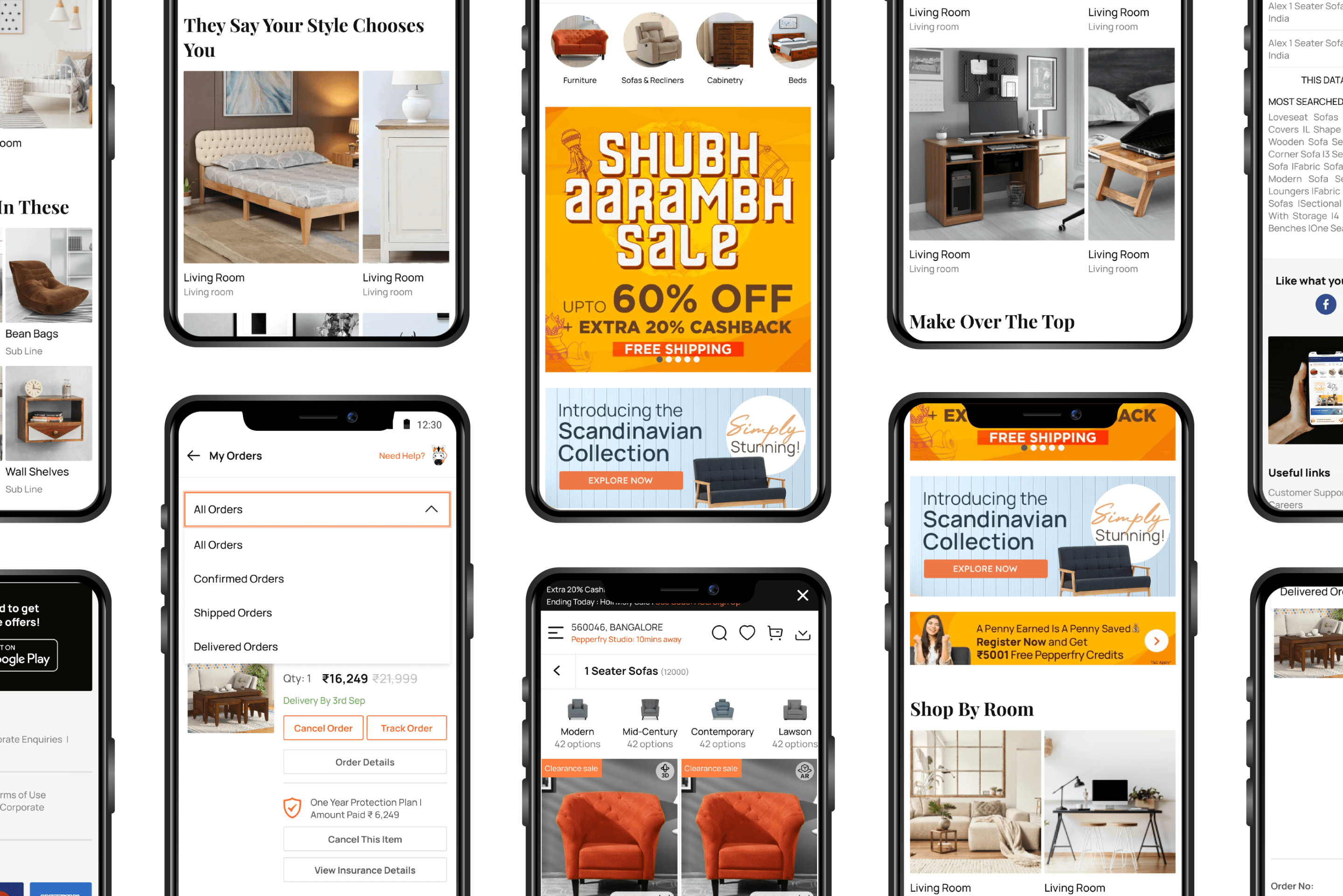
BUSINESS REQUIREMENT
Pepperfry wanted to enhance the user experience and cut-down development time for future projects, all while ensuring that the existing screens remain intact.
OUR SOLUTION
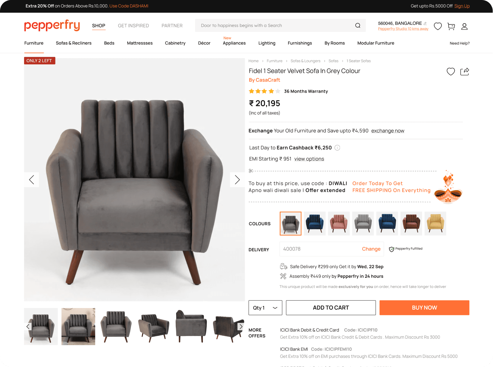
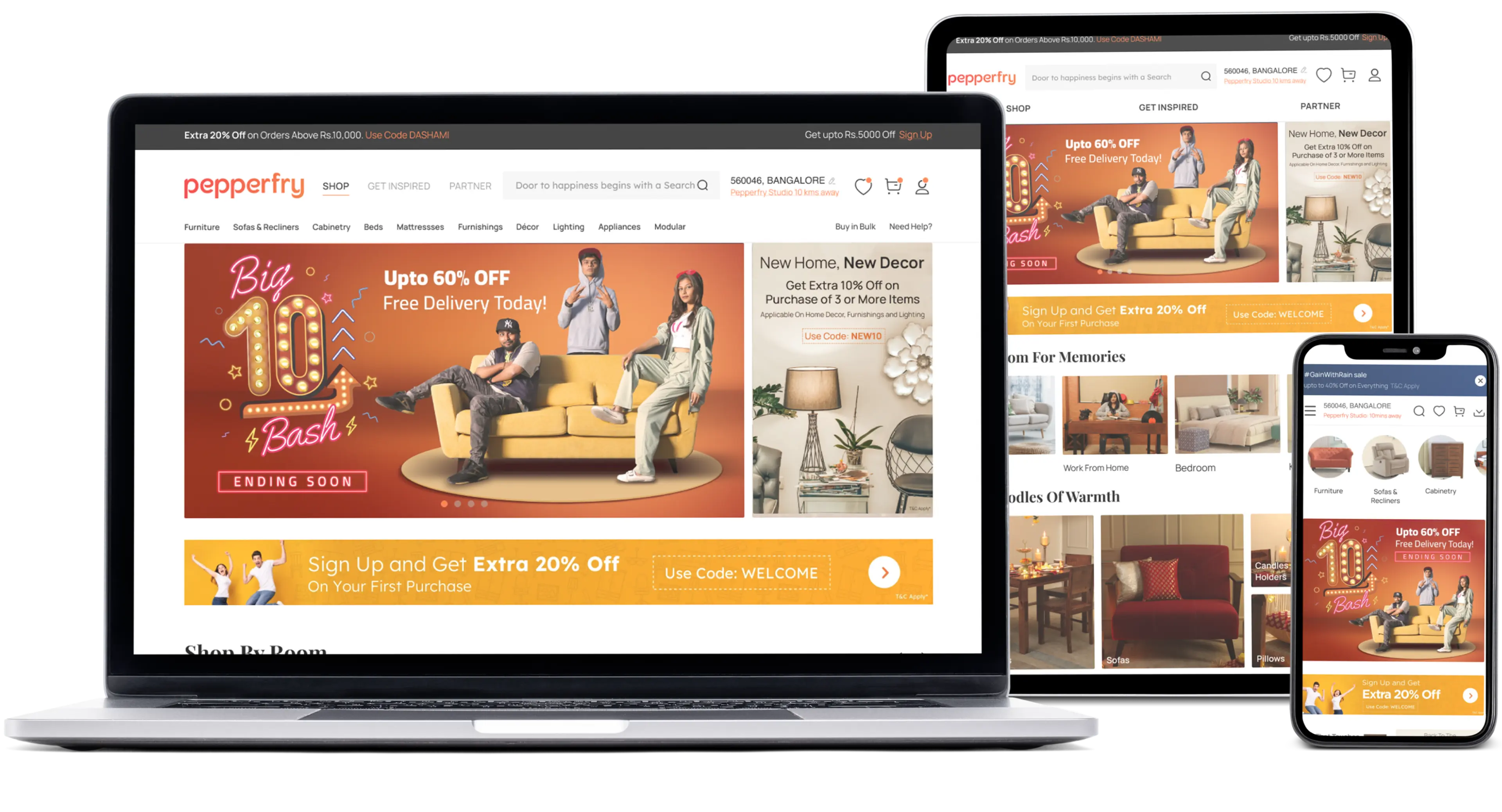
We focused on crafting a robust design system that delivers a seamless and visually consistent user experience across all devices. To achieve this, we employed reverse engineering to streamline the process of creating responsive screens. This eliminates the need for multiple website versions, guaranteeing optimal performance and a cohesive look and feel on any device.
CHALLENGES IN EXECUTION & SOLUTIONS
We had to build the design system keeping in mind existing components within a tight 3-month deadline. Unexpected additional breakpoints were addressed through flexible design practices, ensuring comprehensive responsiveness.
A strict 3-month window for design system creation clashed with the usual research and iteration cycles.
A strict 3-month window for design system creation clashed with the usual research and iteration cycles.
The initial plan for 3 screen sizes needed to adapt to 2 additional breakpoints, demanding design flexibility.
Reused existing design system components for efficiency and to avoid breaking compatibility.
OUR SOLUTION
We focused on crafting a robust design system that delivers a seamless and visually consistent user experience across all devices. To achieve this, we employed reverse engineering to streamline the process of creating responsive screens. This eliminates the need for multiple website versions, guaranteeing optimal performance and a cohesive look and feel on any device.
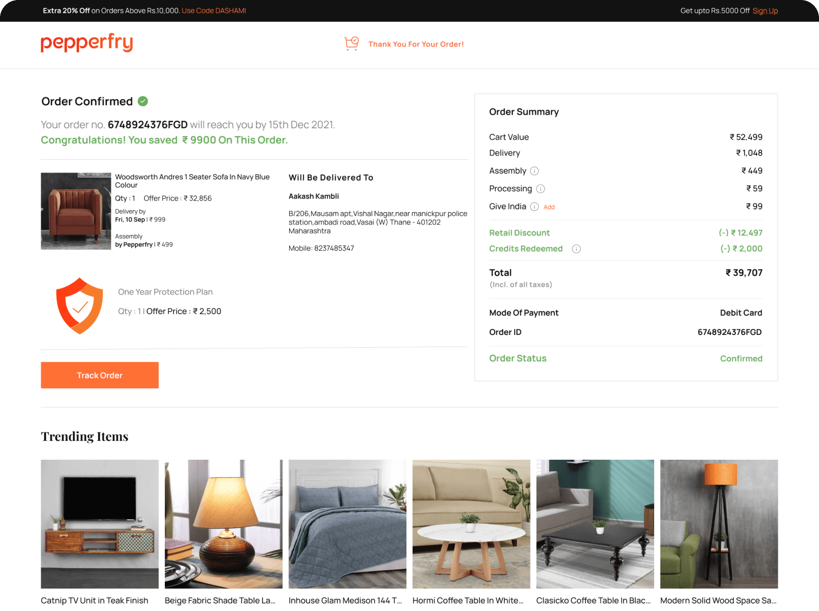
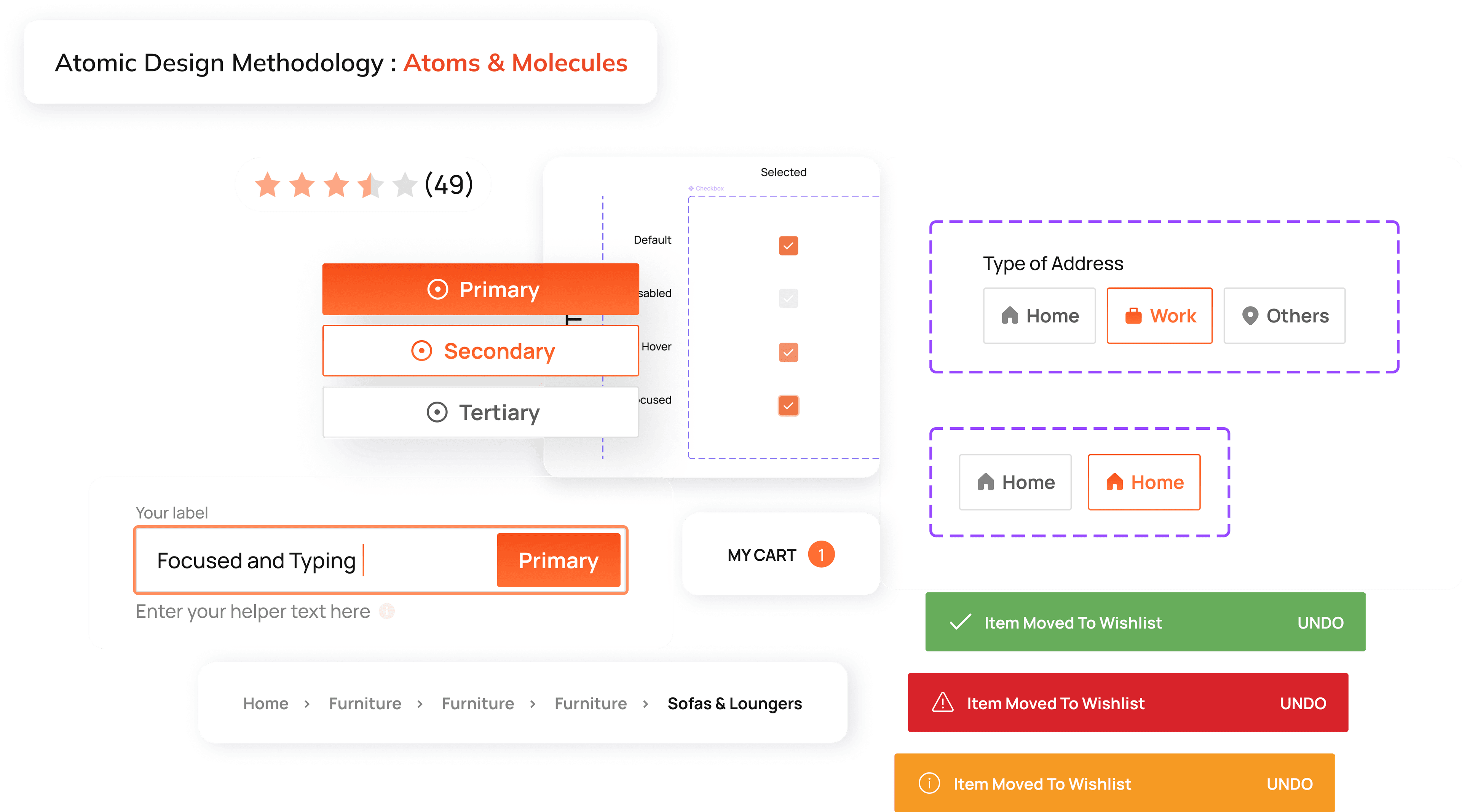
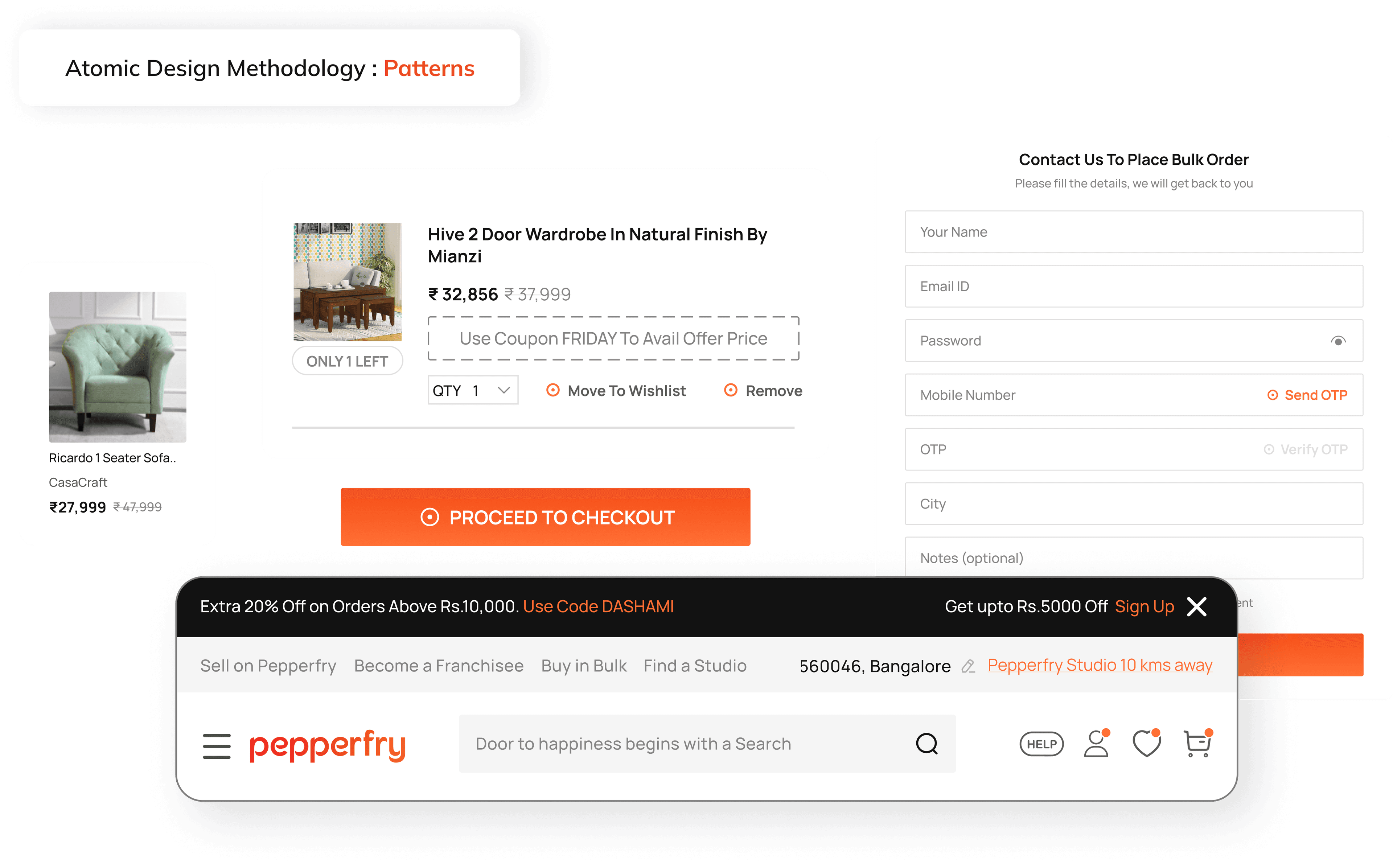
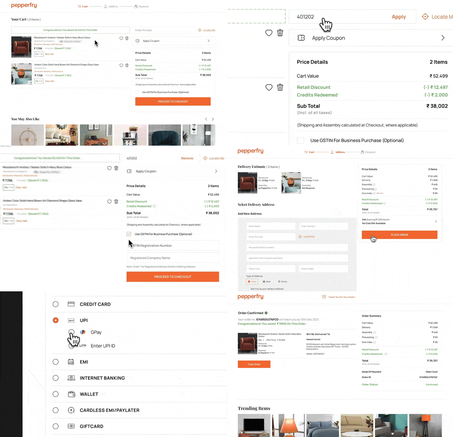
OUR APPROACH
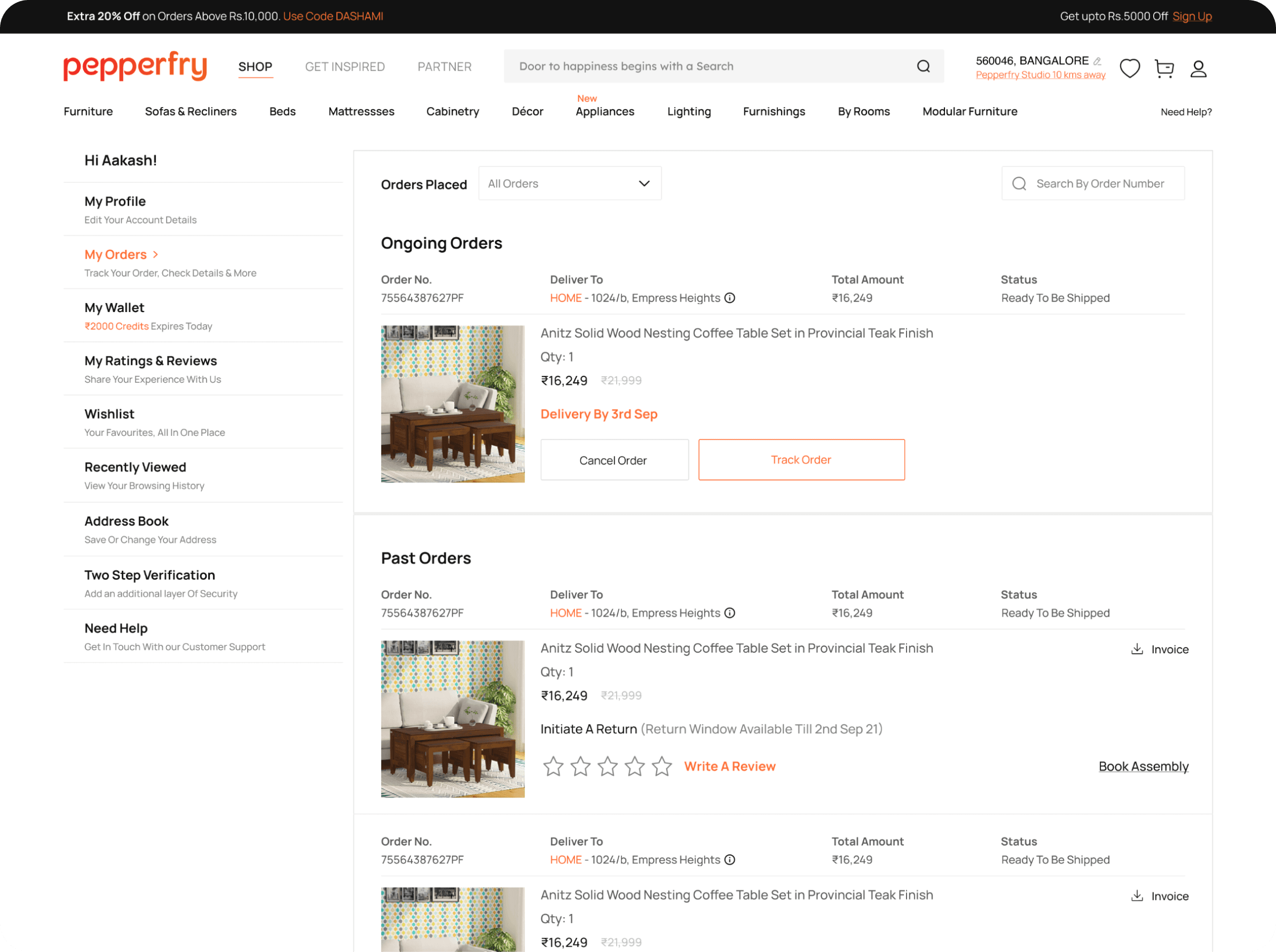
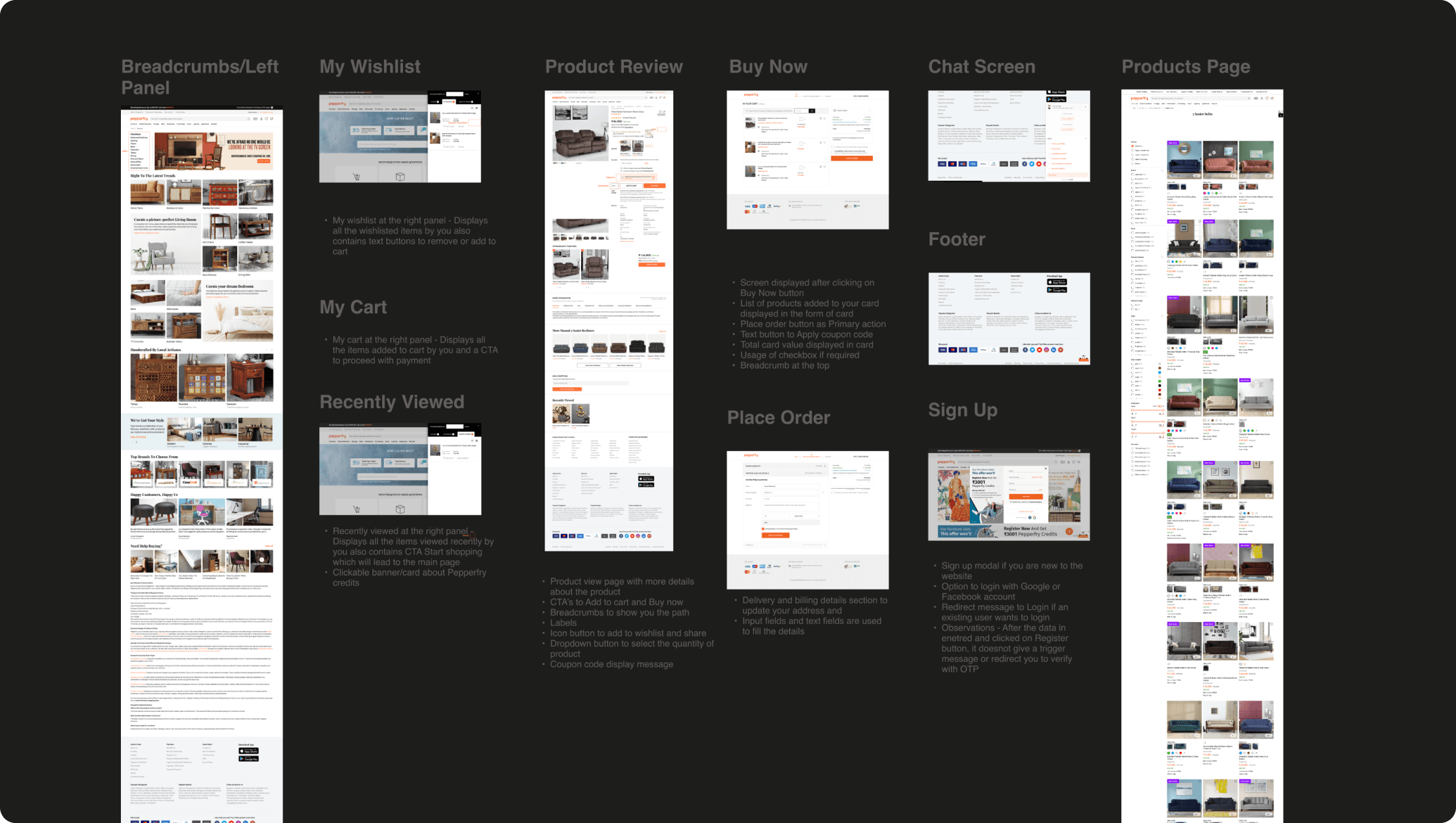
We focused on four main pillars to ensure a smooth transition from concept to a fully functional prototype, setting the stage for flawless development, and meticulous deployment.
- We started out by dissecting the website's building blocks and understanding it's usage. A complete understanding the flow and functionality of the product was achieved in this stage.
RESULTS
In conclusion, GeekyAnts delivered a design system design system that fosters seamless harmony across a diverse range of devices. As a result, Pepperfry achieved 100% Responsiveness, 80% Consistency Growth and 300+ Reduction in Design Hours.
The Right Conversation Can Save You Six Months
Contact us
More from our engineering work

Retail Platform for the Nordic Market
We re-engineered the infrastructure using a lightweight Kubernetes (K3s) architecture to make production MVPs scale-ready while keeping operational overhead low. The setup enabled automated deployments, environment parity, and cloud-agnostic scalability from day one.

Have a business problem or idea to scale? Connect with us.
Book a consultation call with our experts.