Design Systems for Web Development
We design systems that act as a single source of truth, combining component-driven architecture with reusable foundations to ensure your web products stay consistent as they scale.
Consistent and Scalable UI foundation











Every growing product eventually hits a point where the interface contradicts itself. Inconsistent buttons, spacing, and styles are clear signs of design debt. Without a shared system, a simple rebrand becomes a massive undertaking, requiring updates to hundreds of files because there is no single source of truth.
We build design systems that act as your organization’s connective tissue. By moving beyond simple style guides to engineered, token-based foundations, we bake design intent directly into your production code. This allows your team to stop re-creating basic elements and start compounding their efforts, shipping faster and scaling without the friction of technical debt.
Client Results and Success
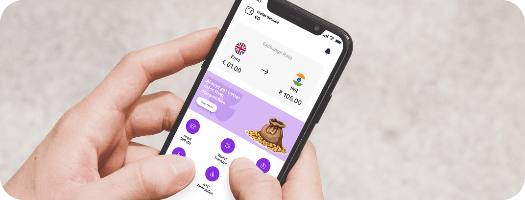
350k+ downloads across iOS and Android.
The system eliminates reliance on technical teams for adding destination countries, facilitating seamless global service provision.
- Global Payments Processed Annually
- 400M+
- Active Users across the UK, Canada, Europe, and Australia
- 120k+
- Downloads across iOS and Android
- 350k+
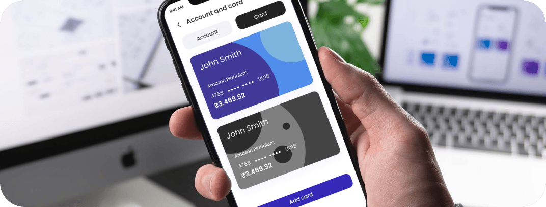
$57,000+ annual savings.
The project focused on right-sizing cloud resources and implementing automated scaling to handle fluctuating transaction volumes without compromising speed.
- Reduction in Monthly Cloud Costs
- 60%
- Saved per Month
- $4,800
14,274 sites in the Collect+ network.
The revamped application provides a unified interface for managing complex billing tasks and integrated logistics collection flows.
- Growth in Online Market Presence
- 17%+
- Growth in Parcel Transactions
- 20%
Including CO2 emission calculations.
The platform focuses on reducing the carbon footprint in construction by providing innovative tracking and sustainability tools.
- Users Onboarded
- 675
- Major Features Built
- 15+
From 5 Days to 2 hours
The system improves hiring speed and accuracy by automating initial voice-based interactions.
- Reduction in Manual Screening Effort
- 99%
- Success Rate for Technical Teams.
- 80-90%
- Hours to Complete Hiring Cycles
- 2
Separate Apps for Nurse, Child, and Parent
We integrated native APIs and synchronization protocols to ensure data accuracy across the healthcare suite.
- Separate apps Synchronized into One Ecosystem
- 3
Our Capabilities
We build the technical infrastructure that allows your design language to scale alongside your product, ensuring every component is accessible, performant, and easy to maintain.

Component-Driven Architecture
We build independent, reusable blocks that function seamlessly across all platforms.

Reusable UI Libraries
We develop centralized code libraries that eliminate duplicate work for developers.

Token-Based Theming
We manage brand variables like color and typography through tokens, making global updates instant.

Design-to-Code Workflows
We automate the transition from Figma to production code to ensure high-fidelity deployment.
24/7
Engineering Support
100%
App Router Ready
100%
Code Quality Score
1M+
Scalable for high-volume user traffic
Strategic Advantages of Design Systems
By standardizing the how and what of your user interface, we remove the friction that slows down product teams, ensuring that as your product grows, your quality improves rather than degrades.
Brand Consistency
Ensure a unified experience across every user interaction.
Faster Development
Speed up delivery by using a library of pre-built, tested components.
Reduced Design Debt
Eliminate one-off styles that clutter your codebase and slow down updates.
Improved Collaboration
Give designers and developers a common language and unified tools.
A Disciplined Approach to Design Systems for Web Development
We analyze your existing UI to identify patterns and establish the core design tokens.
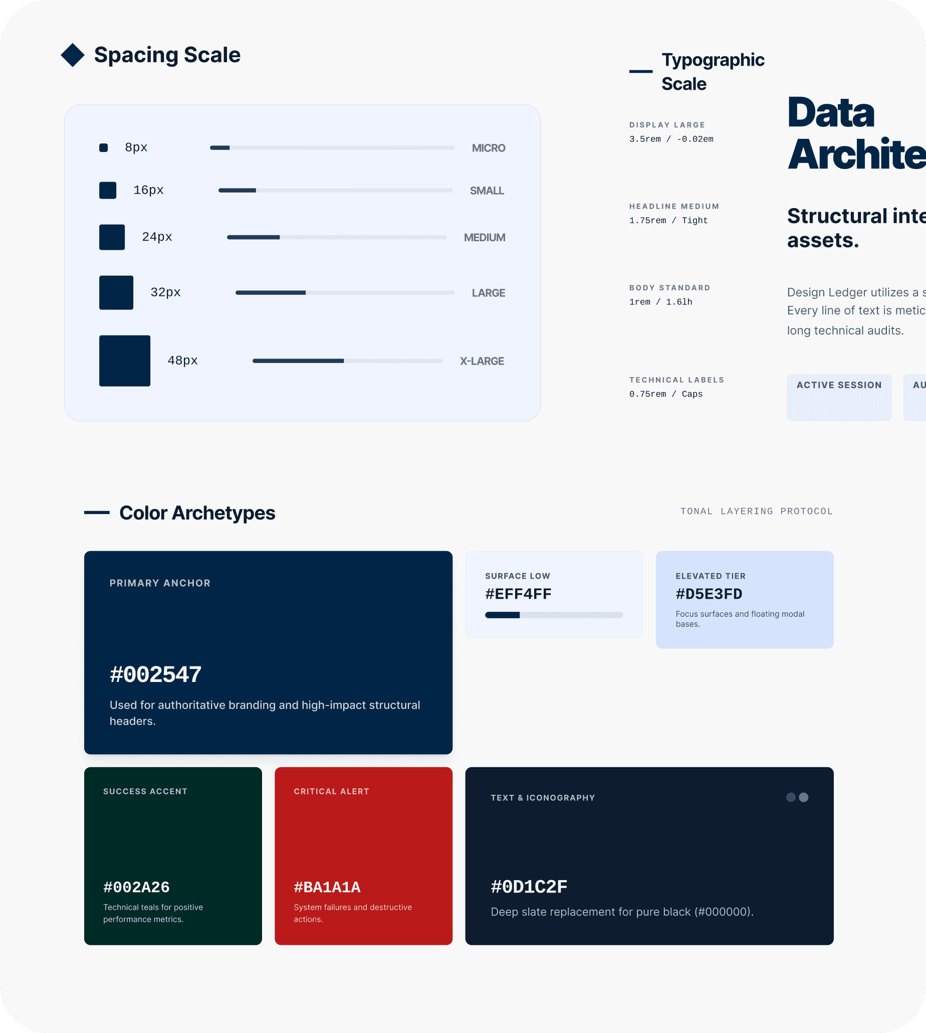
Building the core library using modern, accessible, and performant code.
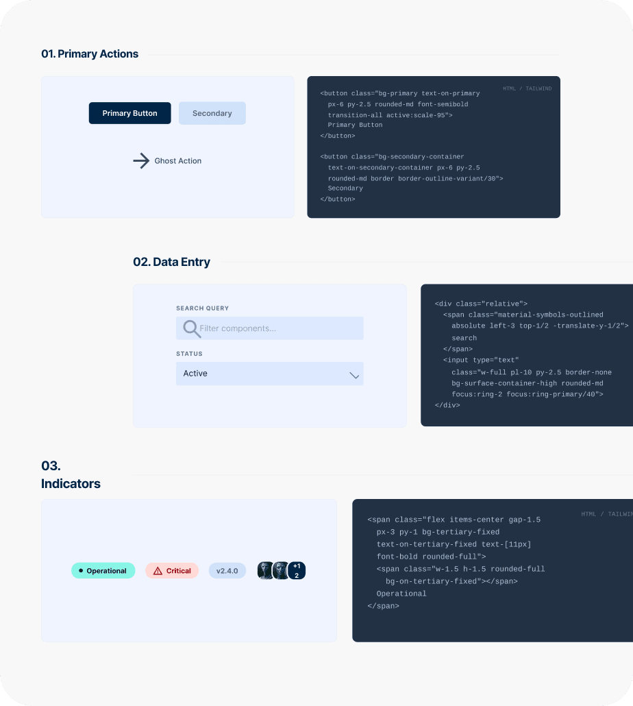
Creating clear guidelines on how to use and extend the system for both designers and developers.
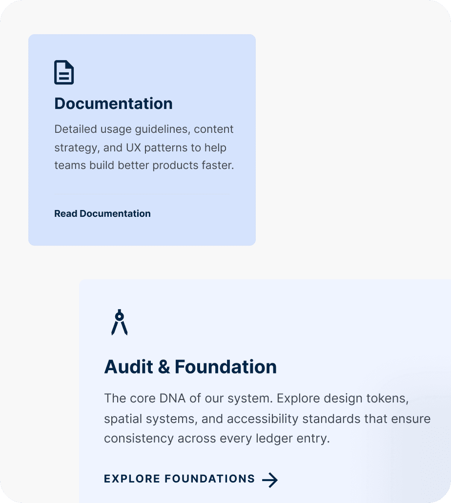
Helping your teams integrate the new system into their daily workflows for maximum impact.
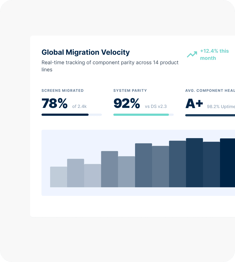
Comprehensive solutions for Web Engineering
Technology Stack for Design Systems
We build design systems on the tooling and frameworks your teams already work with — so adoption is an engineering decision, not a platform migration.
- Next.js

- Vue.js

- React

- Angular
- TypeScript

- Tailwind CSS

- shadcn css
- gluestack-ui

- Node.js
- Vercel

- AWS

- Google Cloud

- Contentful

- Strapi

- PostgreSQL

- Redis

Design Systems for Web Development across diverse domains
Design system requirements vary by organization size, product complexity, and how many teams are consuming the same UI foundation. We have built and scaled design systems for:
Fintech
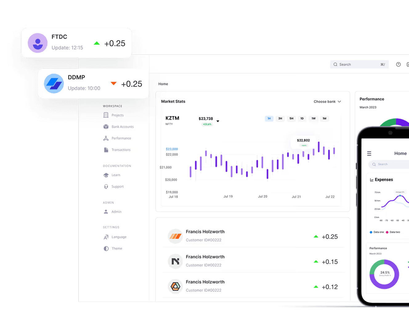
Secure, scalable fintech and banking app development.Explore more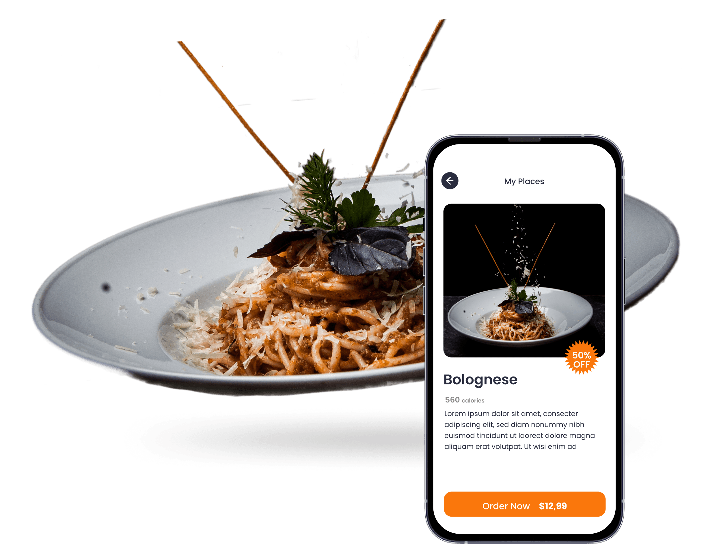
Food and Beverages
Customized AI-driven F&B apps for a booming business.Explore more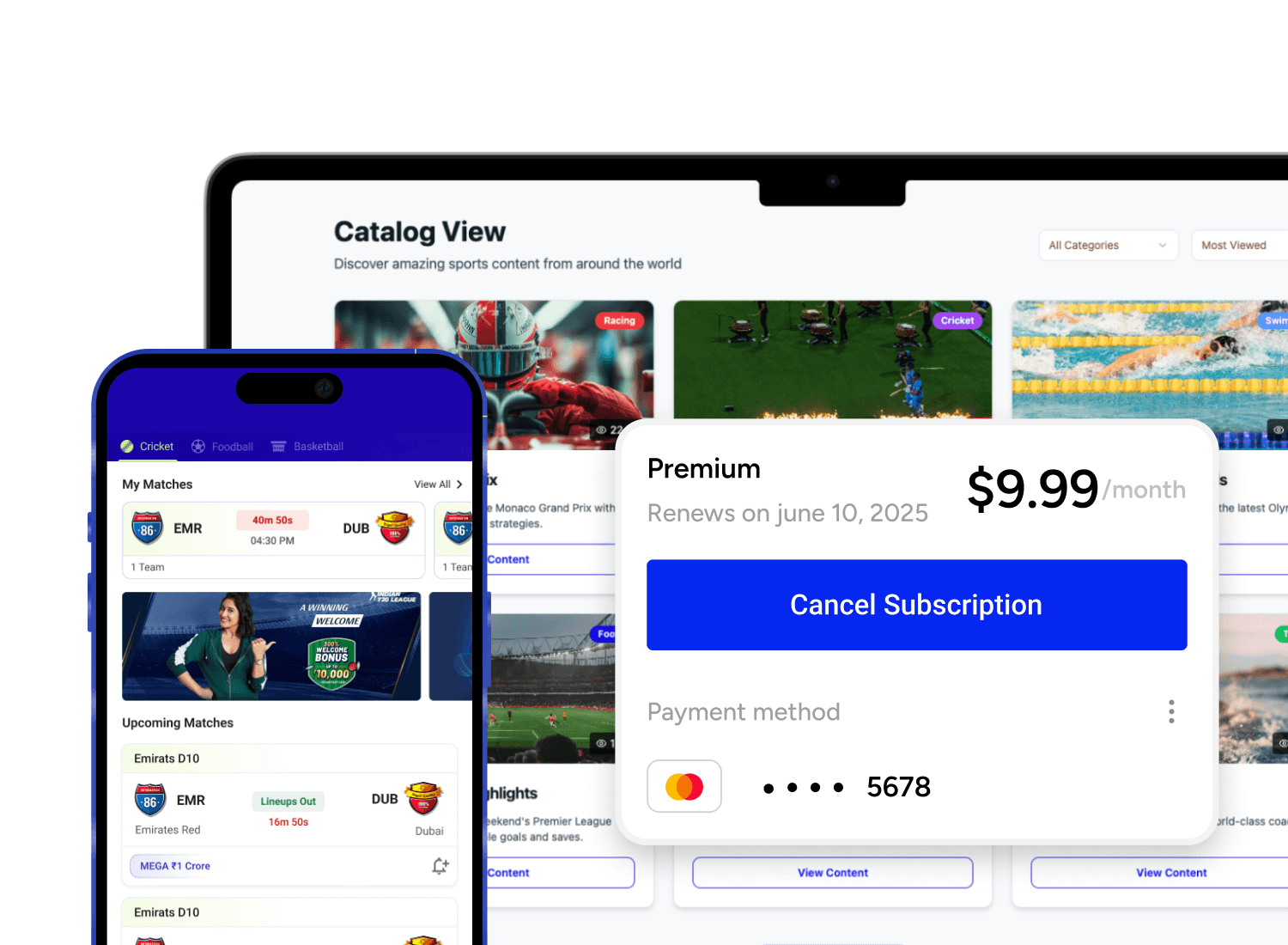
Sports
Cross-platform sports app development by GeekyAnts. Build fast, scalable apps for live scores, fan engagement, team management & more—across mobile, web, and wearables.Explore more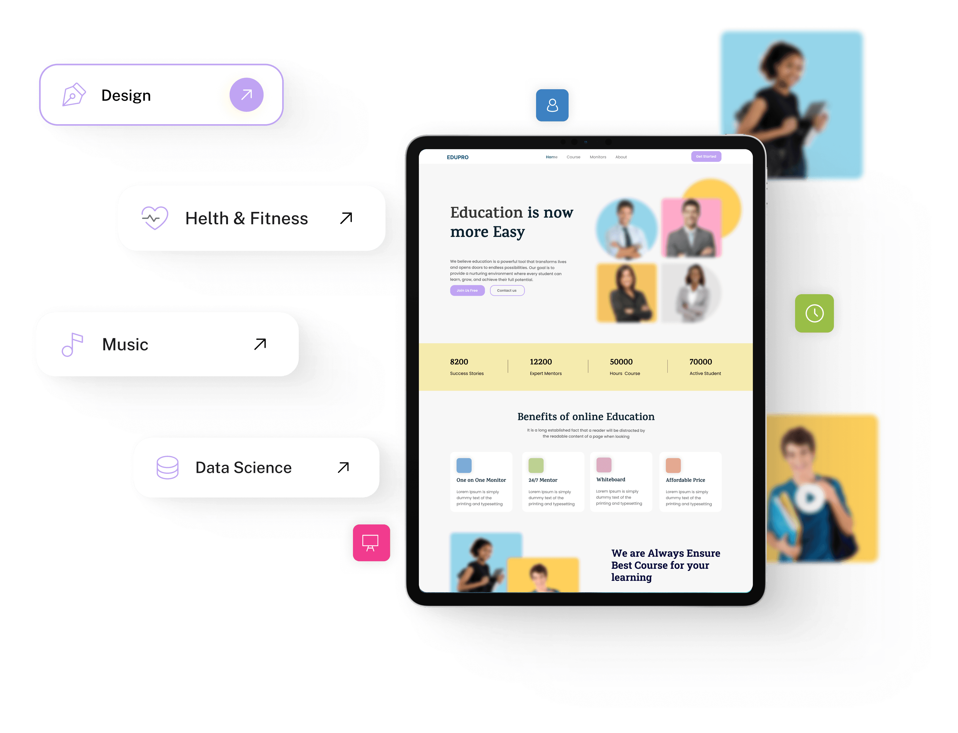
Education
GeekyAnts offers the best education and e-learning app and software development services for the education industry that can help you make the shift from traditional practices to a digital infrastructureExplore more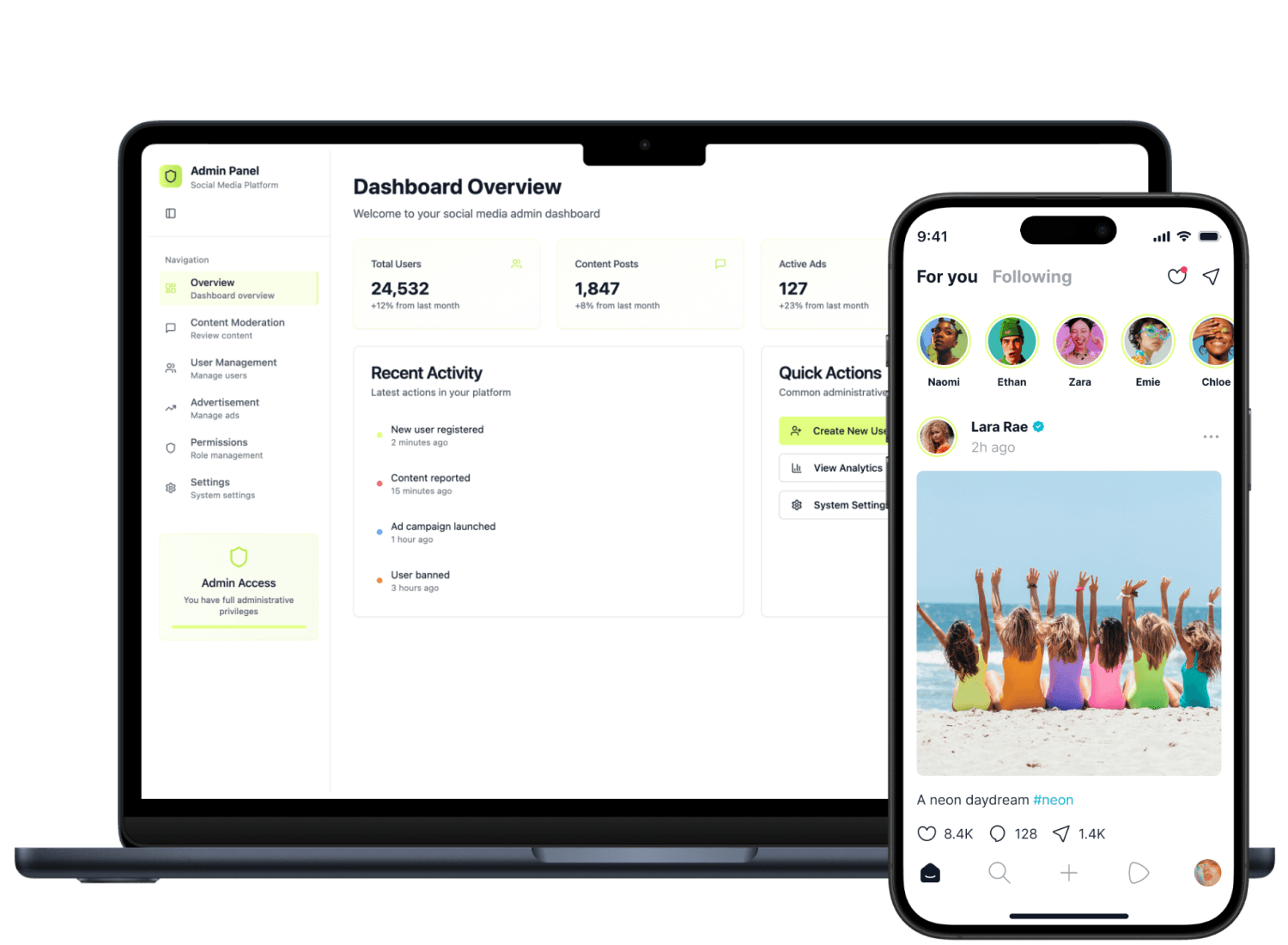
Social Media
GeekyAnts offers custom social media app development services to build scalable, AI-powered platforms that enhance user engagement and retention.Explore more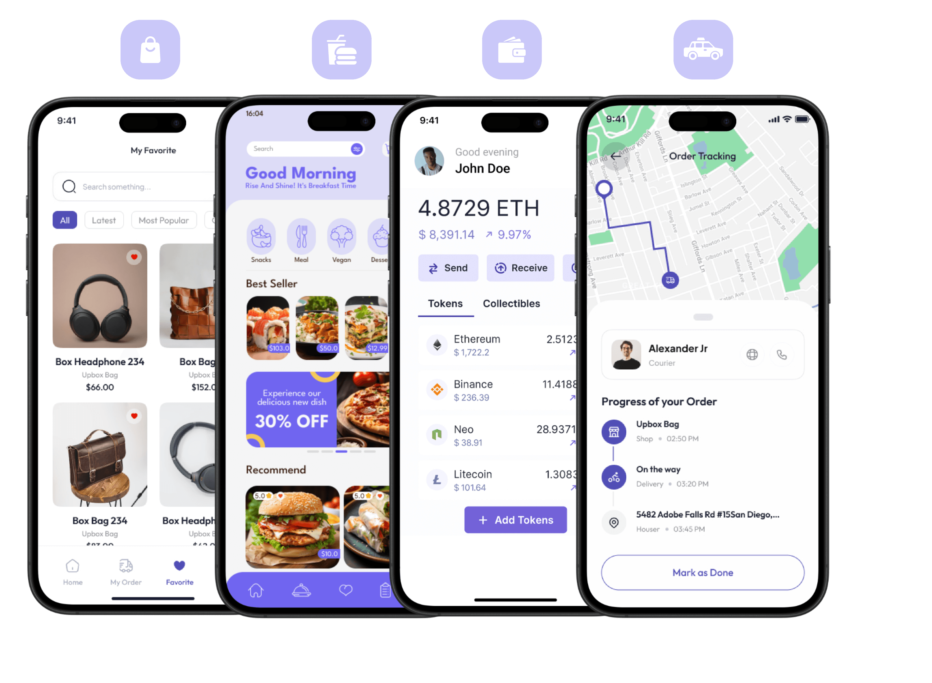
On-demand Booking
Trusted on demand app development company offering custom on demand app development services to build scalable, user-centric solutions for global businesses.Explore more
Our Latest Thinking in Web Engineering


Build with us.Accelerate your Growth.
- Customized solutions and strategies
- Faster-than-market project delivery
- End-to-end digital transformation services
Contact us
FAQs on Design Systems for Web Development
They are related but distinct. A style guide covers brand and visual language — colors, typography, tone. A component library catalogs reusable UI patterns with usage guidance. A design system encompasses all of this, plus tokens, principles, accessibility standards, governance, and a contribution model. A pattern library is often part of a design system rather than a substitute for one— the distinction matters when scoping what you actually need built.
Design tokens are platform-agnostic, stored in neutral machine-readable formats like JSON, and can be transformed and applied consistently across diverse platforms, including web, iOS, and Android, from a single definition. The architecture matters because poorly structured tokens — flat lists of hard-coded values without semantic layering — are difficult to theme and expensive to maintain. We structure tokens across three tiers: raw reference values, semantic purpose-driven aliases, and component-level references. This means a theme change requires updating one layer, not hundreds of individual values.
Most engagements start from an existing codebase, and a full rewrite is rarely the right approach. We audit what already exists — components, styles, patterns — and identify what can be standardized, what needs to be rebuilt, and what can be deprecated. The system is built incrementally, with existing screens migrated to system components in phases rather than all at once. This keeps the product live and functional throughout the process.
Design systems drift when there is no governance model — no defined process for proposing changes, reviewing contributions, or deprecating outdated components. We establish this alongside the system itself: a contribution model, a versioning and changelog process, and clear ownership. Governance covers roles, decision-making, backlog management, and release cadence— the organizational layer that determines whether a design system stays relevant or becomes a historical artifact your team works around.
The stable Design Tokens Specification supports theming and multi-brand configurations — managing light and dark modes, accessibility variants, and brand themes without file duplication through token inheritance and group structures. We use this architecture to build systems where brand expressions share a common component foundation but diverge at the token layer — so a rebranded product or a white-label variant requires token updates, not component rewrites.
It means designers and developers are working from the same component definitions rather than parallel artifacts that slowly diverge. In practice, this involves connecting Figma component libraries to production code via tools like Code Connect, establishing token sync pipelines so style decisions made in design tools update the codebase automatically, and documenting component APIs in a format developers can use directly. The handoff question — "which token are you using here?" — stops being a recurring friction point.