


How to Create a Custom Extension in TipTap WYSIWYG Editor
Author

Date

Book a call
TipTap WYSIWYG editor is a headless content editor in which you can craft a customized editing experience for the user. In TipTap, you can create and customize the interactions and functionality to cater to the user's needs. Under the hood, TipTap uses ProseMirror, a toolkit for building rich-text editors on the web. Before we jump on how to create a custom extension in the TipTap editor, we need to understand ProseMirror.
Who is Using TipTap?
Tiptap is a versatile and widely adopted rich text editor framework, popular among various companies due to its robust features and customizable nature. More than 20,000+ companies are using the TipTap editor ( as per the TipTap website ). Here are some of the companies that are using TipTap editor: GitLab, Statamic, Apostrophe CMS, Productboard, Axios, Staffbase, Beehiiv, Front, ChartHop, Jenni, Chegg, Trainual, UserTesting, Substack, Opal, Nextcloud, Y Combinator, Ahrefs, Storyblok, etc.
What is ProseMirror?
ProseMirror is a toolkit for building rich text editors that handles schema enforcement, state management, and content rendering. It doesn't store its content to inform of HTML but it uses a custom data structure organizing content, specifically designed for documents. The ProseMirror editor builds itself around this document to represent the content.
ProseMirror document is a node that holds a fragment that contains zero or more child nodes. These children can be paragraphs, lists, tables, or other elements. You can learn more about Prosemirror from the official documentation. Now let's look into how to set up TipTap in Next.js.
Set up TipTap with Next.js
In this section, we will walk through the steps to set up a Next.js project and integrate Tiptap, a rich-text editor. Tiptap is a highly customizable editor based on ProseMirror that allows an excellent user experience in content editing.
- Create a new Next.js project:
Open your terminal and run the following command to create a new Next.js project:
This command creates a new directory called my-nextjs-tiptap-project and initializes a Next.js project inside it.
2. Install Tiptap packages:
Run the following command to install Tiptap and its dependencies:
Now, let's create a Tiptap editor component:
1. Create the Tiptap editor component:
Create a new file called Tiptap.tsx in the src/app/components directory of your Next.js project.
2. Set up the Tiptap editor in Tiptap.tsx:
Open Tiptap.tsx and add the following code to initialize and configure the Tiptap editor:
You can read more about the setup from TipTap official docs.
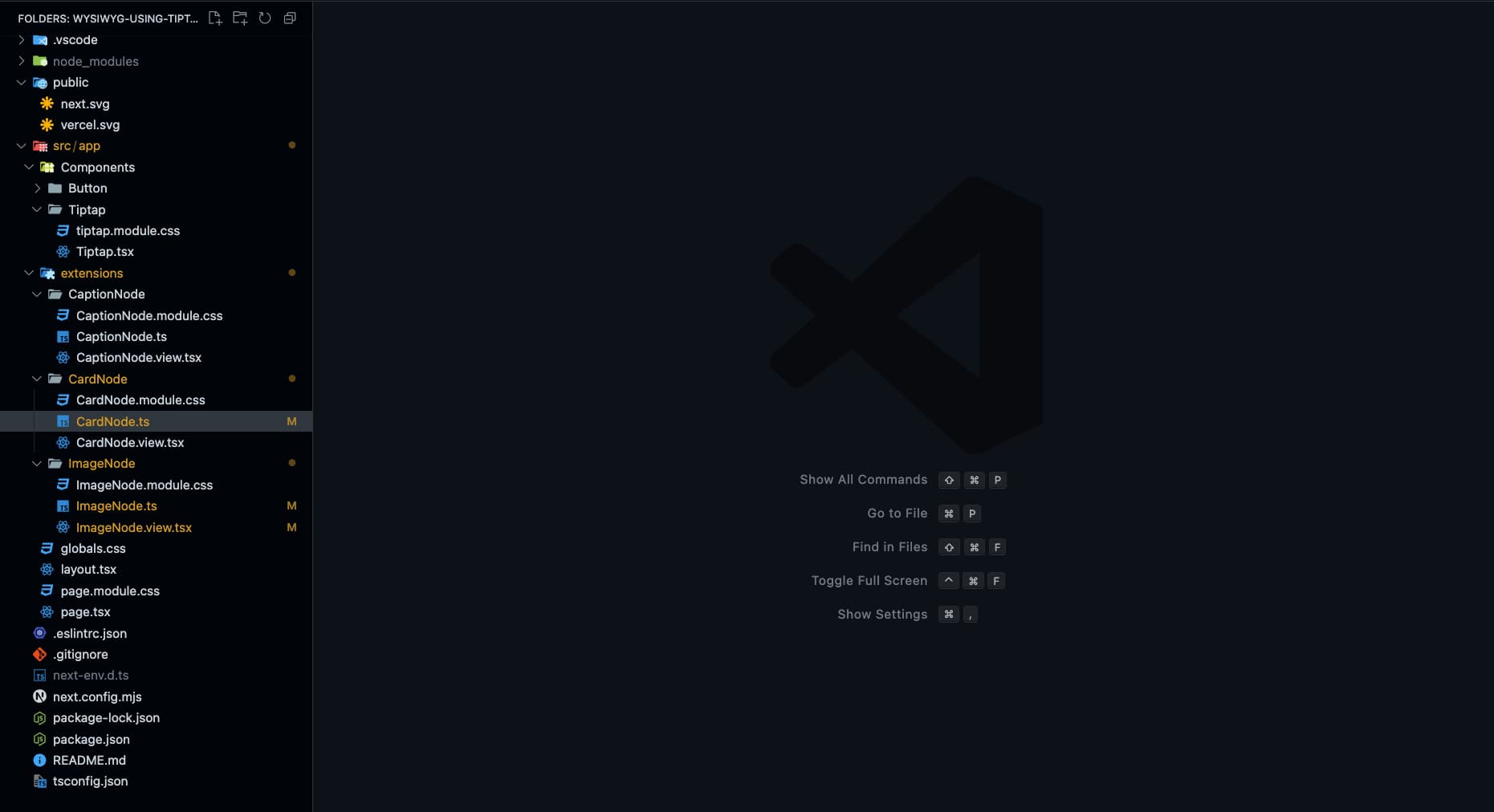
Here is the folder structure we are following for the website :
Creating our CardNode Extension
To create a custom node, you need to define the scheme for the node using which editor will validate the document content. Before we jump onto creating our node, let's understand some schema terminology and function:
name: represents an identifier unique to each node type and is used to distinguish it from other node types within the same schema.group: defines a category or set that a node type belongs to, which can be referred to in the content expressions for the schema. It can beblock,list, orinline.content: the value we assign to the content field is known as "Content Expression." They determine which sequences of child nodes are permissible for this node type. consider an example where we want one or more than one node namedparagraphthen it will be represented asparagraph+, in case of zero or more paragraphs then it will be represented asparagraph.
We can also create a combination out of these sequences. For example, we have a node where we want to choose between the nodes. In that case, we can use a pipe operator. Let's have code or blockquote; the expression would be (code|blockquote). If we want a particular sequence, consider an example where we want a heading and then a list. It can be represented as a heading list.
parseHTML: tries to load the editor document from HTML.renderHTML: function allows you to control how a node is converted to HTML. You provide it with an attributes object containing all the local attributes, global attributes, and configured CSS classes. So, the return value is an array for this function where the first value should be a tag; if the second element of an array is an object, it implies the set of attributes, and if any other element, it will be considered children.addCommands: functions that allow a user to perform a certain editing action by interacting with others. To use any othercommandsfrom the editor inaddCommands, we can use the 'commands' parameter from theaddCommands.addAttributes: Attributes allow us to store extra information about the node. The addAttributes function helps us create and define these attributes.addNodeView: a function that helps you render the node view on the editor and to render a sophisticated interface.
You can also go through the official documentation by the TipTap to understand more about schema and extensions.
Now, let's look into how to create a Card Node. The Card Node will contain two elements: the image and the caption. So, we will create two separate nodes: an image Node and a caption node.
In the ImageNode, we will have a placeholder button on click, of which an alert box will open, and we can add an image link. Let's create a component which will handle the rendering of this Image Node:ImageNode.view.tsx
The component will have a placeholder button initially, on click of which we will open a prompt where we will paste the url for image, and the image will be rendered, and the placeholder button will hide. Also, there will be a button to update the image link again, which will only be visible if the URL is available at the bottom right corner of the image. Here NodeViewContent and NodeViewWrapper are the wrappers provided by TipTap, where NodeViewContent is responsible for adding editable content to your node view. NodeViewWrapper is used as a wrapper on the component, which will help you render the react component in the editor view. By default, these wrappers are rendered as div, but they can be changed by using as props. These view nodes get props of the type. NodeViewProps.
updateAttributes is one of the props that we are using here from NodeViewProps. This prop is used to update the attributes for the node. In our case, we will define an attribute named. url.
Now, let's integrate this view with the ImageNode node. Our node may contain an image or not.
We use a URL attribute to store the URL information and render the user's image. There is a function named ReactNodeViewRenderer. TipTap provides this function and helps us render the react component in the editor. It passes a few very helpful props to your custom React component.
This NodeViewContent will be rendered as an editable paragraph, and we can write the text below the image. Now, let's integrate the view with our CaptionNode.
CaptionNode.ts
We are done with our child nodes for our CardNode. So, we will create a component that renders our child node and provides a button for the user to delete the Node at the top right corner, which will be visible while we hover on the view. We will use the deleteNode function that we get as a prop.
CardNode.view.tsx
Now, let's define a type for the command to create the Card node. The core package has a type called Commands, which is required wherever we write commands. As you can see in the below example, we added the createCardNode command.
Now let's define the schema for the CardNodeNode. So in our case, we have nodes that are part of the block group. So the group will be block. In the case of content expression, we want the order of rendering the nodes to be image, then caption, and we want only one block each of that child node so that the expression will be imageNode captionNode.
Now inside the addCommands, we will add a command createCardNode to insert the content. We will use the command called insertContent which is provided by the TipTap. It adds the passed value to the document. The value will be an object representation of the structure of how we want to render our data. So in our case, we want to render a type called CardNode content as ImageNode and CaptionNode. So the object will look like this.
Here is what our code for CardNode will look like.
Now let's add our Nodes in the Tiptap editor file and an option for adding cards in the editor view.
Conclusion
Creating custom extensions in the TipTap WYSIWYG editor allows you to tailor the editing experience to your needs. You can build powerful and interactive content editing tools by understanding the underlying ProseMirror schema and leveraging TipTap's flexible API. In this article, we walked through setting up TipTap with Next.js and creating a custom CardNode extension. This extension includes an image and a caption, demonstrating how to handle complex node structures and interactions.
To complete implementation and learn more about this project, visit the GitHub repository.
Happy coding!
Dive deep into our research and insights. In our articles and blogs, we explore topics on design, how it relates to development, and impact of various trends to businesses.