
Easily craft stunning gauges in Flutter with the geekyants_flutter_gauges package. Following our guide on Linear Gauges at https://geekyants.com/blog/crafting-gauges-with-geekyantsfluttergauges, let us explore the world of Radial Gauges using the same package.
What is a Radial Gauge? 🎚️
In its essence, a radial gauge comprises a circular dial with a pointer that indicates the current value within a predefined range. The position of the pointer on the dial reflects the magnitude of the data being represented. This dynamic representation allows users to grasp the significance of the data at a glance quickly. Coming to geekyAnts_flutter_gauges , it provides you with a widget to display data on a radial scale. Use this widget as a base to craft high-quality gauges to represent data or have some progress data in your app. It uses Flutter’s Render Objects under the hood to let you create stunning-looking gauges or indicators as required. In this blog, we cover the basic usage of Radial Gauge.
Getting Started with Radial Gauge
Add the dependency to your pubspec.yaml:
flutter pub add geekyants_flutter_gauges Import the package in your Dart code:
import 'package:geekyants_flutter_gauges/geekyants_flutter_gauges.dart';
Now we delve into using the Gauge:
class MainApp extends StatelessWidget {
  const MainApp({super.key});

  @override
  Widget build(BuildContext context) {
    return MaterialApp(
      debugShowCheckedModeBanner: false,
      home: Scaffold(
      body: const Center(
        child: RadialGauge(
          track: RadialTrack(
            start: 0,
            end: 100,
          ),
          needlePointer: [
            NeedlePointer(
              value: 30,
            ),
          ],
        ),
      ),
    ),);
  }
}
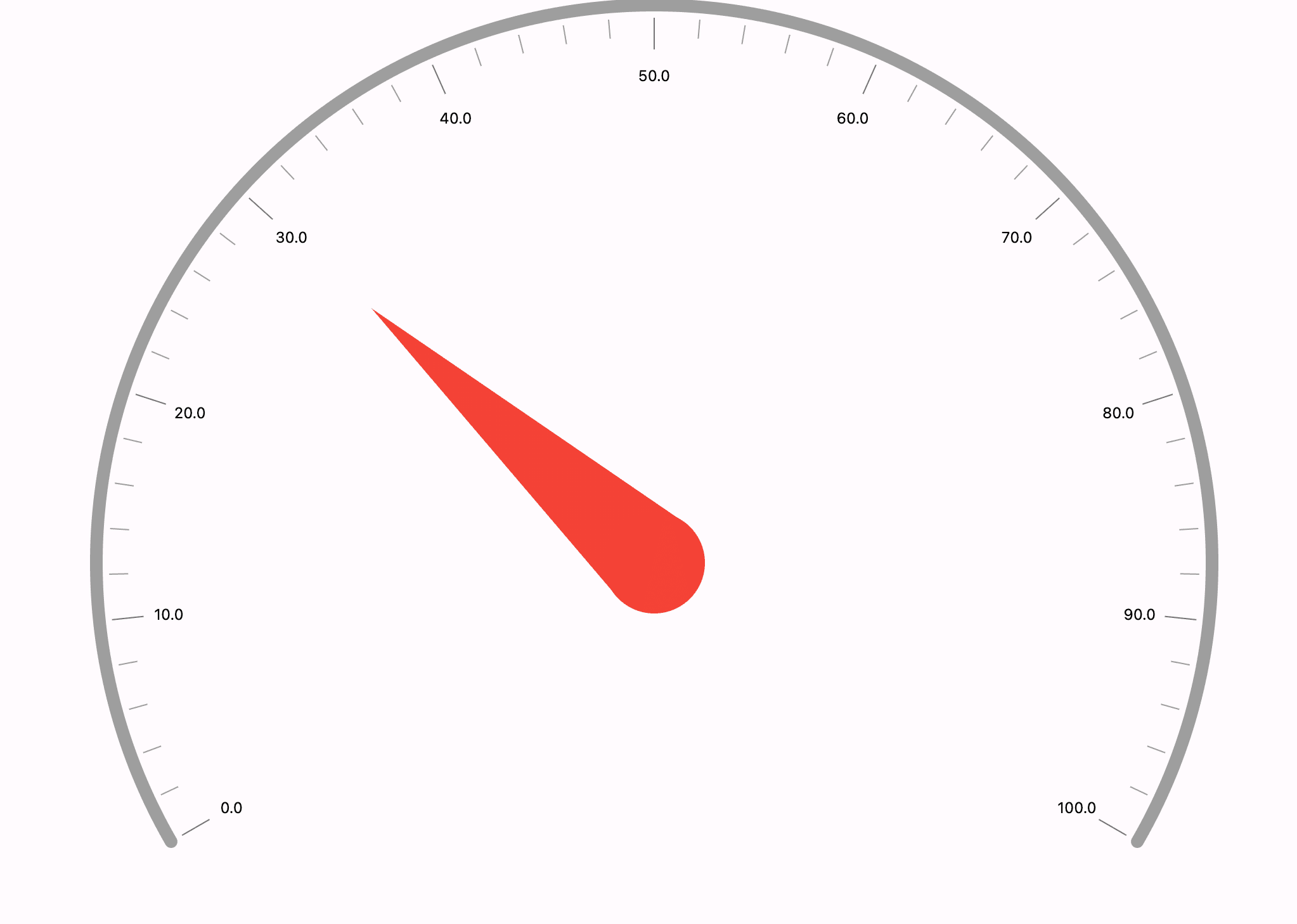
The above code gets you the basic radial gauge with a needle, which will look something like the below picture. Let us start exploring more so we can get a better understanding of it.
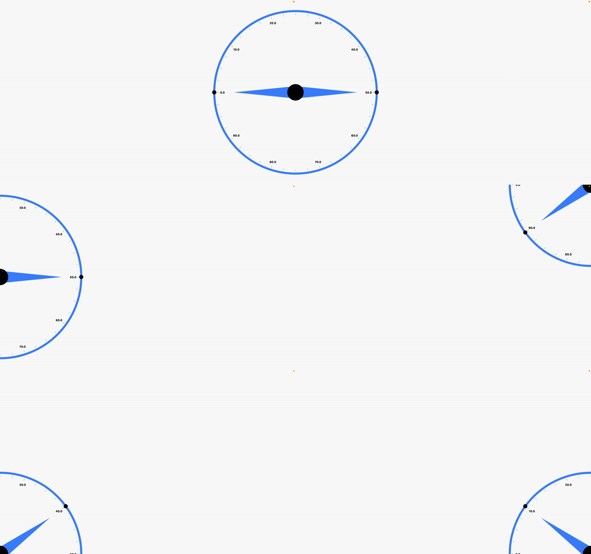
We will explore some examples you might use in the app, but before that let us familiarize ourselves with the radial gauges naming and properties.
- Radial Track
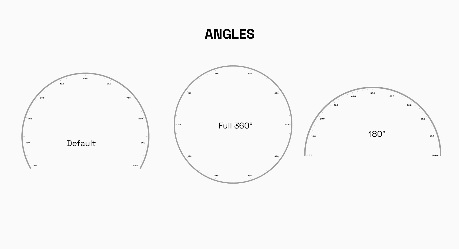
The Radial Track defines the visual representation of the track within the Radial Gauge, with properties such asstart,end,startAngle, andendAngledictating its range, thickness, format trackLabels, and orientation. For instance, settingstartto 0 andendto 100, along withstartAngleas 0 andendAngleas 360, creates a complete circular track indicating values from 0 to 100 in a full revolution.
- Needle Pointers and Shape Pointers
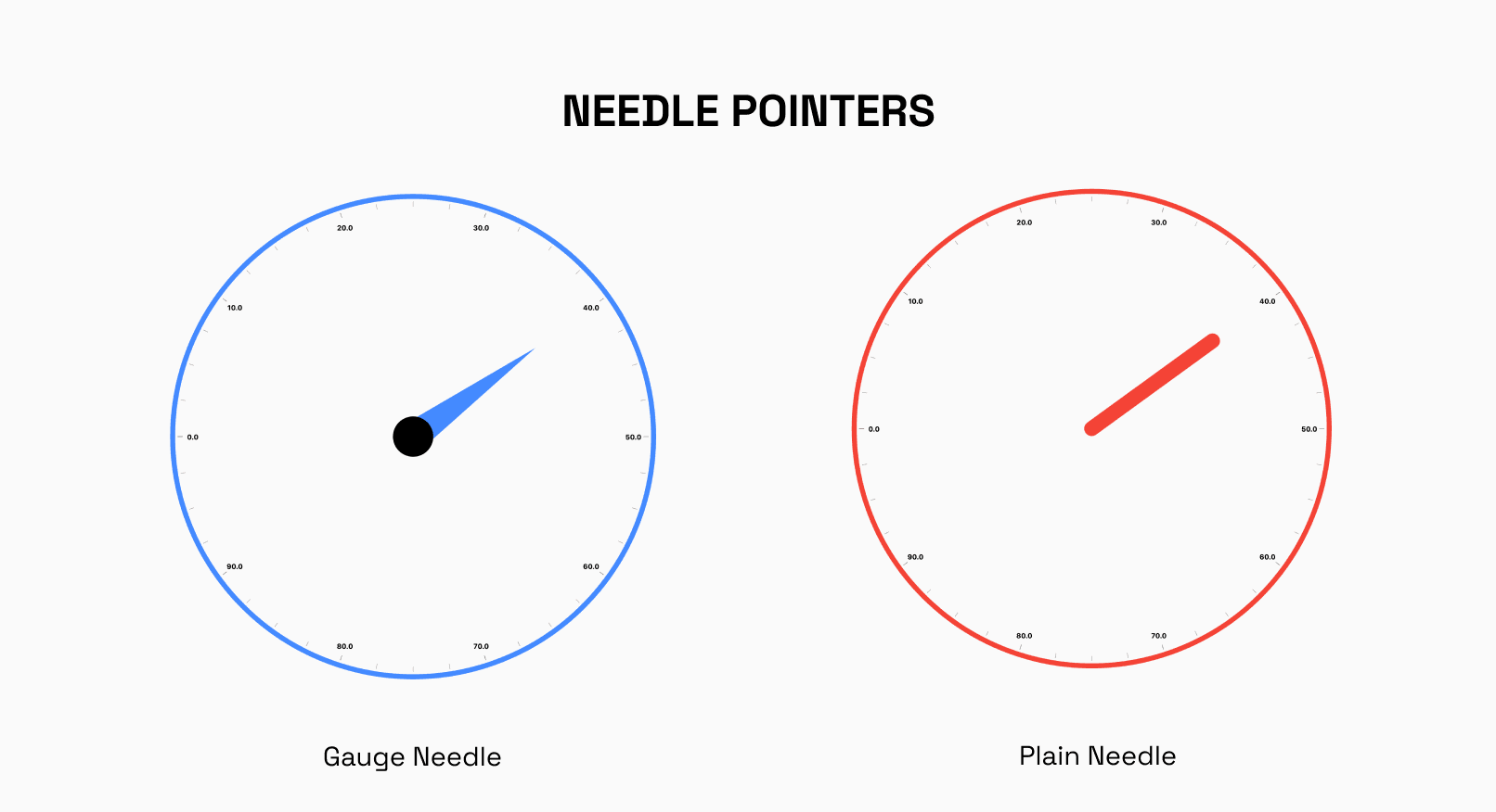
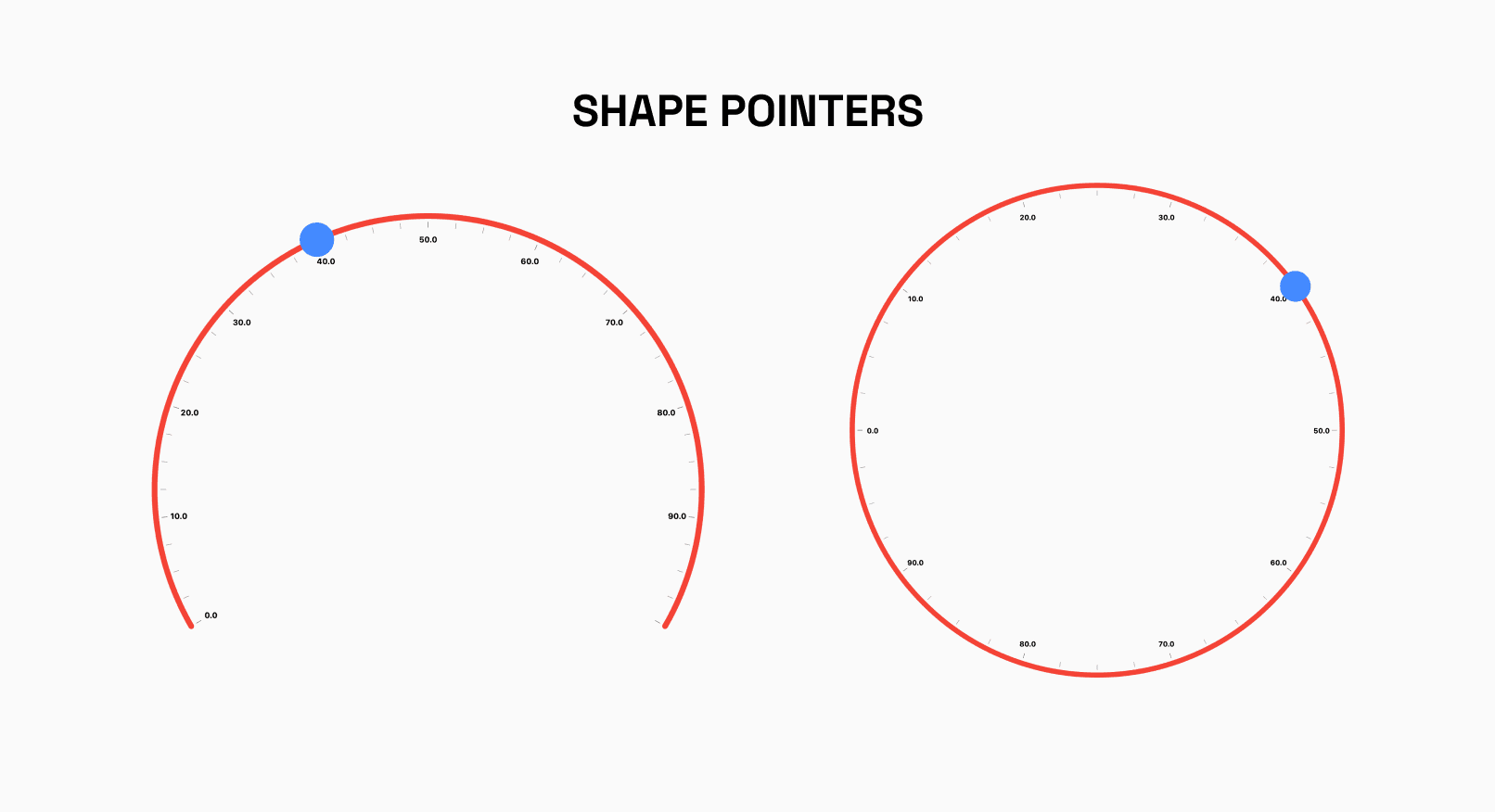
The NeedlePointer component in the RadialGauge creates a needle-like indicator that points to a specific value, with its position determined by the provided value property. For instance, setting NeedlePointer(value: 30) positions the needle at 30 units on the gauge's track. On the other hand, RadialShapePointer offers the flexibility to render custom shape pointers within the RadialGauge. Currently supporting only circle shape pointers, it allows customization of color, height, and width properties to tailor the appearance of the pointers to suit the application's visual requirements.
- Widget Pointers
Along with NeedlePointers and ShapePointers, we can add our widget pointers to the gauge, allowing for endless customizability options.
- ValueBar
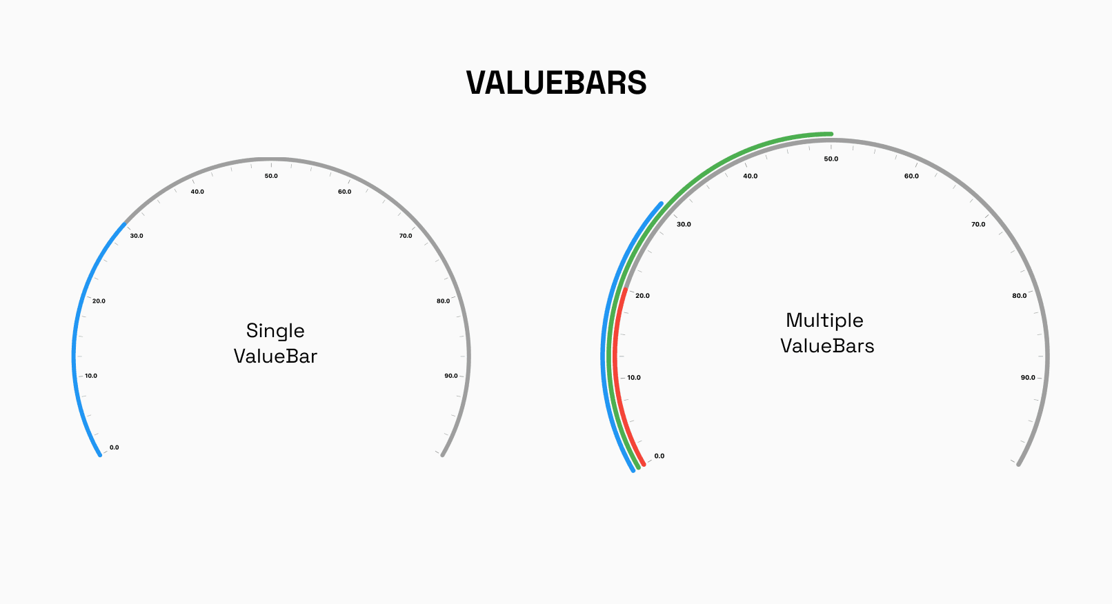
The RadialValueBar component in the RadialGauge widget allows for the visualization of a dynamic value within the gauge, represented by a colored bar. By specifying properties such as value, color, radialOffset, and valueBarThickness, developers can customize the appearance and behavior of the value bar to suit their application's requirements. Additionally, the option to utilize a gradient allows for further visual enhancement, enabling the creation of compelling and informative data visualizations within the RadialGauge.
- Positioning
RadiusFactor along with x and y coordinates can be used to correctly position the gauge wherever you like on the screen.
Some Examples
Let us now go over some examples.
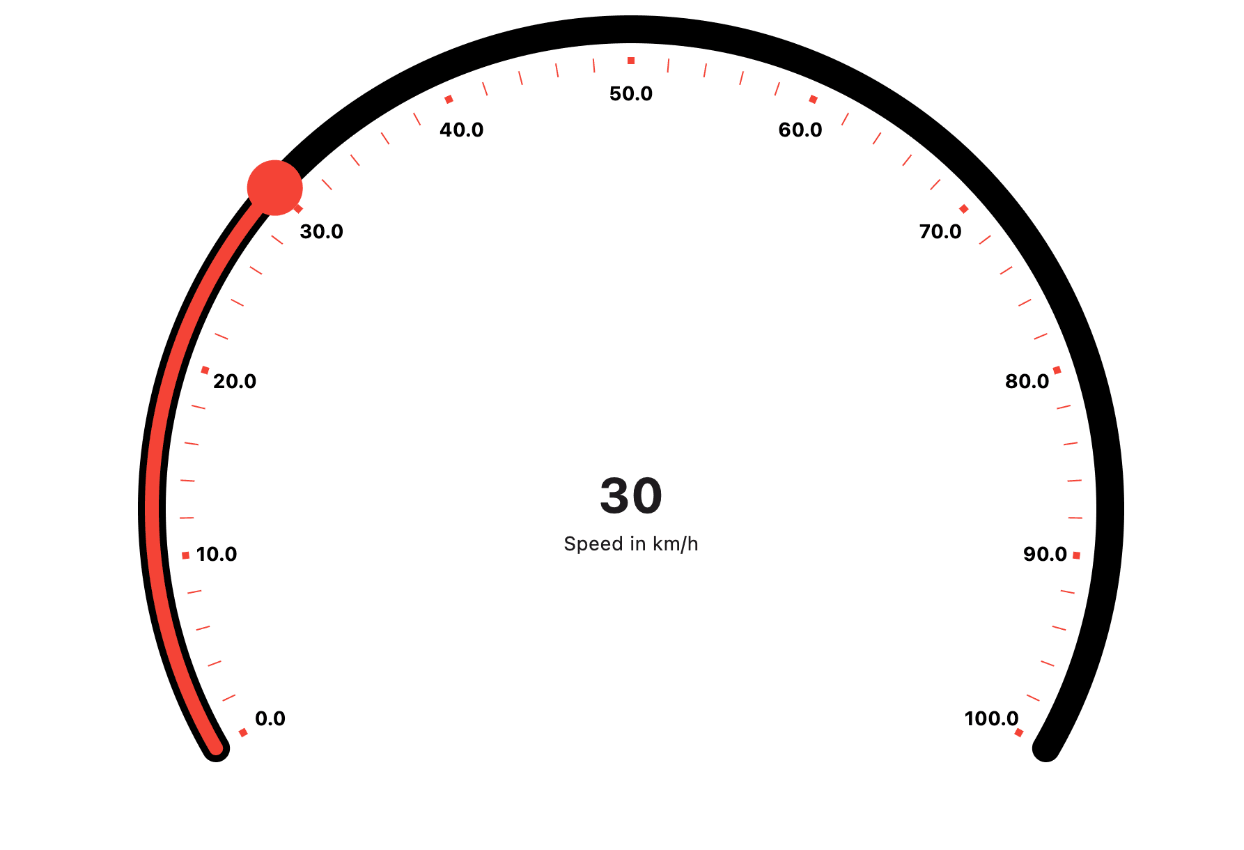
First, we will create something similar to a Speedometer.
Configure the RadialTrack to define the appearance of the speedometer track. Customize properties like thickness, color, and ruler styles using showLabel, primaryRulerColor, and secondaryRulerColor.
 RadialTrack(
                  hideTrack: false,
                  thickness: 20,
                  color: Colors.black,
                  start: 0,
                  trackStyle: TrackStyle(
                      showLabel: true,
                      secondaryRulerPerInterval: 4,
                      primaryRulerColor: Colors.red,
                      primaryRulersHeight: 5,
                      primaryRulersWidth: 5,
                      secondaryRulerColor: Colors.red),
                  end: 100,

                ),
Once the track is completed, we can add the Shape Pointer and ValueBar as required add a RadialShapePointer to represent the speedometer needle, and a RadialValueBar to visualize the speed value within the speedometer. Update the pointer's value dynamically for interactivity.
The result should look like this:
Here is the code for the entire Speedometer:
             SizedBox(
              child: RadialGauge(
                radiusFactor: 0.8,
                track: const RadialTrack(
                  hideTrack: false,
                  thickness: 20,
                  color: Colors.black,
                  start: 0,
                  trackStyle: TrackStyle(
                      showLabel: true,
                      secondaryRulerPerInterval: 4,
                      primaryRulerColor: Colors.red,
                      primaryRulersHeight: 5,
                      primaryRulersWidth: 5,
                      secondaryRulerColor: Colors.red),
                  end: 100,
                ),
                shapePointer: [
                  RadialShapePointer(
                    value: value2,
                    isInteractive: true,
                    width: 20,
                    onChanged: (value) {
                      setState(() {
                        value2 = value;
                      });
                    },
                  ),
                ],
                valueBar: [
                  RadialValueBar(
                    value: value2,
                    color: Colors.red,

                  )
                ],
              ),
            ),
For the next example, let us recreate a simple activity tracker commonly found in smart watches. Hide the track and customize the appearance within the value bars.
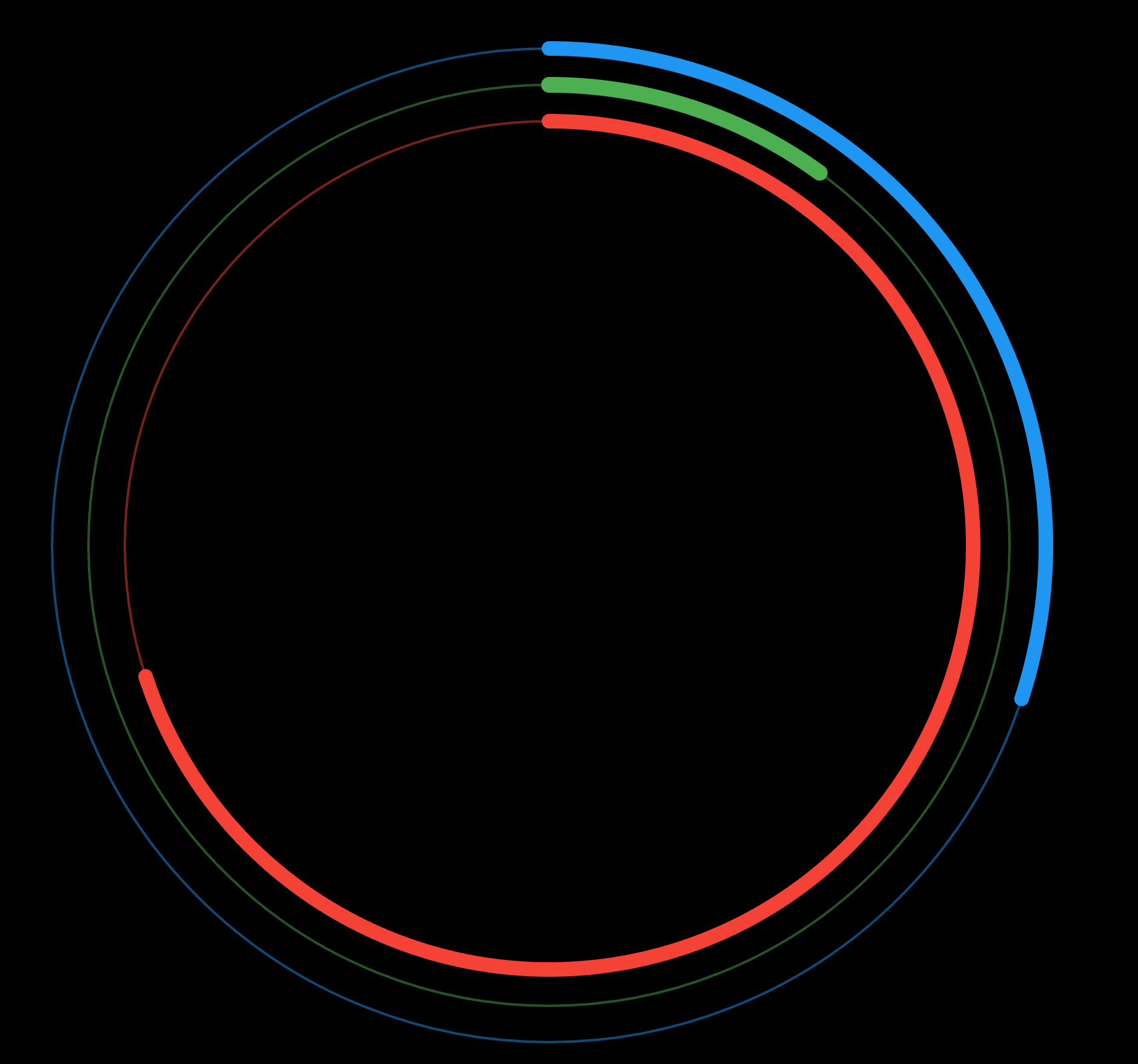
Here we will hide the track and do most of the customization using the valuebars of the Radial Gauge.
 RadialTrack(
                color: Colors.red,
                startAngle: 90,

                endAngle: 450,

                trackStyle: TrackStyle(
                  primaryRulersHeight: 10,
                  secondaryRulersWidth: 1,
                  showLabel: false,
                  showPrimaryRulers: false,
                  showSecondaryRulers: false,
                ),
                hideTrack: true,

                start: 0,
                thickness: 10,
                end: 100,
              ),
For the value bars, utilize radialOffset and thickness to achieve desired effects.
Increasing or decreasing the offset will move the valuebars closer or further away from the center.
  valueBar: [
                RadialValueBar(
                  value: 100,
                  color: Colors.green.withOpacity(0.7),
                  valueBarThickness: 2,
                  radialOffset: 60,
                ),
                const RadialValueBar(
                  value: 10,
                  color: Colors.green,
                  valueBarThickness: 13,
                  radialOffset: 60,
                ),
                RadialValueBar(
                  value: 100,
                  color: Colors.blue.withOpacity(0.7),
                  valueBarThickness: 2,
                  radialOffset: 30,
                ),
                const RadialValueBar(
                  value: 30,
                  color: Colors.blue,
                  valueBarThickness: 12,
                  radialOffset: 30,
                ),
                RadialValueBar(
                  value: 100,
                  color: Colors.red.withOpacity(0.7),
                  valueBarThickness: 2,
                  radialOffset: 90,
                ),
                const RadialValueBar(
                  value: 70,
                  color: Colors.red,
                  valueBarThickness: 12,
                  radialOffset: 90,
                ),
              ],
The result should get you this:
Add a stack to your widget to show informational data in the center.
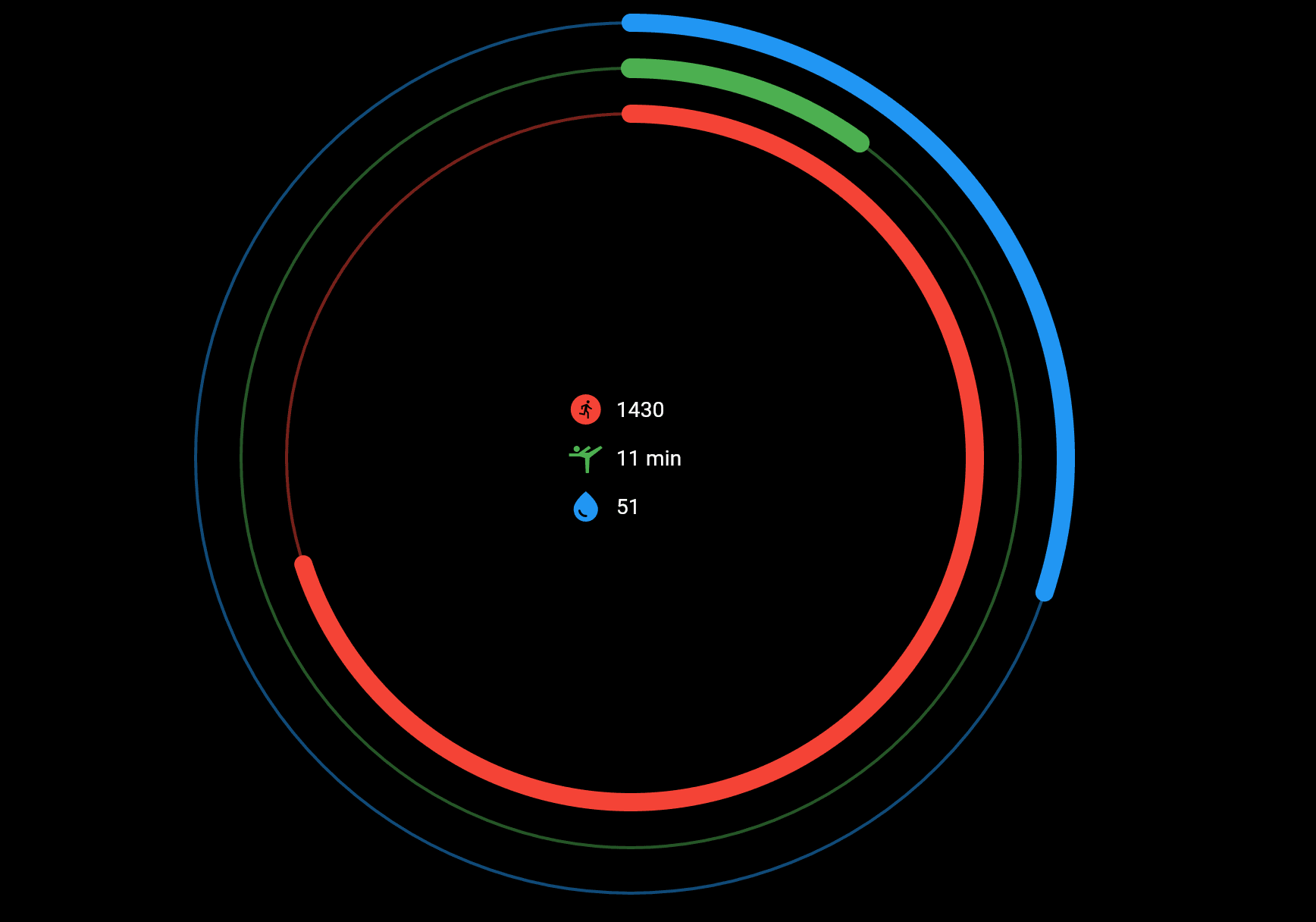
Here is the entire code:
Stack(
          children: [
            Center(
                child: Column(
              mainAxisAlignment: MainAxisAlignment.center,
              crossAxisAlignment: CrossAxisAlignment.start,
              children: [
                IconLabel(
                  text: "1430",
                  icon: Icons.run_circle,
                  iconColor: Colors.red,
                ),
                IconLabel(
                    text: "11 min",
                    icon: Icons.sports_gymnastics,
                    iconColor: Colors.green),
                IconLabel(
                    text: "51", icon: Icons.water_drop, iconColor: Colors.blue),

                IconLable(text: "text", icon: icon)
              ],
            )),
            RadialGauge(
              radiusFactor: 1,
              valueBar: [
                RadialValueBar(
                  value: 100,
                  color: Colors.green.withOpacity(0.7),
                  valueBarThickness: 2,
                  radialOffset: 60,
                ),
                const RadialValueBar(
                  value: 10,
                  color: Colors.green,
                  valueBarThickness: 13,
                  radialOffset: 60,
                ),
                RadialValueBar(
                  value: 100,
                  color: Colors.blue.withOpacity(0.7),
                  valueBarThickness: 2,
                  radialOffset: 30,
                ),
                const RadialValueBar(
                  value: 30,
                  color: Colors.blue,
                  valueBarThickness: 12,
                  radialOffset: 30,
                ),
                RadialValueBar(
                  value: 100,
                  color: Colors.red.withOpacity(0.7),
                  valueBarThickness: 2,
                  radialOffset: 90,
                ),
                const RadialValueBar(
                  value: 70,
                  color: Colors.red,
                  valueBarThickness: 12,
                  radialOffset: 90,
                ),
              ],
              track: const RadialTrack(
                color: Colors.white,

                startAngle: 90,
                // hideLabels: true,
                endAngle: 450,
                // steps: 10,
                trackStyle: TrackStyle(
                  primaryRulersHeight: 10,
                  secondaryRulersWidth: 1,
                  showLabel: false,
                  showPrimaryRulers: false,
                  showSecondaryRulers: false,
                ),
                hideTrack: true,
                // hideStartLabel: ,
                start: 0,
                thickness: 10,
                end: 100,
              ),
            ),
          ],
        ),
Looking to Explore Further?
These are just simple examples, visit https://gauges-showcase.vercel.app/ to view more examples of how you can create stunning Gauges with ease using RadialGauge.
We have just scratched the surface there is a lot to play around with, so try cloning the repository and get your hands dirty. PR and Issues are welcome on the official Github repository https://github.com/GeekyAnts/GaugesFlutter.
Explore the power of geekyAnts_flutter_gauges! Leverage this tool to display data on a linear scale and create high-quality, visually appealing gauges for your app. The widget uses Flutter’s Render Objects, allowing for stunning designs.