

Book a call
A website is the reflection of any company and it is critical to ensure that it stands out and expresses the mission and vision of the organisation. Digital trends are constantly on the move with new technological trends rolling into the market ever so often which makes it imperative for businesses to revamp their website in order to integrate what’s the latest in the market. The objective of a great website is to provide a great experience for users along with projecting the ideals of the company to get maximum marketability and visibility for both the company’s brand as well as its products. In March 2021, we at GeekyAnts, decided to give our old website a new look as we wanted it to resonate with the growth of the company. Read on to find out more about how the website was revamped in a progressive manner to reflect this evolution:
Who are we?
GeekyAnts is a company that is known for its contributions and standing in the development company, especially since the inception of its flagship project, NativeBase- a library for high-end React Native and web components. We have grown exponentially over the past five years and the instrument driving this change is not just through our technical expertise but also through the dynamic environment that we foster and propagate at GeekyAnts which encourages innovation. As we reached new feats of success, one of the primary changes that we made to our company’s persona was to change up the slogan to “Research. Collaborate. Build.” as we felt that these were the three words that best described our ethics and professionalism. Once this was done, the next step was to showcase this in order to let the world know about what we bring to the table as we design, and bring to life, digital productions that are envisioned by our clients and in turn projecting ourselves further into the tech community.
The reason behind redesigning the website
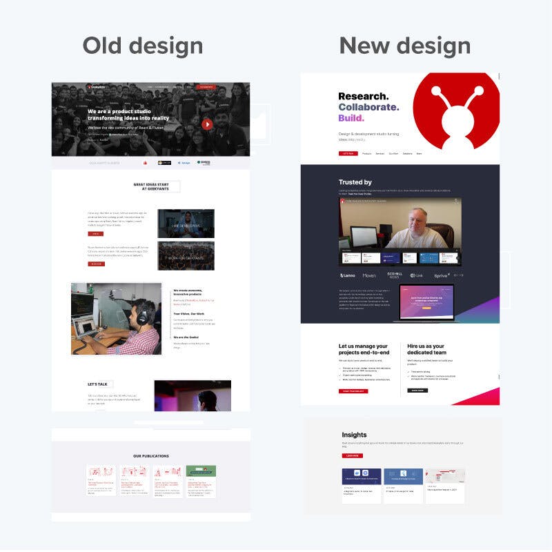
In March of 2021, we rolled out a new website as the need of the moment was to analyse ourselves and ensure that we are still staying relevant not only to the digital trends but also to our evolving goals. We believe in constant reflection in order to create products that are not only beautiful but also efficient, whether it be for ourselves or our clients, and the website revamp was an effective way to ensure that we are delivering ourselves, including our skills, products and laurels, in the best possible way. On thorough analysing of the previous website, we realised that not only does it not incorporate our values, which was when we brought in the the new slogan, but we were also of the opinion that the communication that was happening through the website wasn't satisfactory as it catered more to clients and talent rather than to the development community as a whole. We changed this up as we implemented the new website revamp strategy which projected us as a company oriented company with the latest version projecting our latest skills and our contributions towards open source. We also called attention to our work in the design community by marketing ourselves and our work in the field, as opposed to the previous layout which exclusively referred to us as a development company.
Significant Changes In The Layout
Our reason for changing up the website was to offer synergy between who we are and what we are trying to communicate and to design a website that is truly effective for which we needed to reflect and understand the kind of experience that we wanted to provide through constant user research. As the previous website, which used a different staging server, was already in existence, we followed a progressive approach to the revamp process wherein we singled out the pages that needed a facelift and worked on them one at a time with the marketing team identifying the pages that needed enhancements and the UI and design team working on these improvements. The process, which was spread over a period of four months, encapsulated thorough testing to check the viability of some new features as well as the alignment of certain components to ensure that integral information got maximum viability. Here are some of the changes that were implemented in the process:
- The landing page was given a fresh look with the slogan being the highlight of the page as we wanted to communicate who we are and our professional goals as we expand to new horizons.
- Switched up the content placement to make the website appealing as well as to provide a pleasant experience to users.
- We are a dynamic community who love experimenting with the latest tech stacks; we added information in sections like technologies and products to document our work in these areas.
- We also sought to give users an insight into our work in the development community by integrating video testimonials as well as highlighting our open source contributions and the tech conferences that we have participated in and hosted over time.
- The company’s blog as well as the case studies page needed some refinement for which we implemented filters to make it easy for users to access the required information without too much hassle.
How were designs implemented without shutting down the system?
One of the primary roadblocks that we faced as we resigned the company’s website was when we tried to implement the designs as the previous website was already functional and based on an entirely different staging system based on Bootstrap, a CSS framework. We singled out Tailwind CSS as the best tech stack for the revamp as it is a utility first CSS which offers faster and better performance. The main hassle that we encountered was in implementing the designs without shutting down the system as we were progressing through the revamp process in progressive manner, handling a single page at a time. We also observed that we had to convert some of the previous pages that had been built in Bootstrap to Tailwind as the website was becoming increasingly heavy with pages taking longer to load. We worked through this by handling tasks and setting sprints for one week at a time, where inner pages were redesigned with their layouts given a new look. Even though we ran into issues resulting in broken pages, we continued to persevere through research and innovation to attain perfection in this venture.
Conclusion
We, at GeekyAnts, are a dynamic bunch of folks who believe in researching and innovating through collaborative efforts to build up great digital solutions. Any business is a constantly changing and an ever growing entity and for this reason it is optimal to align its values along with its business strategy; the website, being a visualisation of this projection, had to be refurbished not just to incorporate the essence of the new slogan, but to show off our recently acquired skills which make us standard-bearers in the development community. The landing page which was initially rolled out received multiple accolades on Twitter, which then became the reason to redesign certain other sections. Our goal was to offer an entirely new experience for our clients and while the major hurdle was to implement these changes without shutting down the website, our determination and hold over technical skills were the moving factors that helped us sail through this.The project is now live and can now be witnessed by clicking on this link.
Dive deep into our research and insights. In our articles and blogs, we explore topics on design, how it relates to development, and impact of various trends to businesses.


