Nov 16, 2022
Affordances in UI Design
An introduction to affordances in UI design, types of affordances, and the importance of designing affordances.
Author


Book a call
Table of Contents
Introduction
Good design includes good usability. Various factors influence usability, but affordances are one of the most crucial. Affordances help you successfully interact with the world of physical and digital objects.
What are Affordances?
Affordance is a relationship between a person and a physical or digital object. An object's affordances are the actions a user can accomplish with it in line with their abilities. Learning about the possibilities of the environment in which we live is an important part of our socialization.
In his book The Design Of Everyday Things, human-computer interaction expert Don Norman sums up affordances' significance as follows: “When affordances are utilized, a user can determine what to do simply by looking; no instructions, labels, or pictures are required.”
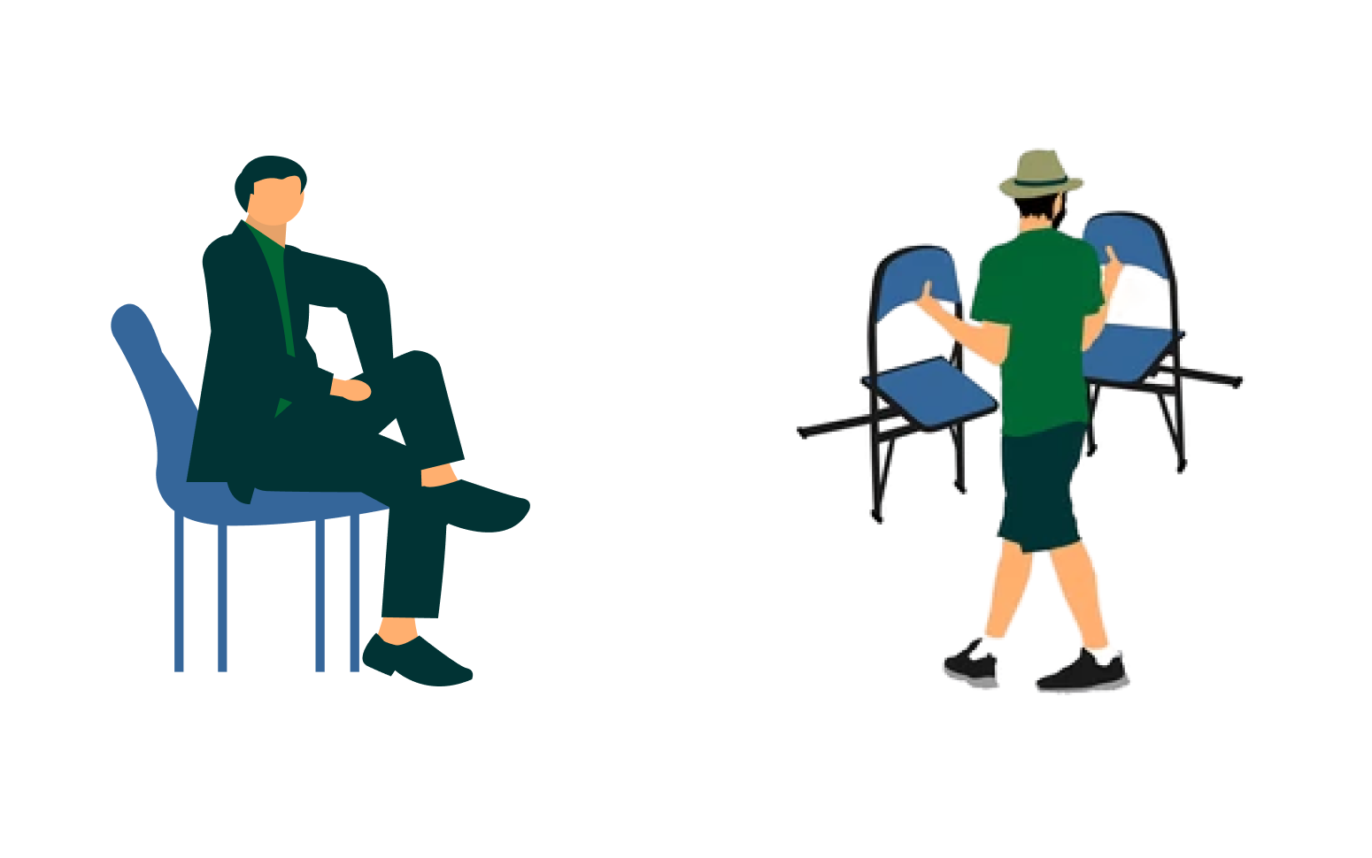
For instance, A chair affords (“is for”) support and, therefore, affords sitting. Some chairs can also be carried by people (they afford to lift them). If children or people who are comparatively weak cannot raise a chair, then for these people, the chair does not have that affordance; the chair does not afford to lift.
Affordances in UI Design 🤔
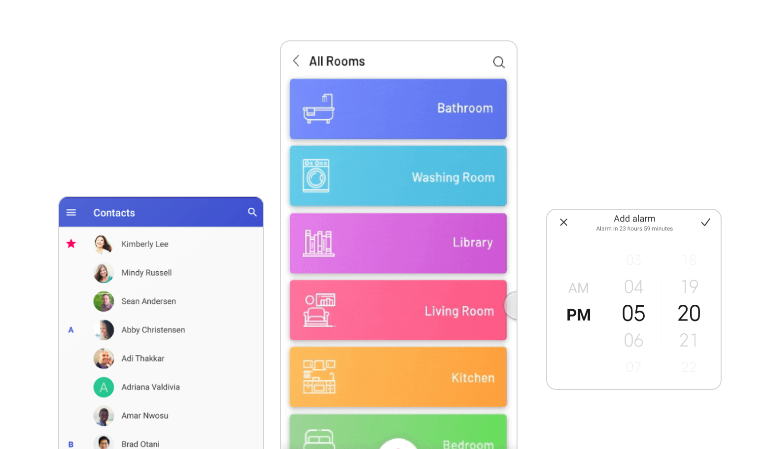
User interface (UI) affordances are perceivable, implementable possibilities. Perceived affordances are what users think they can do but could not be 100 percent accurate.
How does a user know which actions are possible? Users decide based on their expectations and previous experiences.
For example, When we see a vertical interface, we know we can use it for scrolling.
Types of Affordances
Perceivable affordances in a UI are generally categorized into:
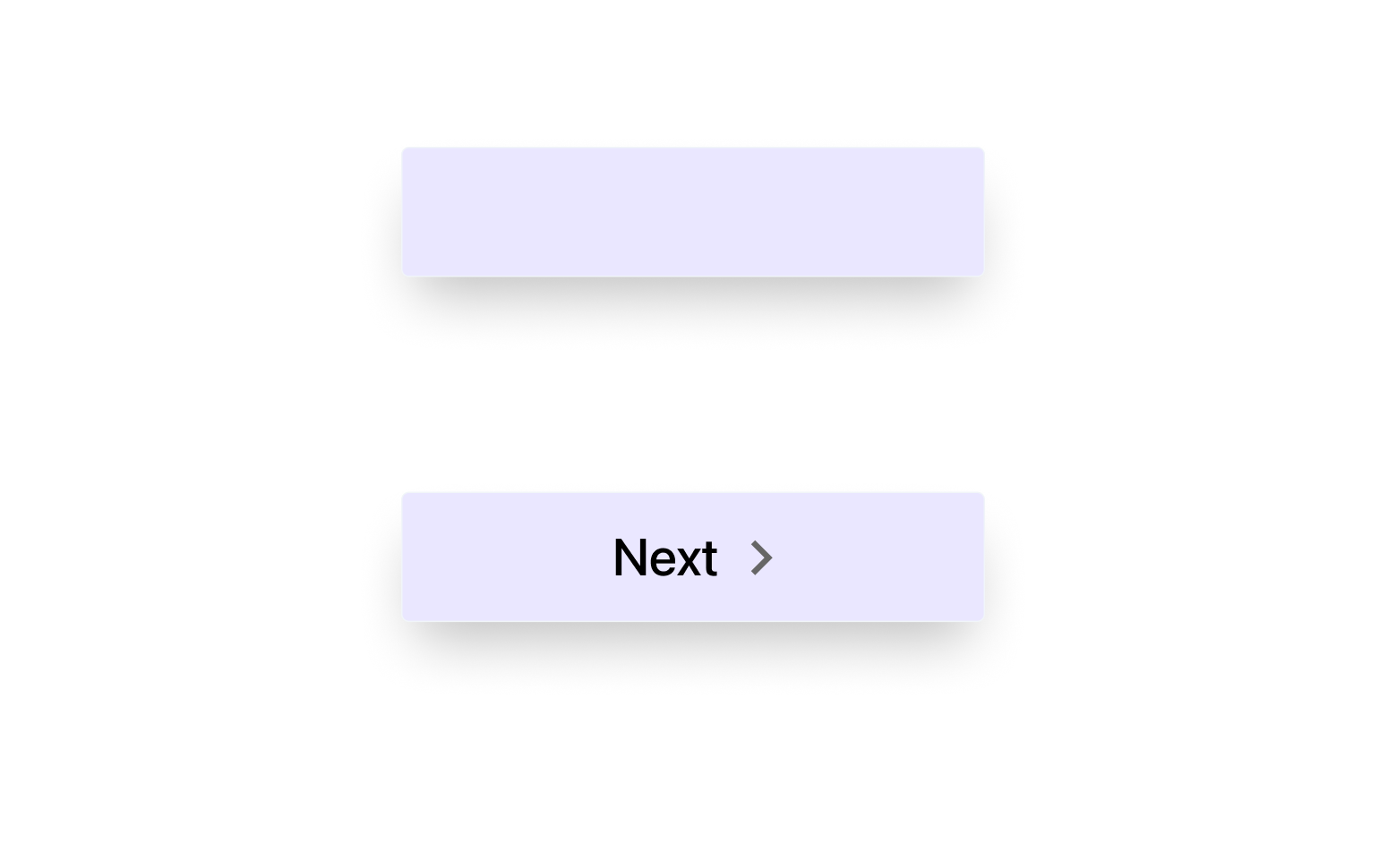
- Explicit: Characteristics of an object that are explicit and readily apparent, indicating the possible actions, are called Explicit Affordance.
For example, users believe that an object can be clicked or tapped to interact when it appears raised above the surrounding surface. Like a “Next” button below, the user guesses that the object that looks pushable invites pushing.
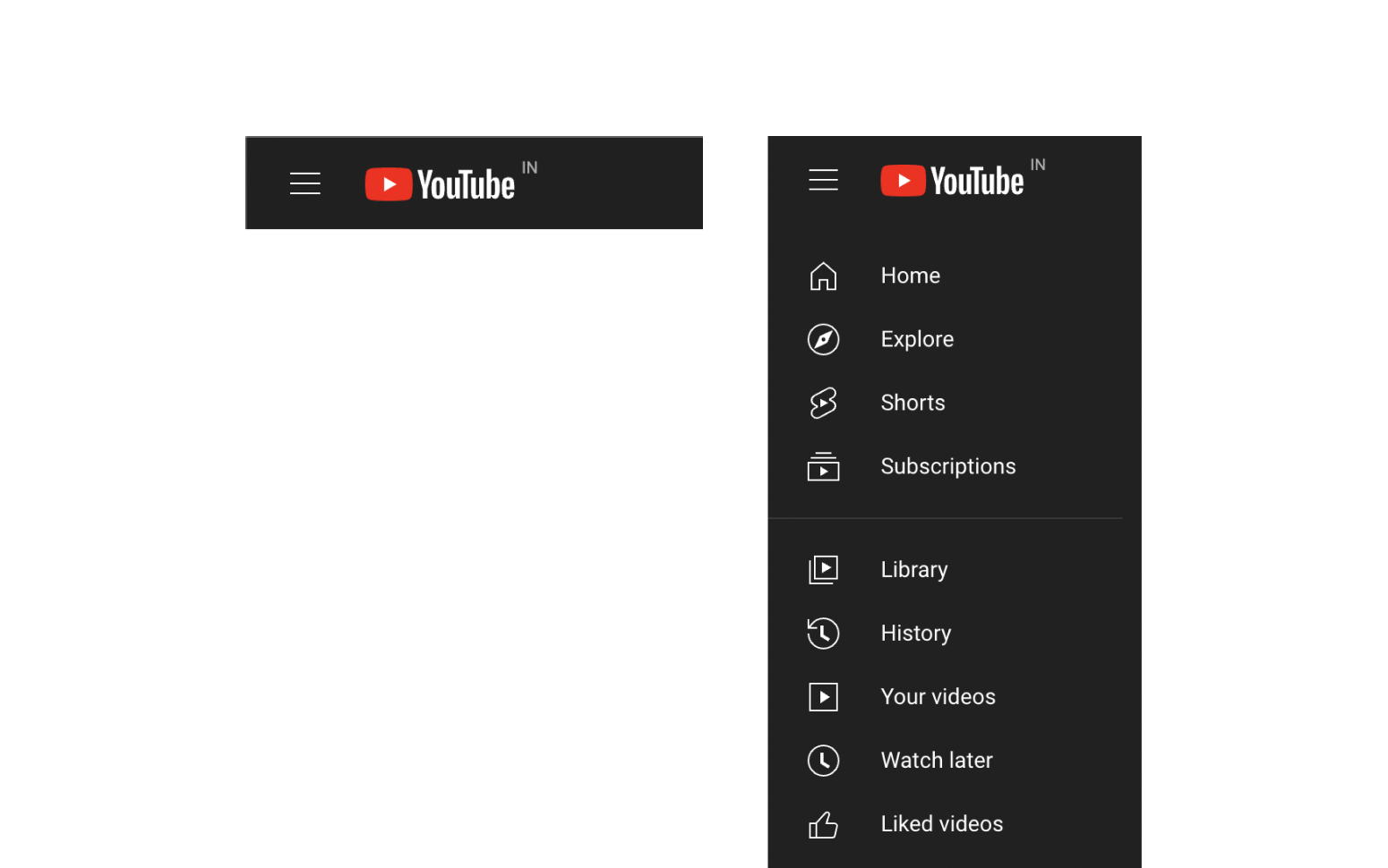
- Hidden: By default, hidden affordances are hidden and only become visible when a requirement is satisfied. It is designed because of long-standing learned behaviors. It is standard practice to employ hidden affordance in complicated products where it is impossible to make every action obvious due to UI clutter.
For example, a hamburger icon that, when clicked, displays a list of menu options.
- Negative: They inform users that a UI element currently offers no capabilities, indicating a lack of functionality or engagement.
For Example, Until you finish filling out the entire form, the button's clicking affordance is disabled.
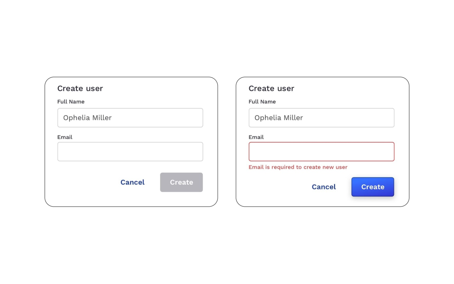
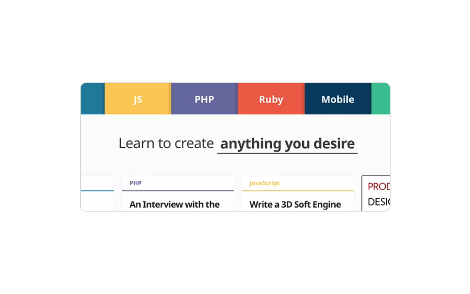
- False: They often happen by accident or take place due to the need for better design techniques, suggesting that users should do something they can't do.
For example, underlined text that looks like a link but isn’t a link
Design for Accessibility
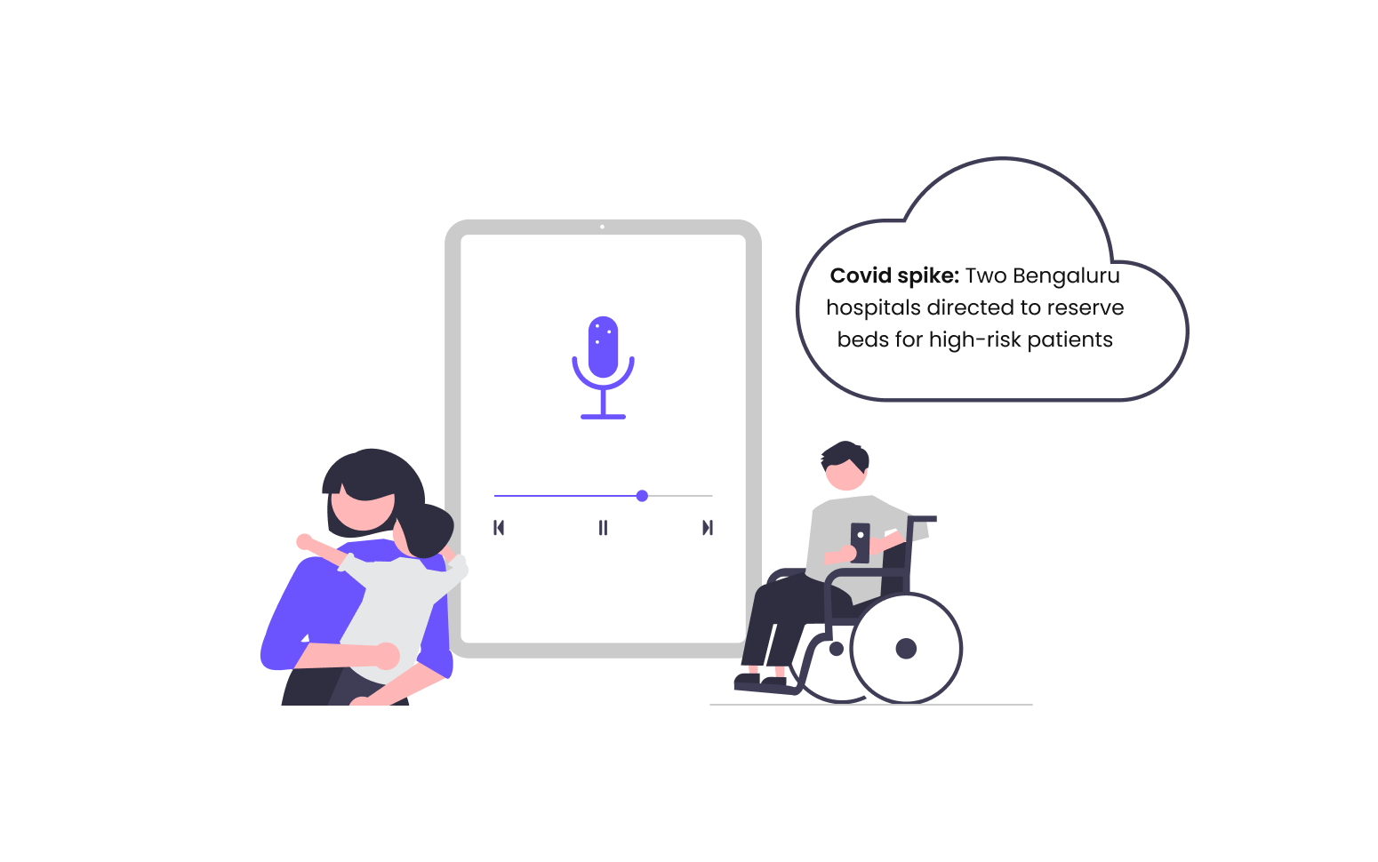
Always consider the various user capacities when designing and developing affordances, and ensure the suitable features are accessible to the right groups. For instance, If you were designing a news app, you might consider the different user abilities and include a feature that reads news aloud. This would help users who may have fewer hands to use in the kitchen or while driving, whether they carry a small child or a permanent circumstance in their life, to stay updated about what’s happening.
Problems While Designing Affordances
Even when affordance is present and readily available in design, users are now and then not directed to interact with the screen in the desired way, making them unhappy and exhausted when their progress is unnecessarily delayed. We need to provide clues by adding a piece of information that supports an affordance and communicates where the action should take place, provided by signifiers.
Conclusion
In this article, we understand the meaning, types, the importance of affordances while designing and how affordances in UI design are related to app accessibility.
Read our next blog to understand how signifiers solve this problem- “Signifiers in Design”.
Related Articles.
More from the engineering frontline.
Dive deep into our research and insights on design, development, and the impact of various trends to businesses.

Apr 24, 2026
RAG vs Fine-Tuning vs AI Agents: Which Architecture Fits Your Use Case
RAG, Fine-Tuning, or AI Agents? Use a proven decision framework to choose the right architecture for accuracy, cost control, and real outcomes.

Apr 24, 2026
How to Build a HIPAA-Ready AI Healthcare Product Without Slowing Delivery
AI healthcare products miss compliance reviews because of deferred decisions and poor architecture. This blog walks engineering leaders, product managers, and founders through practical patterns that keep delivery fast and compliance built in from the start.

Apr 23, 2026
Your AI Works in the Demo. It Will Not Survive Production Without Preparation
Why AI prototypes fail before reaching production, and the six readiness factors that determine whether they scale successfully.