
In the ever-evolving landscape of app development, creating a cohesive and accessible user interface is more critical than ever. gluestack-ui for Flutter, inspired by it predecessor gluestack-ui, is not just a toolkit but a revolution in creating Flutter design systems with unmatched ease and simplicity.
Why gluestack-ui for Flutter?
gluestack-ui for Flutter is designed to bridge the gap between the need for a consistent design language and the flexibility required for modern app development. It offers a set of customizable, accessible, and responsive widgets that can be easily integrated into Flutter applications. The motivation behind gluestack-ui is to provide developers with a toolkit that not only simplifies UI development but also helps develop a design system that is adaptable, consistent, and aligned with your brand vision.
How Can gluestack-ui Help You?
With gluestack-ui for Flutter, you can easily define a design system for your Flutter apps. It provides a UI library with customizable props for each widget, allowing you to tailor its appearance and behavior to your specific needs. By using JSON for style configurations, you are enabling a more declarative and consistent approach to UI design. Need more than that? Use our style prop which takes in a GSStyle object and has support for tons of inline styling options. You can check out the ever-expanding list of widget components that gluestack-ui supports here.
Key Features of gluestack-ui for Flutter
- Customizable Widgets: Each widget in gluestack-ui comes with a set of customizable properties, allowing developers to tailor the appearance and behavior of components to their specific needs.
- Declarative and Dynamic Styling: Utilizing JSON for style configurations enables a more declarative approach to UI design, making it easier to change styles dynamically or load them from external sources.
- Web-Focus: Optimized for web experiences, gluestack-ui offers components and styles that are responsive and optimized for desktop interaction and layout, including responsive design, mouse hover interactions, and web-specific UI patterns.
- Flexibility for Developers: Inline style overrides provide developers with the flexibility to customize components on a case-by-case basis without altering the JSON configuration for minor tweaks.
- Responsive Design: Built with modern web design principles, gluestack-ui widgets are fully responsive, ensuring seamless performance across a wide range of device platforms and screen sizes.
- Well-Documented: Comprehensive documentation for each widget, including a list of properties and examples, will help developers to get up and running easily.
- Easy to Use: Designed to be easy to integrate into existing Flutter applications, gluestack-ui requires minimal setup and configuration.
- Independent from Material Design Standards: By embracing independence from Material Design, gluestack-ui grants developers the freedom to craft UI components tailored to their application's unique needs and branding, potentially enhancing user experiences and reducing resource consumption.
Building Your First App with gluestack-ui
Let us translate theory into practice by creating a simple yet stunning app. Starting with the installation of gluestack-ui in your Flutter project, you will experience firsthand the ease of bringing your design vision to life.
To get started with gluestack-ui for Flutter, you need to add it to your project’s dependencies.
Install the Package
Simply run the following command in your terminal from project directory:
flutter pub add gluestack_ui
Or, you can do the same by adding the following to your pubspec.yaml file:
dependencies:
 gluestack_ui: 0.1.0-beta.2
Or, for the latest development version:
dependencies:
 gluestack_ui:
    git: https://github.com/gluestack/gluestack-ui-flutter.git
Import the Package
After adding the dependency, import gluestack-ui into your Flutter app:
import 'package:gluestack_ui/gluestack_ui.dart';
Congratulations, you have now successfully included gluestack-ui for Flutter in your project!
Let's Get Building
Let us imagine that we are making an app that follows the design system of a certain well-known music streaming app. The goal is to make such a button:

In a normal Flutter app, since we are following a design system, we would try to make a reusable component of button that takes two parameters, namely, an icon and a text as child for the button.
The child widget of such a button may be declared so:
//Child component of the button
class ButtonChild extends StatelessWidget {
  final IconData icon;
  final String text;
  const ButtonChild({super.key, required this.icon, required this.text});

  @override
  Widget build(BuildContext context) {
    //Row - to have 2 children side by side in y axis.
    return Row(
      mainAxisSize: MainAxisSize.min,
      children: [
        //Icon for the button
        Icon(icon),
        const SizedBox(
          width: 5,
        ),
        //Text for the button
        Text(
          text.toUpperCase(), //Converting it to uppercase
          //A sample text style for the button text
          style: const TextStyle(fontSize: 16, fontWeight: FontWeight.w700),
        ),
      ],
    );
  }
}
Now for the button itself, it may end up looking something like below:
          ElevatedButton(
                onPressed: () {},
                style: ElevatedButton.styleFrom(
                  backgroundColor: const Color(0xff1DB954),
                  foregroundColor:
                      Colors.black, // For black text in foreground
                  shape: RoundedRectangleBorder(
                    borderRadius: BorderRadius.circular(20),
                  ),
                  padding:
                      const EdgeInsets.symmetric(horizontal: 30, vertical: 15),
                ),
                child: const ButtonChild(
                  icon: Icons.play_arrow,
                  text: 'play',
                ),
              ),
Now since we know that all the buttons are supposed to follow a similar design, we would try to have some customizable props exposed for much needed configuration at times for this reusable component, along with configuring ThemeData to get the general look of the Design System down in our app. But what if there was a better way? In general, creating custom components for an app takes takes precious time and initially developers would spend time in the first phase of project planning and developing these custom components. But I ask of you again, what if there was a better way ?
This is where magic of gluestack-ui comes into play. Let us take same component as above, but now, the app is developed with gluestack-ui in the picture. Here are the basic general steps that you would need apart from getting the package installed in the project.
Use GSApp as the Entry Point of the App
import 'package:flutter/widgets.dart';
import 'package:gluestack_ui/gluestack_ui.dart';
import 'package:gs_showcase/homepage.dart';

void main() {
  runApp(const MainApp());
}

class MainApp extends StatefulWidget {
  const MainApp({super.key});

  @override
  State<MainApp> createState() => _MainAppState();
}

class _MainAppState extends State<MainApp> {
  @override
  Widget build(BuildContext context) {
   // Use GSApp as entery point!
    return const GSApp(
      debugShowCheckedModeBanner: false,
      home: HomePage(),
    );
  }
}
Wrap the Entire Thing with GluestackProvider
class _MainAppState extends State<MainApp> {
  @override
  Widget build(BuildContext context) {
    return GluestackProvider(
     //Insert GluestackProvider as parent of GSApp
      child: const GSApp(
        debugShowCheckedModeBanner: false,
        home: HomePage(),
      ),
    );
  }
}
We are done with the base setup. Now, we can start tapping into the prowess of gluestack-ui!
Let us recreate the same button using GSButton [trivia: GS -> GlueStack] that gluestack-ui for Flutter provides and provide the above made ButtonChild to it as its child widget. The code would look something like this:
    GSButton(
          onPressed: () {},
          child: const ButtonChild(
            icon: Icons.play_arrow,
            text: 'play',
          ),
        ),
But hey, what is this? The button does not look like what we are trying to make, it looks something like this:
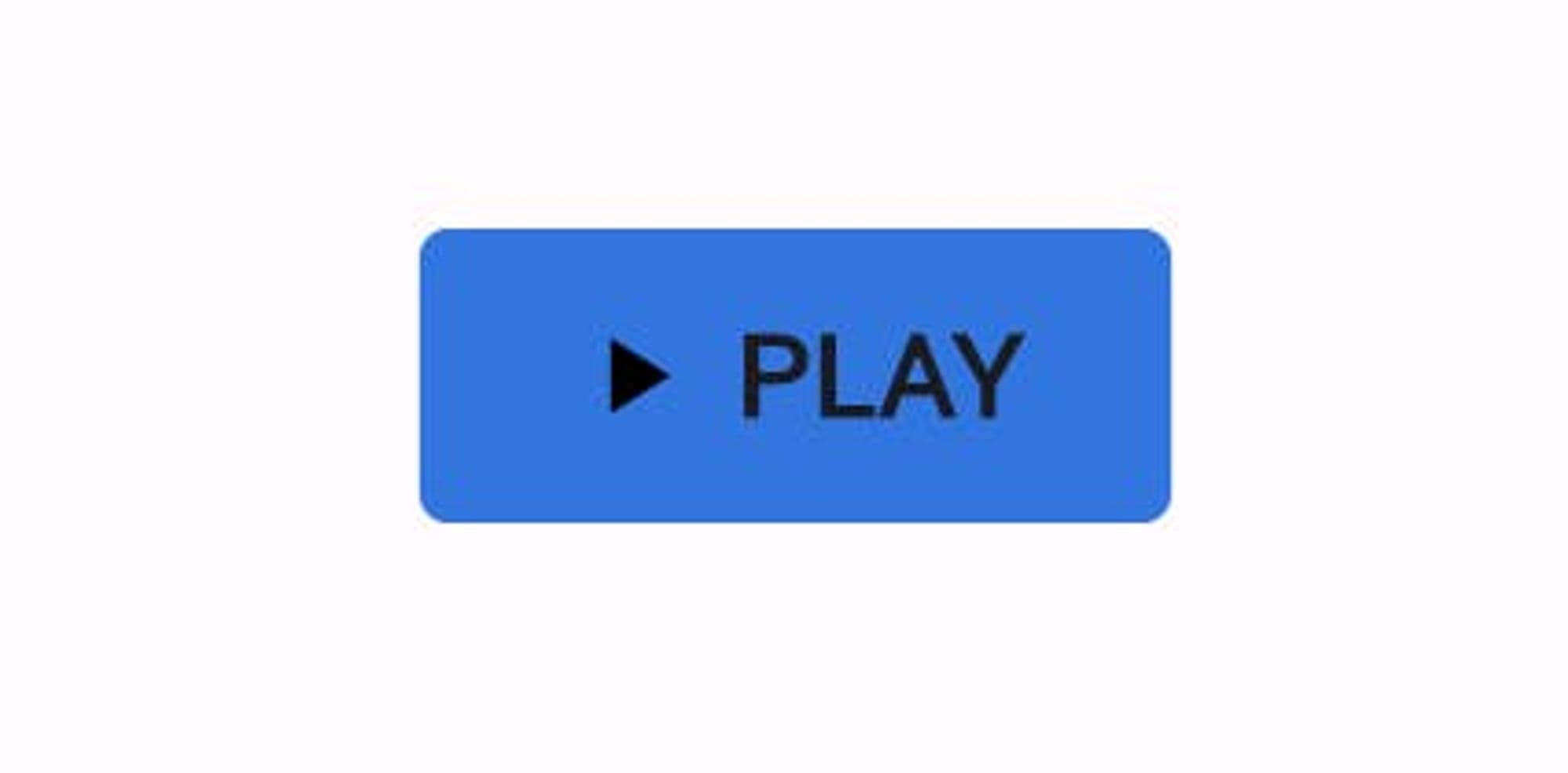
This is because we only have GSButton a UI component in place from gluestack-ui. We have not told it what sort of design system we are following yet. To do so, first let us see the default config file for GSButton, available here.
What's a config? Configs are basically JSON files that gluestack-ui uses in the form of Map<String, dynamic> type in Flutter, to give a default styling to the components like GSButton, GSText, etc. that are available under gluestack-ui for Flutter. With proper tools, one can export these config files directly from Figma and use them in their app directly!As we can see, there are props like border and color that we need to configure to match the Design System we are following.
{
  'borderRadius': '\$sm',
  'backgroundColor': '\$primary500',
   ...
}
Let us refer to tokens information available here (especially at bottom $GSRadii) or from Github to choose our border radius from the available values. Let us go with full for now.
What about the color? Thanks to prowess of gluestack-ui, we could either think of modifying the backgroundColor in the config (via GluestackProvider, not in the file directly) or we could define primary color at entire app level, which makes more sense to do here as lots of other components will be using this. Here is how we can do so:
GluestackProvider(
      gluestackCustomConfig: GluestackCustomConfig(
        //Injecting custom config JSON for button to modify it's radius
        button: {
          'borderRadius': '\$full',
        },
      ),
      gluestackTokenConfig: GluestackTokenConfig(
        //Modyfying primary color tokens to be generated from our
        //specified base color instead of default
        gsColorsToken: const GSColorsToken(
          primaryColorsFromBase: Color(0xff1DB954),
        ),
      ),
      child: const GSApp(
        debugShowCheckedModeBanner: false,
        home: HomePage(),
      ),
    );
We just made two changes, one in config and one in token, but we got the same result:
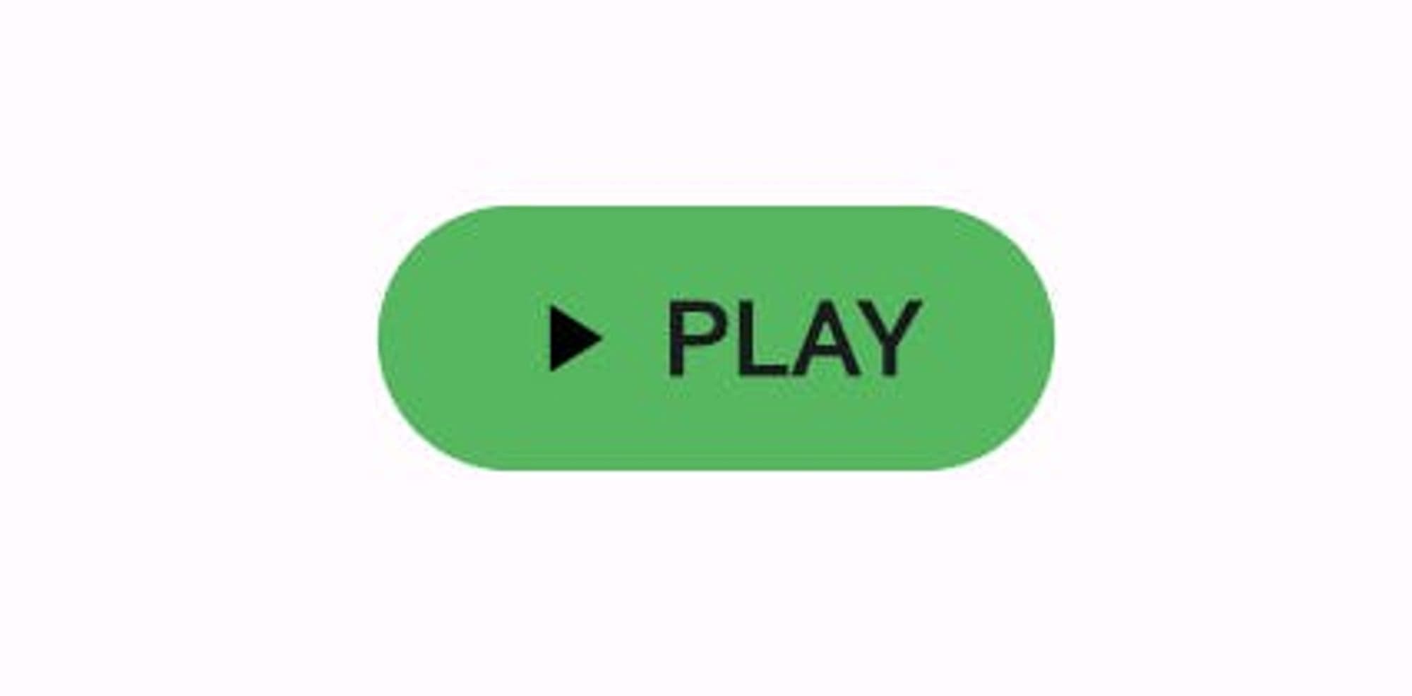
And this would be consistently applied to all other GSButton and gluestack-ui Flutter widgets! But that is not all. We can do some more fancy stuff thanks to GSStyle that gluestack-ui exposes. Let's say when we hover the mouse on the GSbutton we want button to get a bit expanded as a visual cue of hovering. We can do so by:
    GSButton(
          onPressed: () {},
          style: GSStyle(
            //Giving padding and increasing height on hover
            onHover: GSStyle(
              padding: const EdgeInsets.symmetric(horizontal: 25),
              height: 50,
            ),
          ),
          child: const ButtonChild(
            icon: Icons.play_arrow,
            text: 'play',
          ),
        ),
Resulting UI:
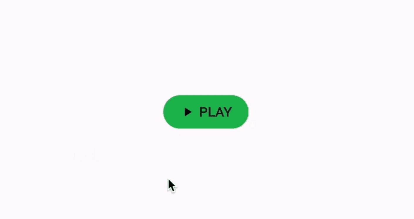
Because onHover and other parameters that can be used as triggers accept GSStyle object as input, we can modify all possible props available in GSStyle such as padding, color, etc. to be applied when the onHover trigger is executed. Similarly, we also have triggers for screen break points, platforms, etc. This opens up tons of possibilities for powerful customization with minimal efforts.
To drive the point in further, here is a simple snippet for a GSButton that would change it's background color on the basis of platform - web, iOS, hover state and md screen break point.
        GSButton(
          action: GSButtonActions.negative,
          variant: GSButtonVariants.solid,
          size: GSButtonSizes.$lg,
          onPressed: () {},
          style: GSStyle(
            web: GSStyle(
              bg: $GSColors.amber600,
            ),
            ios: GSStyle(
              bg: $GSColors.pink600,
            ),
            onHover: GSStyle(
              bg: $GSColors.green400,
            ),
            md: GSStyle(
              bg: $GSColors.pink400,
            ),
          ),
          child: const GSButtonText(text: "Click Here"),
        ),
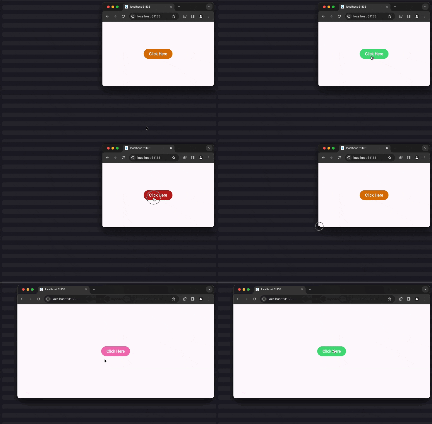
Let's Build More
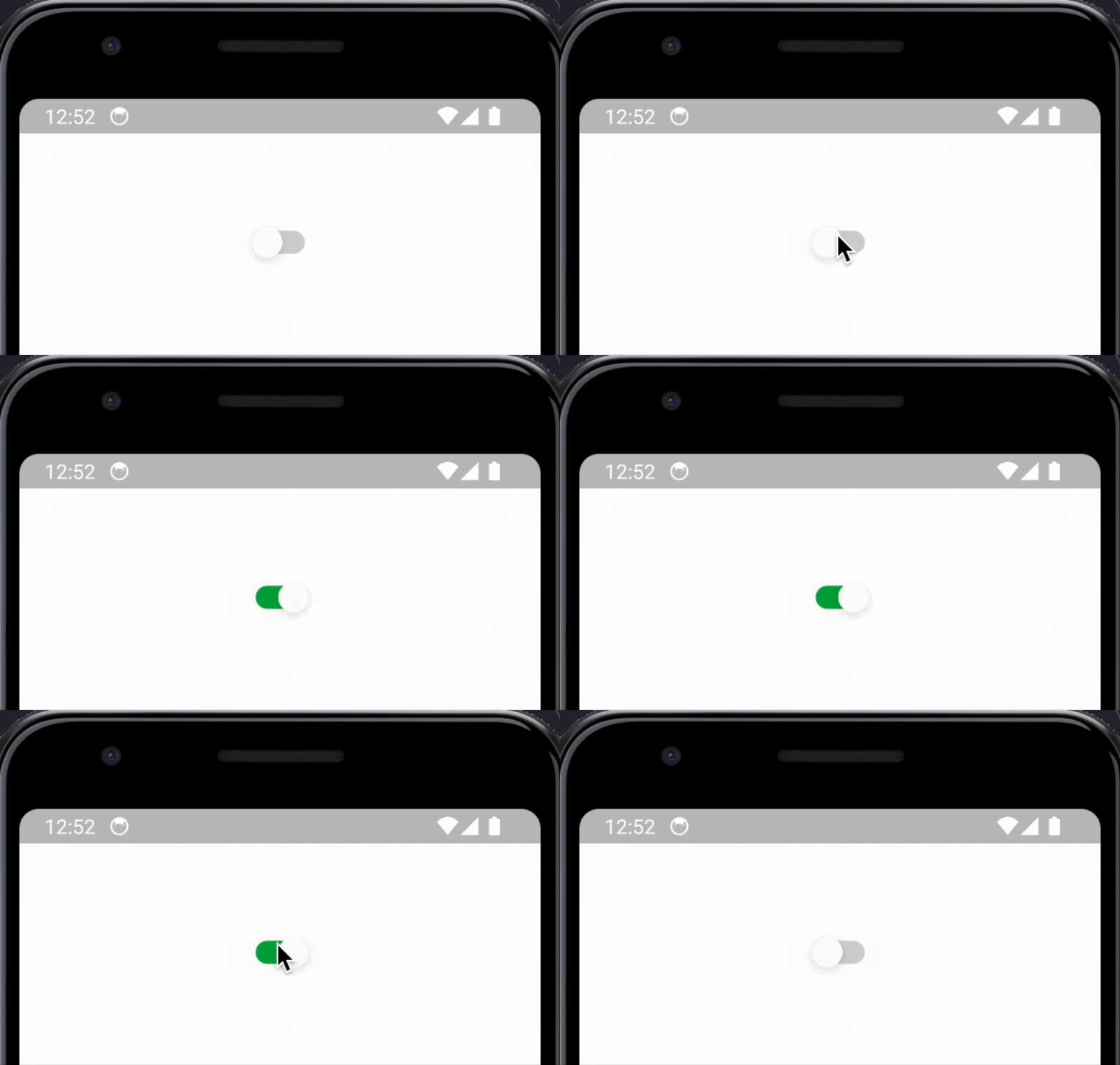
Switch - Let us say we want a basic Switch, which is aligned with our design system. Since we have declared our primary colors inside GluestackProvider. We can simply depend upon GSSwitch to create a Switch component aligned with our design language like so:
    GSSwitch(
          size: GSSwitchSizes.$md,
          onToggle: (bool value) {},
        ),
The output for the above looks like this:
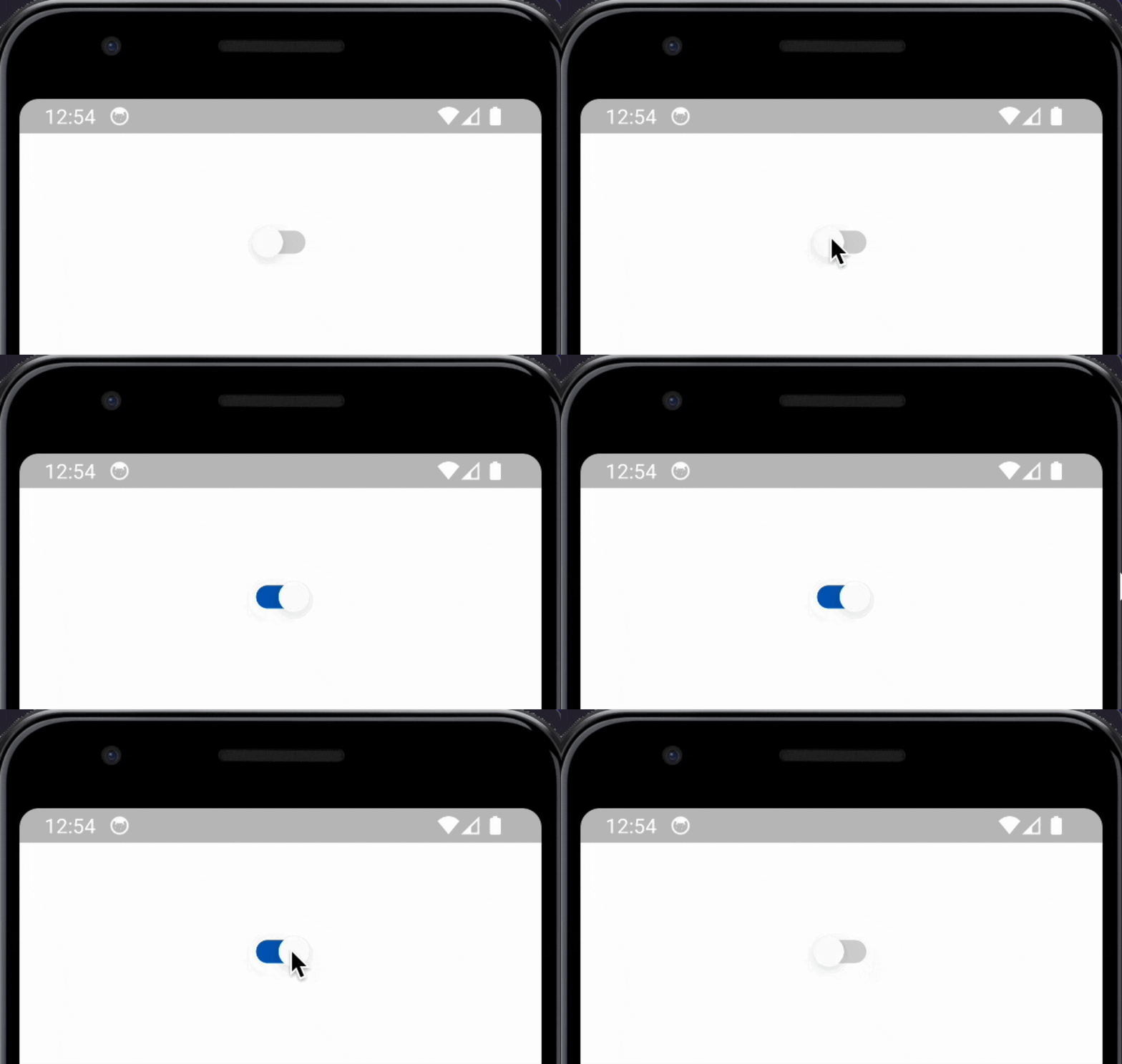
For reference, this is how the output would have looked if we had not specified any custom config or customized token:
Easy and simple, right? Let's take on something a bit complex.
Let's Build Some More
Creating an Accordion can be a pain point to developers. With gluestack-ui though, you can simply depend upon GSAccordion to build one. It accepts an array of GSAccordionItem widget children which in turn take title and the content that needs to be displayed. The code for the above will look like this:
      GSAccordion(
        children: [
          GSAccordionItem(
            title: GSAccordionTitle(text: 'How do I place an order?'),
            content: GSAccordionContent(
              text:
                  "To place an order, simply select the products you want, proceed to checkout, provide shipping and payment information, and finalize your purchase.",
            ),
          ),
          GSAccordionItem(
            title:
                GSAccordionTitle(text: 'What payment options do you accept?'),
            content: GSAccordionContent(
              text:
                  "We accept all major credit cards, including Visa, Mastercard, and American Express. We also support payments through PayPal.",
            ),
          ),
            ],
        )
Output so far:
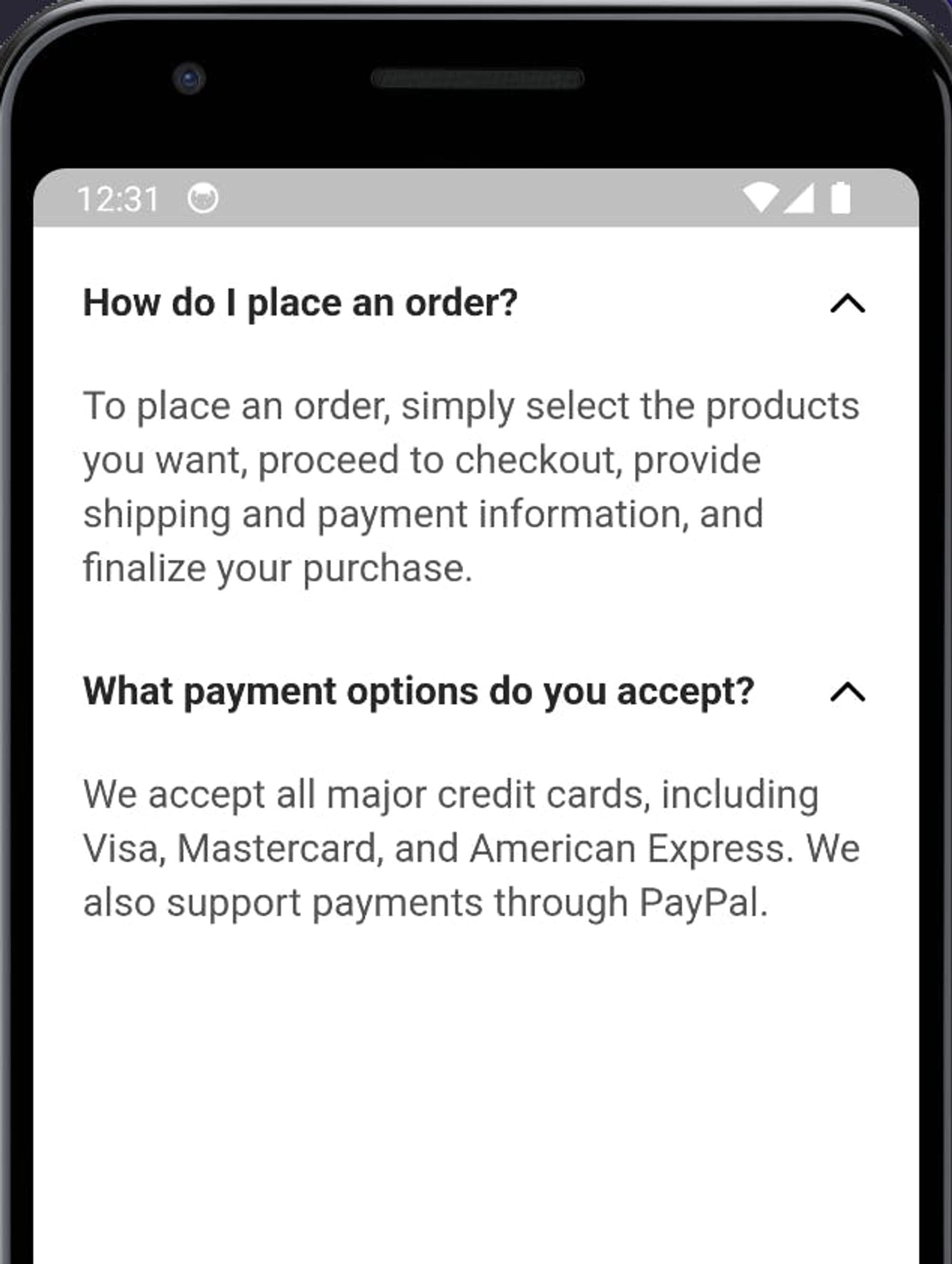
Now, let us say the requirement is to have the heading text have a thinner, normal weight instead of the current default of it having bold weight.
We can make do with inline styling, but that is not the recommended approach. Since name of the game is consistent styling through out the app, gluestack-ui recommends that we make our changes by modifying tokens and config in the GluestackProvider. But to do, first we would need to refer Accordion's default config to understand what we need to modify, available here.
We can see that there is something called, fontWeight defined. We can infer that must be controlling font weight of some text, but we also notice that it is defined, multiple times under _titleText and the _contentText . Since the goal is to change the title text, let us focus there. We can see where it is defined to get a bit more idea. We can see that fontWeight for _titleText is declared in multiple places, inside of sm, md ,lg under size under vairant.
  "variants": {
    "size": {
      "sm": {
        "_titleText": {
          "fontSize": "\$sm",
          "fontFamily": "\$body",
          "fontWeight": "\$bold",
          "lineHeight": "\$sm"
        },
        "_contentText": {
          "fontSize": "\$sm",
          "fontFamily": "\$body",
          "fontWeight": "\$normal",
          "lineHeight": "\$sm"
        }
      },
      "md": {
        "_titleText": {
          "fontSize": "\$md",
          "fontFamily": "\$body",
          "fontWeight": "\$bold",
          "lineHeight": "\$md"
        },
        //... other objects
      },
       //.... other size variants
      }
    },
Based on the above, we can infer that base config takes defines multiple size variants, namely, sm, md, lg which define config for title text and content text of the GSAccordion widget. We can simply change the fontWeight value for the title text (_titleText) value for the specific size, if we wish, or all instances of fontWeight to be normal. How did we know that we wanted declaring normal is allowed? We referred the default text tokens defined for gluestack-ui, available here, to know what values are allowed in the config. Do not change the base config files directly, unless you know what you're really doing! Generally, the safer option is to create a Map with variants and other config keys and values that we want to change or override, for our case since we want to override, fontWeight inside size inside variants. Our config map would look like this:
{
          "variants": {
            "size": {
              "sm": {
                "_titleText": {
                  "fontWeight": "\$normal",
                },
              },
              "md": {
                "_titleText": {
                  "fontWeight": "\$normal",
                },
              },
              "lg": {
                "_titleText": {
                  "fontWeight": "\$normal",
                },
              }
            },
          },
 },
Now all that remains is to provide this value to the GluestackProvider, which would signify that we wish to override these keys and values present in the base Accordion config file. We can do this by:
GluestackProvider(
      gluestackCustomConfig: GluestackCustomConfig(
        // Injecting custom config JSON for GSAccordion
        // to modify it's fontWeight
        accordion: {
          "variants": {
            "size": {
              "sm": {
                "_titleText": {
                  "fontWeight": "\$normal",
                },
              },
              "md": {
                "_titleText": {
                  "fontWeight": "\$normal",
                },
              },
              "lg": {
                "_titleText": {
                  "fontWeight": "\$normal",
                },
              }
            },
          },
        },
      ),

      child: const GSApp(
        debugShowCheckedModeBanner: false,
        home: HomePage(),
      ),
    );
Which results in:
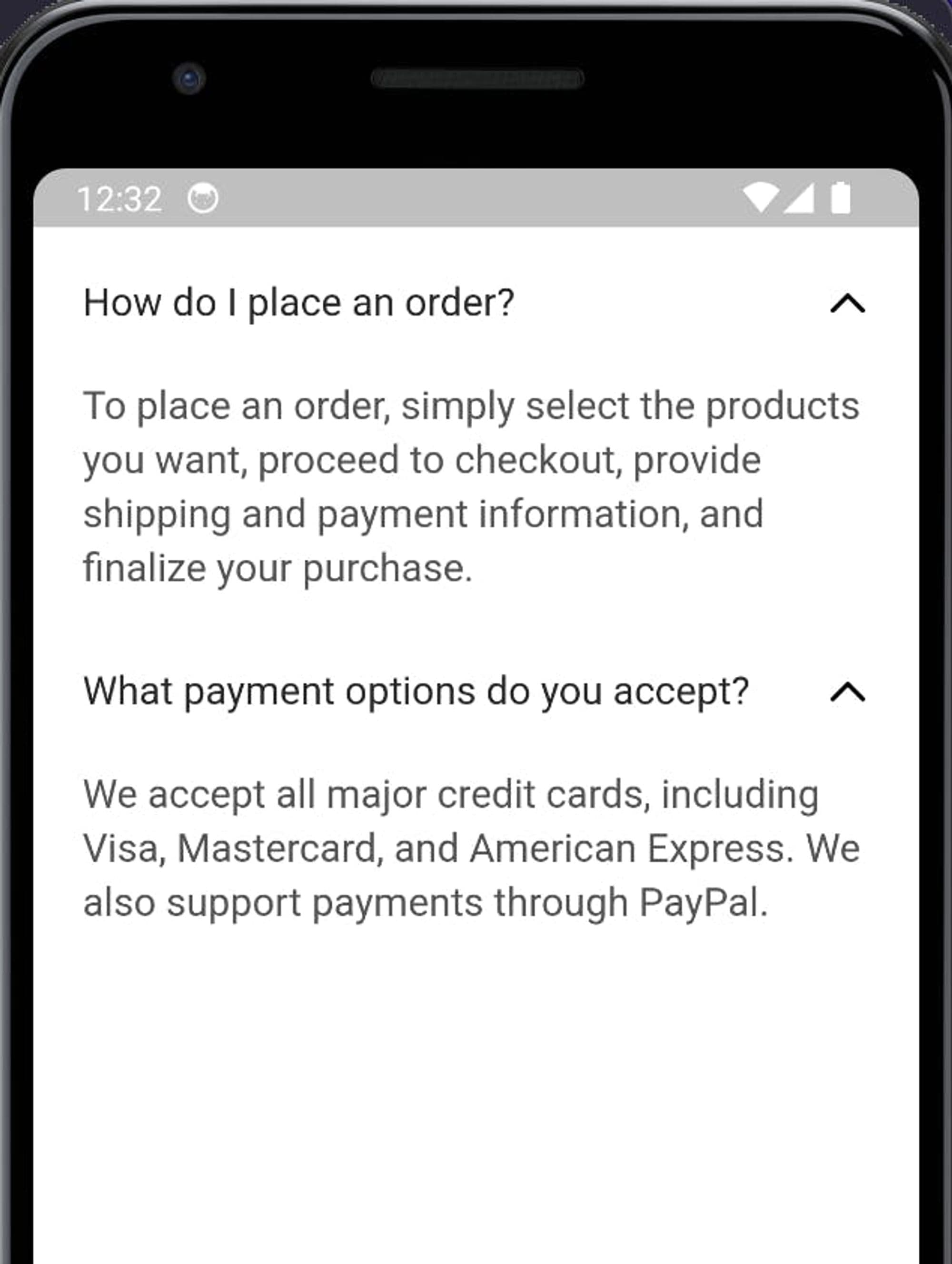
Which means that our requirement of normal font for heading of GSAccordion has been met. Nice.
You can checkout the code for all that we have done in this section in this GitHub repository.
For more info about GSAccordion and other widgets, visit Flutter's gluestack-ui docs, available here.
Showcase and Demos
Checkout the Kitchensink interactive web app, created entirely by using gluestack-ui for Flutter. Demo here.
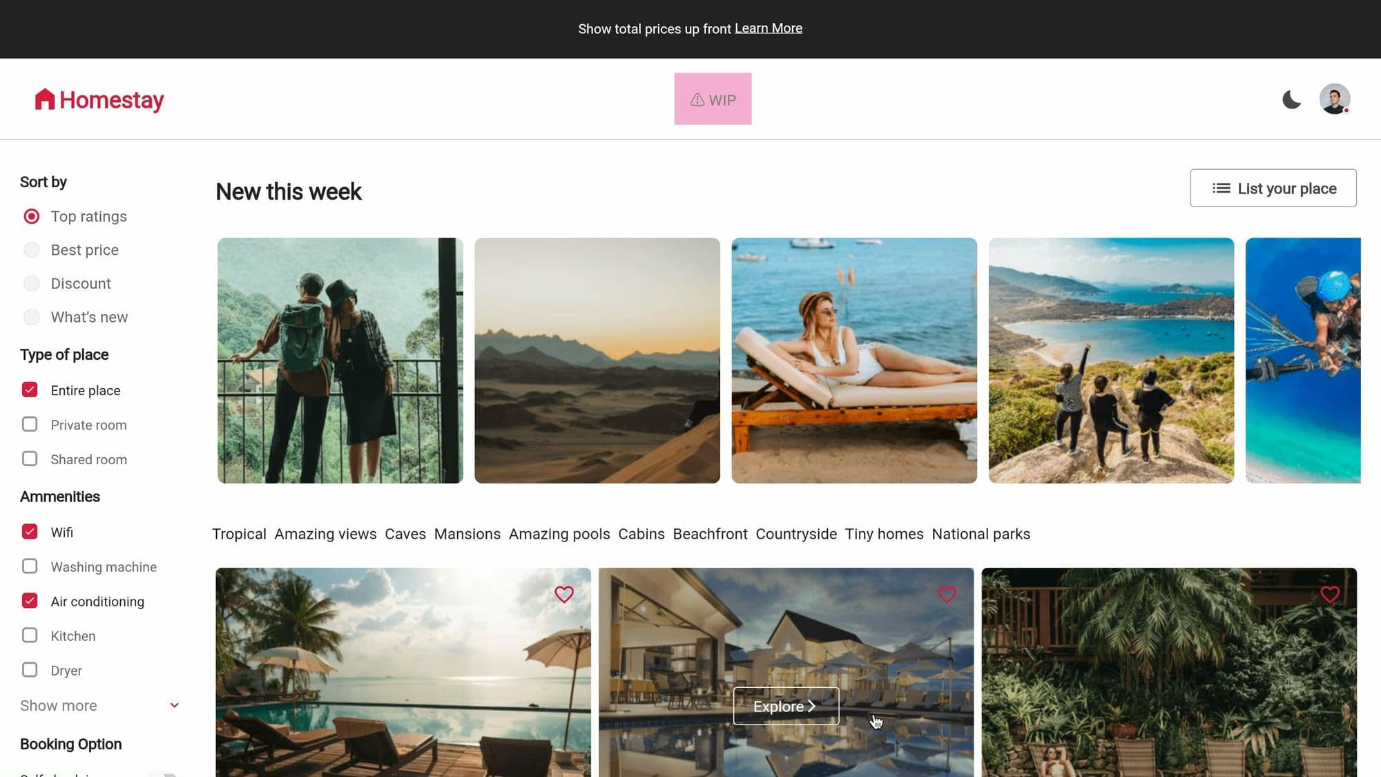
Or, checkout all the components, tokens, docs, etc. from gluestack-ui for Flutter's homepage, or click here.
Want to dive deeper and learn how things are working under the hood? Checkout gluestack-ui for Flutter's GitHub repository, available here. To stay updated with the most recent advancements, keep an eye out for updates in the development branch.
Conclusion
As we conclude this exploration, remember that whether you are a seasoned Flutter developer or just starting out, gluestack-ui for Flutter is a tool that can significantly enhance your development workflow and the quality of your applications which your users love while ensuring that your apps follow a consistent design language envisioned by you or the design system you are following.
gluestack-ui for Flutter is more than just a tool. It is a companion in your journey to build apps that show your brand and presence in the digital realm. With every widget you place and every style you define, you are not just coding, but creating experiences that will echo in this realm for years to come.
Stay tuned for more updates and features from gluestack-ui for Flutter, and join the community to contribute and get support.