
With every new year comes a series of new trends that influence the majority of design that comes along online or on mobile. Like Duotones and Bold Typography in 2018 and Buxom Serifs and gradients in 2019 that defined the way artists in tech expressed themselves and created an impact on consumers, 2020 has its own set of weapons in its arsenal that are coming to light as the year goes on.
We understand that tech and design go hand in hand and it is the visual appeal that draws people in more than the underlying technology used to create that experience, which is why we always try to stay up and close with the latest design trends in the market and implement them as much as we can in the apps that we build (gotta stay relevant, right?). In the spirit of that, we shall look at some of those design styles and the impact that they will have on the designs that we shall use as the current year progresses:
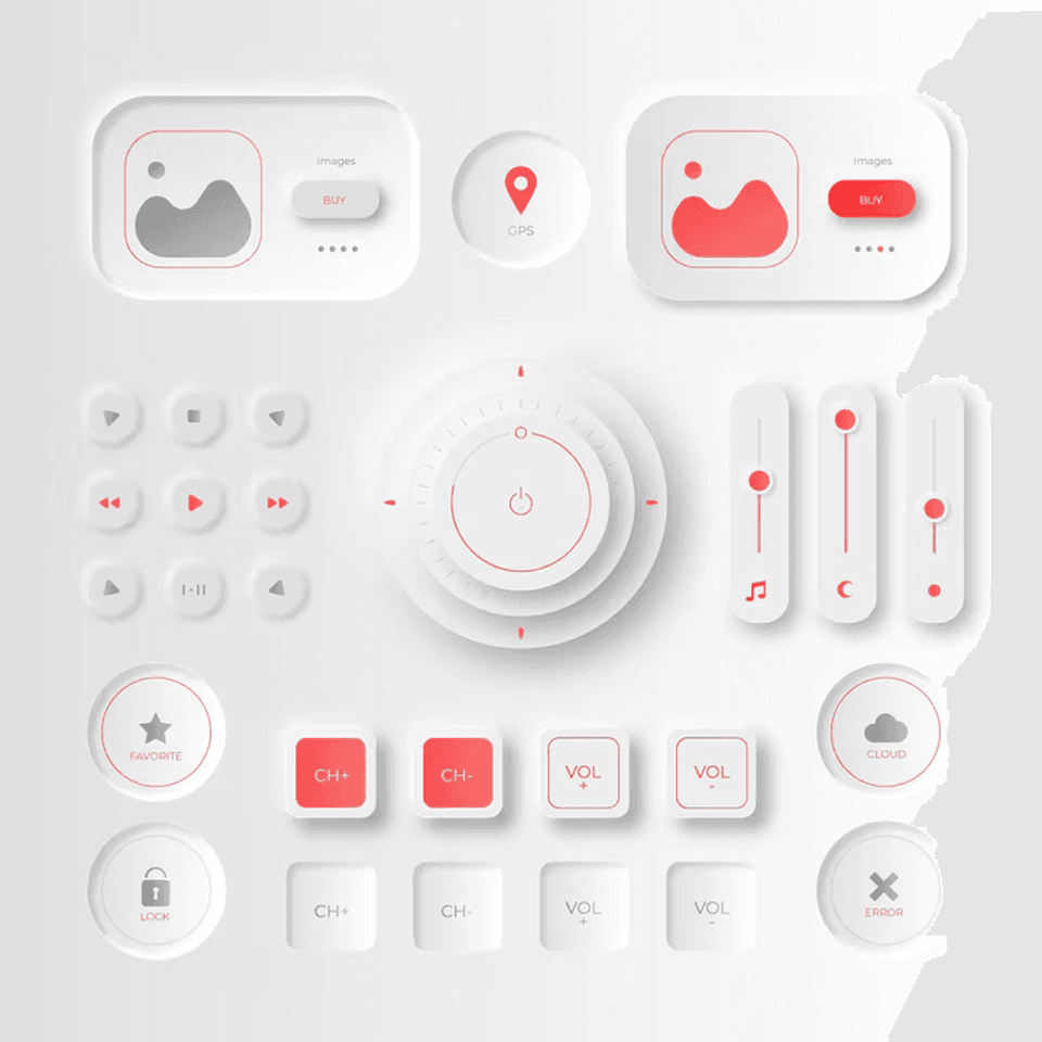
Neumorphism
Based on the famous ‘Skeuomorphism’ principles, Neumorphism, much like its predecessor, derives its inspiration from real like objects, but with the added goodness of the ‘flat’ style of UI design. The ‘Neumorphic’ components tend to have a light or dark shadow beneath them, which gives them an effect of being pushed out through the display.
The one thing that brings Neumorphism to the top of the list is the degree of ‘freshness’ it brings on top of the existing design styles by tweaking what has existed for quite some time. A mere addition to mimicking real like objects in UI design is the next big step towards that direction.
3D Depth
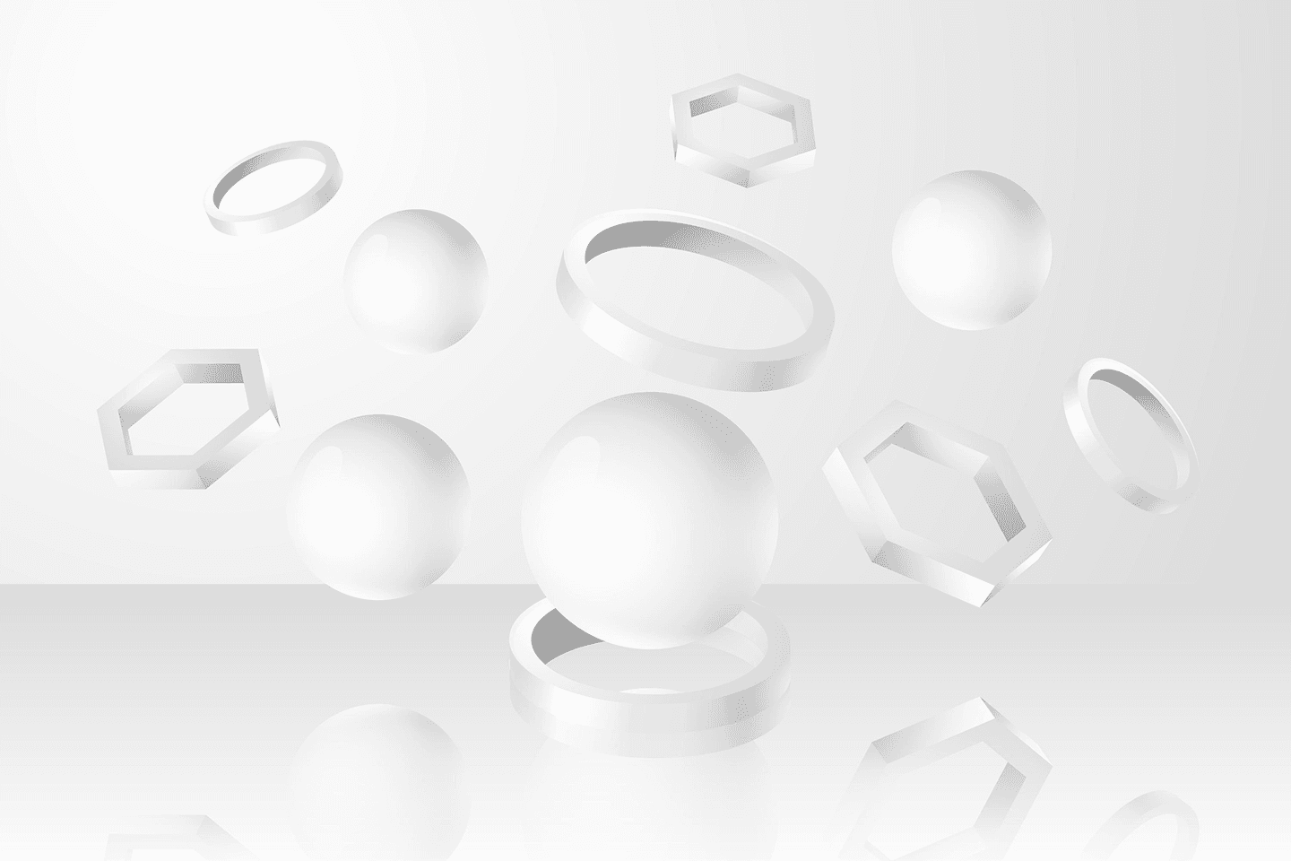
One of the underlying principles of Neumorphism bleeds into the fact that it brings a sense of depth and realism to make it represent real life entities in the closest fashion, and with the current software advancements and capabilities, 3D has found new heights to scale, which clearly means that it is not going anywhere.
Now, 3D elements have also found their way into mobile and web apps and are proving to be just as enriching. Imagine showcasing a product on the web with a complete 360 degree model which is also interactable. Now imagine cube based navigations in a mobile app that move like a cube in a 3D space. The work that is required to be put in creating such an experience is a lot, but it is very rewarding.
Dark Mode
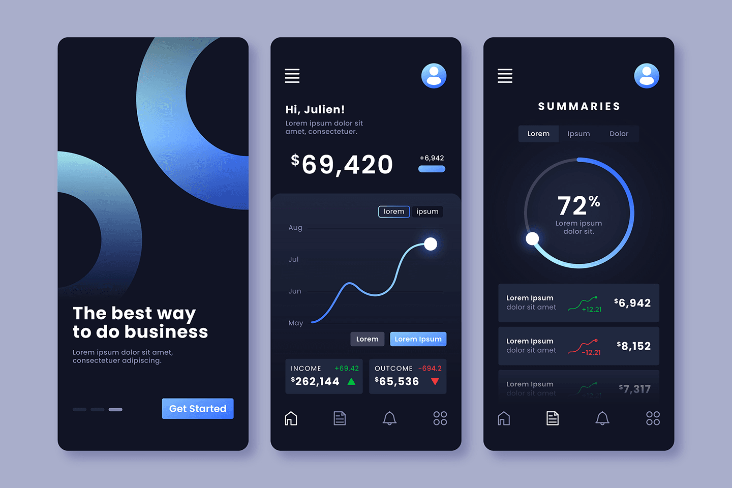
Everyone is going absolutely insane over ‘Dark Mode’ these past couple of months and virtually every app is rolling out a ‘Dark’ version of their UI. There is the technical benefit of dark mode greatly reducing battery consumption in mobile phones today (OLED screens anyone?) but the main reason why it is receiving such popularity is how it makes the entire user experience so relaxing. With habits of reading or browsing at night, dark mode has become the ideal go to style today.
Typically, dark mode uses a black or an equivalent background with contrasting colours as text, like white, blue or whatever goes with the kind of theme you’re going for. We’ve also designed a great deal of UI with a light and an equivalent dark mode as below.
Haptic Feedback With Microinteractions
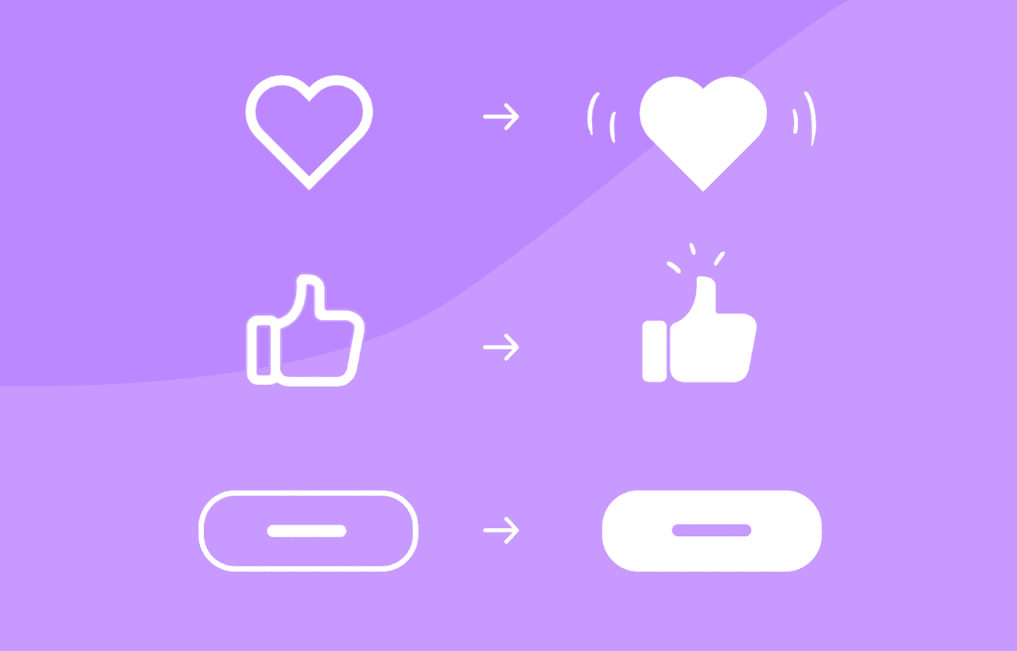
If you haven’t noticed how the ‘Like’ button on Facebook is animated or the double tapping on Instagram feels natural to you, then Microinteractions are doing their job, and the fun part is that they are blended in almost every app or page that you will come across. Why I say ‘blended’ is because they are made in such a way that they fit so well in the overall experience that they would go unnoticed if you did not put any effort to notice them, but if you remove them, something would definitely seem off.
Microinteractions are all about innovation. Different interactions are created to fit in with the kind of experience you want to deliver and are subjective to change along with trends.
Rounded Corners
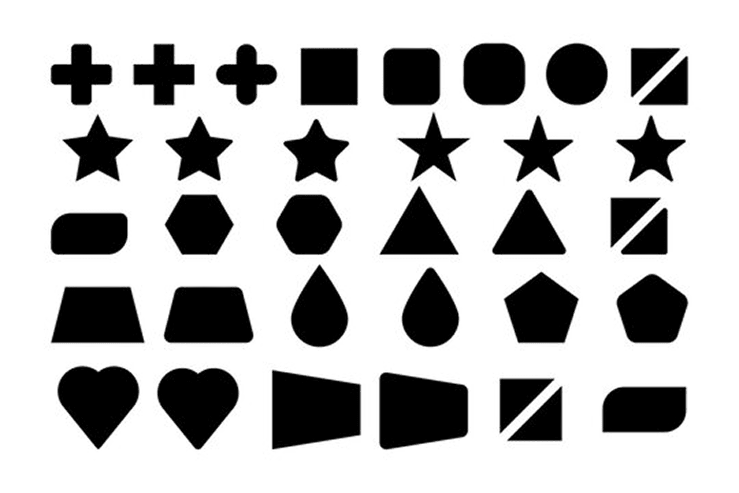
Unpopular opinion, but rounded corners is one of the best things to happen to design trends in a long time. Roundness of an element emits a sense of charisma and endearment, where sharpness represents edginess and crudeness. This is the reason why people prefer to have rounded buttons and rounded corners in their elements and that is how rounded corners made it into the mobile and web UI experience scene. It brings about a degree of softness which is pleasant to the viewer and since 2020 is big on making experiences more relaxing for users, rounded corners have found their footing in them as one of the game changers in UI design. We tried it on with our designs and it does work. Check it below and judge for yourself.
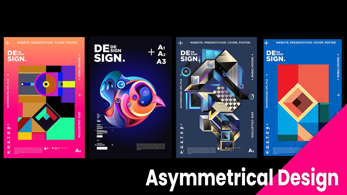
Asymmetrical Designs
In the past year, asymmetrical designs have grown in popularity, depicting the ‘order amongst chaos’ mantra. Creating asymmetric designs adds a degree of dynamism to the overall experience and appears very bold, but there is an equal level of delicacy associated with it.
Asymmetrical layouts are hard to make and require astuteness. Random placements can really harm the experience but if done right, can create something truly impactful. With such layouts, the possibilities are endless and one can create multiple experiences very quickly.
Three months in and these are the trends that got us really excited. We’ve been using these trends to create unique and memorable experiences for our clientele and help them deliver their message in the most impactful way possible. There are a lot of different trends that are on the way and they’re hard to predict but we’re keeping a close eye on what the next big thing might be. (Our bet is on Neumorphism)
Until then…
Godspeed.
Design credits: Alexander Plyuto (Neumorphism), Vlad Gorbunov (3D Depth), Ludmilla Shevchenko (Microinteractions) & asnoguera (Asymmetrical design)