
Design for ten thousand users and you can fix problems, one screen at a time. Design for millions, and every decision sets a rule that must work across thousands of screens, teams and different situations. AI raises the stakes: it can generate a hundred screens in an afternoon, so the real skill is deciding which designs will hold up at scale.
The evidence that design pays at scale is real, but it proves less than headlines suggest. McKinsey's study of 300 listed companies found that top-quartile scorers on its Design Index had 32 percentage points higher revenue growth over five years than their industry peers, plus 56 points higher returns to shareholders.
That is a correlation, not a guarantee.
The study also examined hundreds of practical design decisions, making those practices worth understanding.
The examples in this post come from a project I worked on as a product designer and UX strategy consultant: an e-commerce platform with 13 million shoppers and no design system when I started.
Its homepage was assembled from widgets, and several storefront themes had to stay coherent. The post covers the decisions I made under those conditions and the trade-offs behind each one.
I label every claim as done, observed, used or proposed, because writing about AI and design tends to blur those four.
What Actually Shipped, and What’s Still a Proposal
Each row pins a label to the work it covers, so you always know whether something shipped or stayed an idea.
Label | What it covers |
Done | Interviews, the four-pillar framework, the widget designs and a Maze test |
Observed | Problems documented during the work, such as brand names over the tile limit and the drop in scroll depth |
AI used | Layout and tile exploration in Figma with Claude |
Proposed | AI-assisted widget composition. I describe a pattern and did not build it |
Not measured | Changes in conversion, delivery speed or maintenance effort |
I mark each expected benefit as expected. That is the line between what the work proves and what it only points toward. The next question is why this way of working matters now.
Why Enterprise Design Can’t Wait on AI Anymore
Most large companies now run AI, however, only a few get value from it. McKinsey's 2026 survey of 1,719 respondents found 44% of organizations scaling AI across the enterprise and 37% reporting any EBIT impact. The survey does not say why the two numbers differ. My reading is that part of the gap is a design problem: AI produces output at volume, and volume needs goals, limits, and fallbacks before it becomes value.
The tools are starting to catch up.
Nielsen Norman Group expects generative interfaces to move designers toward defining the goals and constraints an AI works within. The Design Tokens Community Group, a W3C community group, published the first stable version of its token specification in October 2025, with support for theming. Both developments point toward design rules that tools can read, not just people.
Rules that tools can read sound clean on paper. The four problems below are where that idea met a real product with 13 million shoppers.
Four Problems That Get Harder When You Scale
Every decision later in this post traces back to one of four problems. None of them show up when a few thousand people use a product. All four get worse as the user count climbs toward millions.
1. Edge Cases Affect Real People
About 72 of 7,000 brands, roughly 1% of the catalog, had names too long for a product tile. Brands are the core of this product, so each of those 72 has its own shoppers and could not be treated as noise.
Truncation was the obvious fix, and it failed quickly, for two reasons:
- Font weight and size change how many characters fit, so no single cutoff works everywhere.
- A clipped name can turn into a different brand. Cutting Cherry Crumble by Nitt Hyman down to Cherry Crumble points shoppers at a separate brand that exists on its own.
So we tested three limits (18, 22, and 28 characters) at semibold 14px, across one-line and two-line layouts, and checked each against the longest names in the catalog:
- Two lines at 22 characters held up best.
- One line clipped too many names.
- 28 characters pushed the tiles out of alignment.
The rule applies in every storefront theme, so tiles keep one shape.
For names that pair a brand with a designer, we moved the designer into a pill, a small rounded label beside the name. That keeps the brand name whole and gives the designer’s identity its own space.
AI made this step possible. No consistent format separates a brand from a designer across 7,000 names, and reviewing them by hand would have taken weeks. We used AI to find the combined names and split them, and designers reviewed the output before it shipped.
After the change, 61 of the 72 names displayed in full. The other 11 truncate, and their full names appear on the brand page.
2. Stakeholders Multiply
The platform serves two kinds of shoppers at once, and they want opposite things:
- Premium shoppers are about 22% of users but bring about 70% of the business. They research before they arrive and come to buy, so they want a short path to the product.
- Non-premium shoppers browse. They have no fixed target and move through the page to discover things.
The screens have to hold both, and the pressure does not stop at shoppers. Several storefront themes must stay coherent, and merchandising, marketing, product, and engineering each own part of the answer.
That is where a single fixed layout breaks down:
- A page tuned for browsers slows down the buyers who drive revenue.
- A page stripped down for buyers loses the browsers.
One layout can produce only one of those results, at the cost of the other.
The proposed fix is to let AI read these behavior patterns and adjust the content, so a premium shopper reaches the product fast while a browser sees content that moves them toward a decision as they scroll. This part is a proposal, not something we shipped.
A small prototype test pointed the same way. With eight shoppers:
- The buyer version, with price and size availability above the fold, shortened the path to a product page by two taps.
- The browser version, with curated collections first, kept people scrolling longer.
Designers would still decide which modules can swap, and approve every variation.
3. Inconsistency Compounds
The platform grew without a design system, so every mismatch between two widgets reached 13 million people.
Two cards with different corner radii or spacing look like a small flaw on one screen. Across the whole app, they read as a product that cannot be trusted.
Checking this by hand meant comparing hundreds of widget states across every theme, so we used Claude in Figma to compare variants side by side and surface differences in spacing, radius, and type. The pass turned up a clear picture:
- 140 mismatches across 38 widgets
- reduced to 12 shared tokens for spacing and corner radius
Designers decided which version became the standard, because that call depends on brand and usability judgment.
4. Variation Multiplies
When AI generates content and ranks what each shopper sees, no two people get the same page. A single product tile can hold a long brand name, a designer pill, a discount badge, and a premium label in any combination, and nobody will review every combination.
So the rules have to be written as constraints with fallbacks. For the tile:
- The brand name never truncates below 22 characters.
- If the name and the designer pill do not fit together, the pill drops before the name is cut.
- The tile height stays fixed in every theme.
AI composes within those limits, and designers approve both the limits and the generated variations.
This one is conceptual so far, and it extends the rule we shipped for brand names.
Five Decisions That Turned Problems Into Rules
The four problems look different, but they ask for the same thing. At a few thousand users you can answer each case on the screen where it shows up.
At 13 million, that fails: the same case returns in another theme, for another shopper, and you fix it again every time. So the solution is to write rules instead of fixing screens, a decision made once and applied everywhere the case appears. The five decisions below are those rules.
Decision 1: Decide What You’re Designing Before You Draw It
Before anything gets drawn, you have to decide what the basic building block is. A single screen is the wrong unit at this scale, so I defined a widget: a reusable homepage building block that helps users take action faster by presenting relevant content in a focused format.
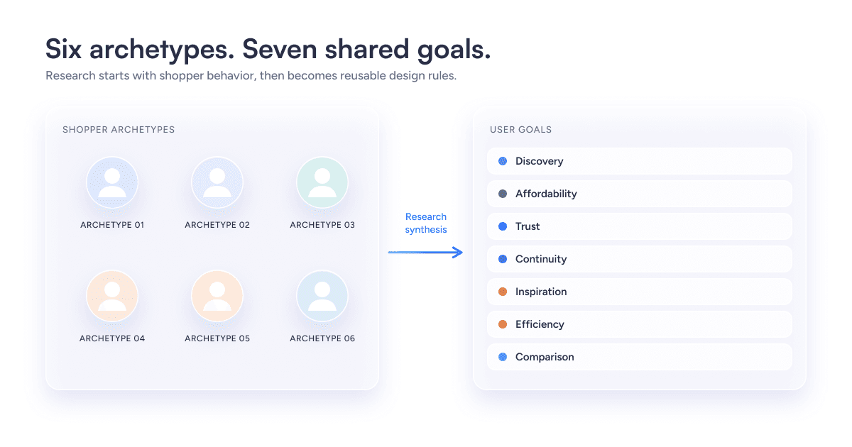
The widget has to serve what shoppers actually want, so the definition started from research, not layout. Open-ended interviews produced six shopper archetypes, and three of the six skip the homepage entirely, which is the clearest sign that a fixed homepage would miss half of them. I clustered what the archetypes wanted into seven goals: discovery, affordability, trust, continuity, inspiration, efficiency, and comparison.
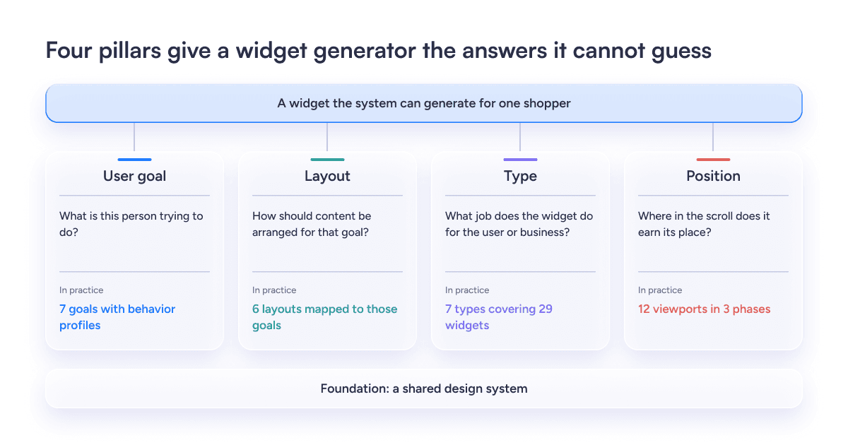
Then I listed what a system that generates widgets would need to know: the user goal, the layout, the type of job and the position in the scroll:
- Goal: which user goal the widget serves.
- Produced- seven goals, each with a behavior profile.
- Layout: how it arranges content.
- Produced- six layouts mapped to those goals.
- Type: the kind of job it does.
- Produced- seven widget types covering 29 widgets.
- Position: where it sits in the scroll.
- Produced- a map of 12 viewports across three phases.
Each layout carries a trade-off, so I wrote the trade-offs down:
- A static banner carousel gives its first item all the attention. That suits a big offer and fails someone comparing options.
- A horizontal finite scroll has a strong left bias. It suits recency and ranking, and items past the edge get less attention.
- A vertical grid with equal columns removes position bias and supports comparison. It uses more vertical space.
- Infinite scroll causes fatigue, so I excluded it from widget layouts.
Attention falls as people scroll, and I treated position as a budget. Nielsen Norman Group's eye-tracking of 120 participants found about 57% of viewing time above the fold and 74% across the first two screenfuls. The platform's own scroll-depth figures fell from 42% at the second viewport to 3% at the twelfth.
So, I placed orientation and relevance widgets in the first viewports and dense deal grids lower.
Expected benefit: A shared vocabulary lets teams decide where a widget goes without a new debate each time. I have not measured this.
The Widget Behind the Next Three Decisions
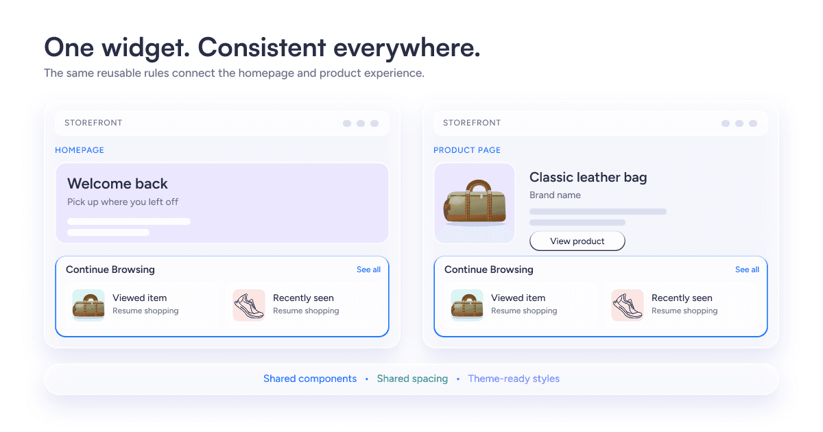
The framework stays abstract until it builds something, so here is the widget that Decisions 2, 3, and 4 all work on: Continue Browsing, which helps a returning shopper pick up where they stopped.
Two findings from behavioral analytics motivated it:
- Of shoppers who viewed three or more product pages, 68% did not buy straight away.
- Of return visitors, 43% repeated the same search in their next session.
Both point to the same gap. People leave mid-journey and then rebuild that journey by hand when they come back, so the widget’s job is to hold their place for them.
It opens a listing page with the filters already applied, and it ranks products by how often the shopper viewed them, with the last viewed product taking precedence. Success was measured one way: a higher share of users who complete a purchase after interacting with the widget.
Decision 2: Truncate Brand Names Instead of Wrapping Them
Observed: The tile's callout holds 26 characters on one line. About 70 of 7,000 brands exceed that.
Options- I weighed four fixes, and each one failed a criterion the tile already had to meet:
- Wrap onto two lines- make some tiles taller than their neighbors. The tile also had to limit vertical space and scroll effort, a criterion that counted against one of the layouts I rejected.
- Shrink the type- produces mixed sizes in one row. Small type already counted against two rejected layouts.
- Widen the tile- crowds the minimum of two tiles in a row.
- Truncate with an ellipsis- keeps one line, one height, and one rule.
Decision: Truncate at 26 characters and set brand names in title case. Brands that specify uppercase letters look inconsistent beside the rest.
Cost: Shoppers see a shortened name for about 1% of brands, so the full name has to live somewhere. The tile opens a listing page, and the full name must appear there. The W3C's guidance on text spacing calls ellipsis a common convention and accepts it when the truncated text appears on the linked page. It treats cut-off text with no way to reveal it as a failure. I recommend that the tile expose the full name to assistive technology.
System-wide effect: The limit lives in the widget's contract, not in one tile file. Each storefront theme changes color and type, and each tile variant keeps the same character limit. One rule covers all 7,000 brands across the themes.
Expected benefit: Consistent tile height and a single rule across themes. I have not measured effects on conversion or build time.
Decision 3: Pick the Tile With Written Criteria
Observed: I compared five tile layouts, and I wrote the criteria before I looked at any of them, so the comparison could not bend to a layout I already liked. The five were- product visibility, room for long brand names, behavior at the minimum of two tiles, reading pattern, and legibility.
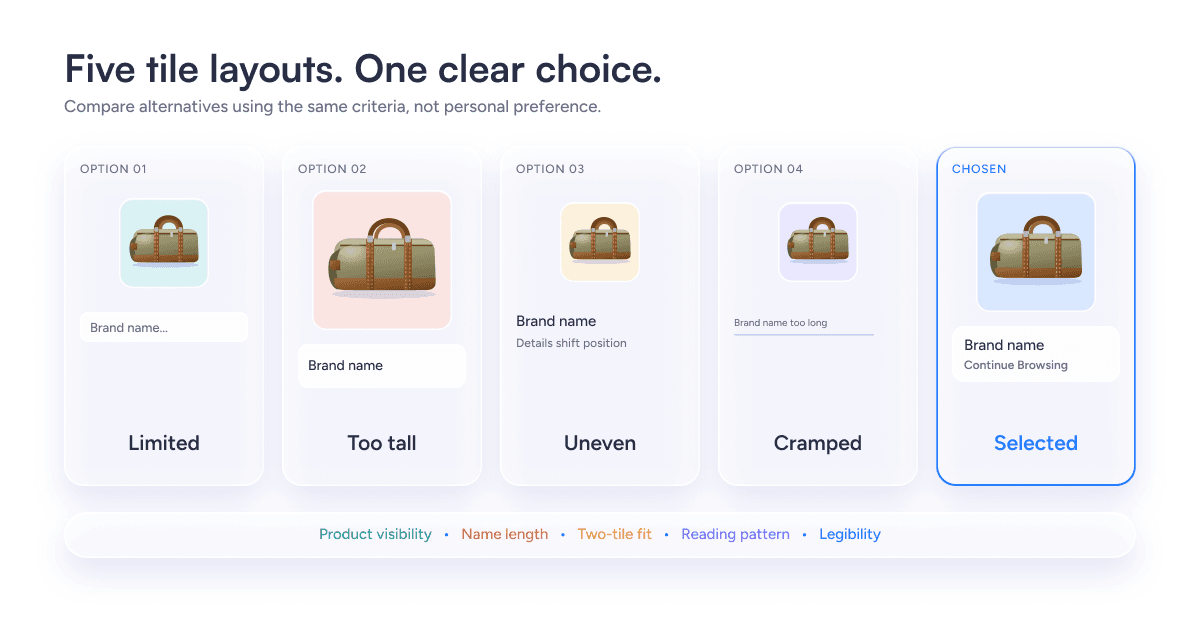
Options- Each rejected layout failed on at least one criterion:
- One showed 1.6 cards at a time, a full card and 60% of the next. That cut discoverability and added scrolling.
- A second took up too much vertical space.
- A third broke the reading pattern.
- Several could not hold long brand names, could not work at two tiles, or set the type too small.
Decision: A larger card with a blur overlay. It shows more of the product, leaves room for larger brand names, works with two tiles, gives a clear click cue and keeps a good reading pattern.
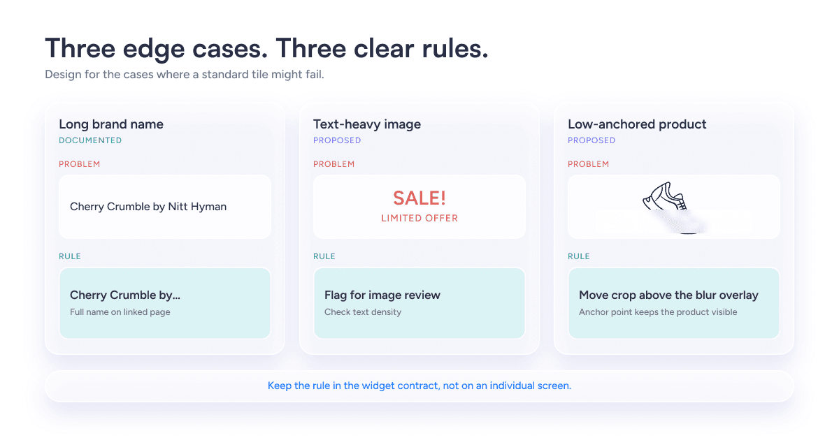
Cost: The overlay hides part of low-anchored products such as shoes, and photos with heavy text break the tile's look. Decision 4 covers both.
Expected benefit: A larger card should help shoppers recognize what they viewed. That follows from the criteria above. I have no production data that compares the layouts.
Decision 4: Write Each Exception as a Rule
A tile that works with a short name and a clean photo proves little. I documented the cases where the widget might fail and gave each one a handling rule or a proposal.
Edge case | What breaks | Handling | Status |
Brand name over 26 characters | The callout holds one line | Truncate with an ellipsis and show the full name on the listing page | Documented in the edge-case review |
Brand casing varies | Uppercase brand styling looks inconsistent beside other tiles | Title case | Proposed during the work |
Photo with heavy text | Text inside the image breaks the tile's look | Check images against a text-density limit before they reach the tile | Proposed in this post |
Low-anchored product | The blur overlay hides part of the product | Crop around an anchor point that keeps the product above the overlay | Proposed in this post |
Each rule goes into the widget's contract with its reason attached. An AI engineer or an AI-assisted workflow can then apply it without asking the original designer. A case without a rule goes on an open-exceptions list for review. It does not get an improvised fix on one screen, because a fix made in one place is the inconsistency problem starting over.
Decision 5: Plan for What Happens After Handoff
A design holds up only if it survives the people who inherit it.
The platform had no design system when I started, and one arrived later. The practices below describe how I recommend keeping widgets consistent after handoff. They are recommendations, because I have no data on how the platform's teams use them.
Ownership- Nathan Curtis describes three team models for scaling a design system: solitary, centralized and federated. A centralized team brings efficiency, consistency and capacity. A federated model spreads contribution and makes decisions harder. For a platform with several themes and many contributing teams, I would give a core team the four pillars and the widget contract, and let product teams propose new widgets.
Intake for new widgets- A proposal names its user goal, layout, type and position, the same four pillars from Decision 1. It reuses an existing layout unless the proposal shows that none fits. This requirement guards against fragmentation, because each request enters the framework before anyone designs it.
Design-to-development consistency- Put themes in design tokens that design tools and code both read. The Design Tokens Community Group's format specification reached its first stable version in October 2025. Build the states into code components: minimum and maximum content, overflow and fallback. Add visual regression checks so unintended changes show up in review. A UK government design team demonstrated that approach with a component build tool that flags CSS changes affecting other components.
Exceptions: Log each exception with its widget and date, and review the log on a schedule. If the same exception keeps recurring, promote it to a rule in the contract. That is how the open-exceptions list from Decision 4 feeds back into the system rather than growing forever.
Expected benefit: Fewer one-off fixes and a clearer path for new widgets. I have not measured either.
Where AI Fits in a Rule-Based Design System
Everything so far has described a system of rules. This section says plainly where AI is used: what it did, what I proposed it could do, and what never left human hands.
Where I used AI- I used Claude alongside Figma to iterate on tile options and layout variations. It widened the set of options I could examine in a day. I scored each option against the written criteria and made every choice myself.
What I propose-AI-assisted widget composition guided by the four pillars. I did not build a generator, and this post does not claim that one exists on the platform. The Continue Browsing tile shows how the contract would constrain a workflow like that, field by field:
Constraint | Rule | What AI may propose | Fallback |
User goal | Continuity: resume where the shopper stopped | Nothing. The widget type fixes it | None needed |
Layout | Larger card with blur overlay | Nothing. The system fixes it | None needed |
Tile count | Minimum of two | Which products fill the tiles, and in what order | Fewer than two eligible products: hide the widget and let the next widget move up |
Brand name | 26 characters on one line, title case | Nothing. The system applies truncation | Truncate with an ellipsis and show the full name on the listing page |
Product image | Photo behind the blur overlay | A crop within an allowed range | Text-heavy or low-anchored photo: default crop and a flag for designer review |
Theme | Storefront theme, light or dark | Nothing. Theme tokens supply color and type | Default theme tokens |
Position | Re-engagement viewport from the framework | Nothing | None needed |
Read the “What AI may propose” column on its own and the boundary is clear: AI chooses which products and how a photo is cropped. It never touches the goal, the layout, the character limit, or the theme. The design documents the 26-character rule and the two-tile minimum; I propose the fallbacks and the limits on what AI may vary.
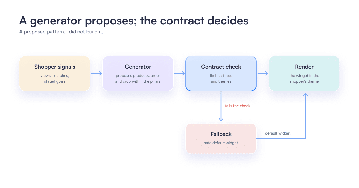
The pattern behind it: propose, validate, fall back.
The generator proposes, the contract check validates each proposal, and a safe default renders when a proposal fails. Nielsen Norman Group suggests sorting information into must show, should show and never show when guiding a generator. The contract carries the same logic.
- A tighter contract makes output predictable and cheaper to test.
- A looser contract allows more personalization and demands more review.
NN/g also warns that constantly changing interfaces cause usability problems, so I would personalize content inside a stable structure.
What stays with designers. Four decisions stay with people:
- Usability judgment- A model cannot tell whether a tile reads at a glance or feels trustworthy. Shoppers can, so test with them.
- Brand consistency- Designers own the theme tokens and approve any new tile variant.
- Accessibility- Designers check the contrast of text over the blur overlay and confirm that truncated names stay available when users increase text spacing.
- Approval- No generated variation ships until a designer checks it against the contract.
A Checklist for Your Next Large-Scale Design
The decisions in this post were specific to one platform, but the questions behind them are not. Run these against your own project before you start drawing. If you cannot answer one of them, that is the part of the work that is not ready yet.
- Can you state the problem and the measure of success in two sentences?
- Does every decision trace back to an interview, a number, or a stated criterion?
- Is the unit you are designing a system, rather than a single screen?
- Are your design rules written so a model, not just a person, can follow them?
- Have you specified minimum, maximum, overflow, and fallback states?
- Are light mode, dark mode, and every theme covered?
- If AI generates or ranks content, have you set guardrails and a fallback for when it fails?
- Do people know why they see what they see, and can they change it?
- Is every figure labeled as projected or measured?
What Carries a Design Across Millions of Users
Small products let you solve problems where you find them. Large ones do not.
The same question pops up again on a different screen, with a different theme, for a different customer, and the same fix applied one way in one place contradicts the fix applied another way somewhere else. The problem addressed in this post is solved by elevating the decision-making process to another level. Rather than styling one tile, you specify how each tile behaves, and the rule travels with the problem wherever it is spotted.
Such rules are also what make automation possible and safe. An automated system assembling web pages needs limits on how it operates, and a contract provides precisely that: the ability to work freely within those limits and no freedom beyond them. The quality stays high while the volume grows.
It is equally important that there is transparency about the process. This post states the deliverables, the ideas, and the unmeasured assumptions, so the reader knows where they stand. A design is reliable when it gives a rationale behind every decision and when all its rules can survive their creator.
Designing this way is its own kind of work. Building a system where rules stay consistent across products, teams, and automated output is what GeekyAnts does through its design systems and CX consistency practice, which keeps experiences coherent as platforms grow and reduces the design debt that builds up when they don’t.